The CSS radial-gradient() function creates an <image> which represents a gradient of colors radiating from an origin, the center of the gradient. The result of this function is an object of the CSS <gradient> data type.
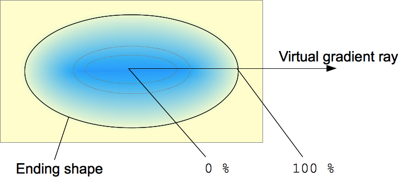 Radial gradients are defined by their center, the ending shape contour and position, and color stops. The radial gradient consists, going from its center to its ending shape and potentially beyond, of successive uniformly-scaled concentric shapes, identical to the ending shape. Color stops are positioned on a virtual gradient ray going out horizontally of the center to the right. Percentages positioning of color stops are relative to the intersection between the ending shape and this gradient ray representing
 100%. Each shape is monocolor and defined by the color on the gradient ray it intersects.
Ending shapes can only be circle or ellipse.
Like any other gradient, a CSS radial gradient is not a CSS <color> but an image with no intrinsic dimensions, i. e. it has no natural or preferred size, nor ratio. Its concrete size will match the one of the element it applies to.
The radial-gradient function does not allow repeating gradients. For such a functionality, use the CSS repeating-radial-gradient() function.
Syntax
// Definition of the ending shape
radial-gradient( circle, … ) /* Synonym of radial-gradient( circle farthest-corner, …) */
radial-gradient( ellipse, … ) /* Synonym of radial-gradient( ellipse farthest-corner, …) */
radial-gradient( <extent-keyword>, … ) /* It draws a circle */
radial-gradient( circle radius, … ) /* A centered circle of the given length. It can't be a percentage */
radial-gradient( ellipse x-axis y-axis, … ) /* The two semi-major axis are given, horizontal, then vertical */

// Definition of the position of the shape
radial-gradient (… at <position>, … )

// Definition of the color stops
radial-gradient (…, <color-stop>)
radial-gradient (…, <color-stop>, <color-stop>)
Values
<position>- A
<position>, interpreted in the same way asbackground-positionortransform-origin. If omitted, the default iscenter. <shape>- The gradient's shape. This is one of
circle(meaning that the gradient's shape is a circle with constant radius) orellipse(meaning that the shape is an axis-aligned ellipse). The default value isellipse. <size>- The size of the gradient. This is one of the Size constants listed below.
<color-stop>- Representing a fixed color at a precise position, this value is composed by a
<color>value, followed by an optional stop position (either a<percentage>or a<length>along the virtual gradient ray). A percentage of0%, or a length of0, represents the center of the gradient, the value100%of the intersection of the ending shape with the virtual gradient ray. Percentage values in-between are linearly positioned on the gradient ray. <extent-keyword>- Keywords describing how big the ending shape must be. The possible keywords are:
-
Early drafts included other keywords (Constant Description closest-sideThe gradient's ending shape meets the side of the box closest to its center (for circles) or meets both the vertical and horizontal sides closest to the center (for ellipses). closest-cornerThe gradient's ending shape is sized so it exactly meets the closest corner of the box from its center. farthest-sideSimilar to closest-side, except the ending shape is sized to meet the side of the box farthest from its center (or vertical and horizontal sides). farthest-cornerThe gradient's ending shape is sized so it exactly meets the farthest corner of the box from its center. coverandcontain) as synonyms of the standardfarthest-cornerandclosest-siderespectively. Use the standard keywords only, as some implementations have already dropped those older variants.
Formal syntax
radial-gradient(   [ circle || <length> ] [ at <position> ]? ,
                 | [ ellipse || [<length> | <percentage> ]{2}] [ at <position> ]? ,
                 | [ [ circle | ellipse ] || <extent-keyword> ] [ at <position> ]? ,
                 | at <position> ,
                 <color-stop> [ , <color-stop> ]+ )
where <extent-keyword> = closest-corner | closest-side | farthest-corner | farthest-side
  and <color-stop> = <color> [ <percentage> | <length> ]?
Examples
background-image: radial-gradient(ellipse farthest-corner at 45px 45px , #00FFFF 0%, rgba(0, 0, 255, 0) 50%, #0000FF 95%);
background-image: radial-gradient(ellipse farthest-corner at 470px 47px , #FFFF80 20%, rgba(204, 153, 153, 0.4) 30%, #E6E6FF 60%);
background-image: radial-gradient(farthest-corner at 45px 45px , #FF0000 0%, #0000FF 100%);
background-image: radial-gradient(16px at 60px 50% , #000000 0%, #000000 14px, rgba(0, 0, 0, 0.3) 18px, rgba(0, 0, 0, 0) 19px);
Specifications
| Specification | Status | Comment |
|---|---|---|
| CSS Image Values and Replaced Content Module Level 3 The definition of 'radial-gradients()' in that specification. |
Candidate Recommendation | Initial definition |
Browser compatibility
| Feature | Firefox (Gecko) | Chrome | Internet Explorer | Opera | Safari |
|---|---|---|---|---|---|
Basic support (on background and background-image) |
3.6 (1.9.2)-moz[1] 16 (16) |
10.0 (534.16)-webkit[2] | 10.0[3] | 11.60-o | 5.1-webkit[2] |
On border-image |
29 (29) | (Yes) | (Yes) | (Yes) | (Yes) |
On any other property that accept <image> |
No support | (Yes) | (Yes) | (Yes) | (Yes) |
| Legacy webkit syntax | No support | 3-webkit[2] | No support | No support | 4.0-webkit[2] |
at syntax (final standard syntax) |
10 (10)-moz[1] 16 (16) |
26 | 10.0 | 11.60-o[2] 2.12 |
No support |
| Interpolation hints (a percent without a color) | 36 (36) | 40 | 27 |
| Feature | Android | Firefox Mobile (Gecko) | IE Phone | Opera Mobile | Safari Mobile |
|---|---|---|---|---|---|
Basic support (on background and background-image) |
(Yes) | 1.0 (1.9.2)-moz[1] 16.0 (16) |
10 | (Yes) | (Yes) |
On border-image |
(Yes) | 29.0 (29) | (Yes) | (Yes) | (Yes) |
On any other property that accept <image> |
No support | (Yes) | (Yes) | (Yes) | (Yes) |
| Legacy webkit syntax | ? | No support | ? | ? | ? |
at syntax (final standard syntax) |
? | 10.0 (10)-moz[1] 16.0 (16) |
10 | ? | ? |
[1] Firefox 3.6 implemented, prefixed, an early syntax. Before Firefox 36, Gecko didn't apply gradient on the pre-multiplied color space, leading to shade of grey unexpectedly appearing when used with transparency. Since Firefox 42, the prefixed version of gradients can be disabled by setting layout.css.prefixes.gradients to false.
[2] Webkit implemented, prefixed, an early syntax. WebKit since 528 supports the legacy -webkit-gradient(radial,…) function. See also their current support for radial gradients.
[3] Internet Explorer 5.5 through 9.0 supports proprietary filter: progid:DXImageTransform.Microsoft.Gradient() filter.
See also
- Using CSS gradients,
repeating-radial-gradient(),linear-gradient() - WebKit's original proposal: http://webkit.org/blog/175/introducing-css-gradients/
- WebKit's new implementation: http://webkit.org/blog/1424/css3-gradients/