Using D3 in Ext JS
Many classes have shortcut names used when creating (instantiating) a class with a
configuration object. The shortcut name is referred to as an alias (or xtype if the
class extends Ext.Component). The alias/xtype is listed next to the class name of
applicable classes for quick reference.
Framework classes or their members may be specified as private or protected. Else,
the class / member is public. Public, protected, and private are access
descriptors used to convey how and when the class or class member should be used.
Public classes and class members are available for use by any other class or application code and may be relied upon as a stable and persistent within major product versions. Public classes and members may safely be extended via a subclass.
Protected class members are stable public members intended to be used by the
owning class or its subclasses. Protected members may safely be extended via a subclass.
Private classes and class members are used internally by the framework and are not intended to be used by application developers. Private classes and members may change or be omitted from the framework at any time without notice and should not be relied upon in application logic.
static label next to the
method name. *See Static below.Below is an example class member that we can disect to show the syntax of a class member (the lookupComponent method as viewed from the Ext.button.Button class in this case).
Let's look at each part of the member row:
lookupComponent in this example)( item ) in this example)Ext.Component in this case). This may be omitted for methods that do not
return anything other than undefined or may display as multiple possible values
separated by a forward slash / signifying that what is returned may depend on the
results of the method call (i.e. a method may return a Component if a get method calls is
successful or false if unsuccessful which would be displayed as
Ext.Component/Boolean).PROTECTED in
this example - see the Flags section below)Ext.container.Container in this example). The source
class will be displayed as a blue link if the member originates from the current class
and gray if it is inherited from an ancestor or mixed-in class.view source in the example)item : Object in the example).undefined a "Returns" section
will note the type of class or object returned and a description (Ext.Component in the
example)Available since 3.4.0 - not pictured in
the example) just after the member descriptionDefaults to: false)The API documentation uses a number of flags to further commnicate the class member's function and intent. The label may be represented by a text label, an abbreviation, or an icon.
classInstance.method1().method2().etc();false is returned from
an event handler- Indicates a framework class
- A singleton framework class. *See the singleton flag for more information
- A component-type framework class (any class within the Ext JS framework that extends Ext.Component)
- Indicates that the class, member, or guide is new in the currently viewed version
- Indicates a class member of type config
- Indicates a class member of type property
- Indicates a class member of type
method
- Indicates a class member of type event
- Indicates a class member of type
theme variable
- Indicates a class member of type
theme mixin
- Indicates that the class, member, or guide is new in the currently viewed version
Just below the class name on an API doc page is a row of buttons corresponding to the types of members owned by the current class. Each button shows a count of members by type (this count is updated as filters are applied). Clicking the button will navigate you to that member section. Hovering over the member-type button will reveal a popup menu of all members of that type for quick navigation.
Getting and setter methods that correlate to a class config option will show up in the methods section as well as in the configs section of both the API doc and the member-type menus just beneath the config they work with. The getter and setter method documentation will be found in the config row for easy reference.
Your page history is kept in localstorage and displayed (using the available real estate) just below the top title bar. By default, the only search results shown are the pages matching the product / version you're currently viewing. You can expand what is displayed by clicking on the button on the right-hand side of the history bar and choosing the "All" radio option. This will show all recent pages in the history bar for all products / versions.
Within the history config menu you will also see a listing of your recent page visits. The results are filtered by the "Current Product / Version" and "All" radio options. Clicking on the button will clear the history bar as well as the history kept in local storage.
If "All" is selected in the history config menu the checkbox option for "Show product details in the history bar" will be enabled. When checked, the product/version for each historic page will show alongside the page name in the history bar. Hovering the cursor over the page names in the history bar will also show the product/version as a tooltip.
Both API docs and guides can be searched for using the search field at the top of the page.
On API doc pages there is also a filter input field that filters the member rows using the filter string. In addition to filtering by string you can filter the class members by access level, inheritance, and read only. This is done using the checkboxes at the top of the page.
The checkbox at the bottom of the API class navigation tree filters the class list to include or exclude private classes.
Clicking on an empty search field will show your last 10 searches for quick navigation.
Each API doc page (with the exception of Javascript primitives pages) has a menu view of metadata relating to that class. This metadata view will have one or more of the following:
Ext.button.Button class has an alternate class name of Ext.Button). Alternate class
names are commonly maintained for backward compatibility.Runnable examples (Fiddles) are expanded on a page by default. You can collapse and expand example code blocks individually using the arrow on the top-left of the code block. You can also toggle the collapse state of all examples using the toggle button on the top-right of the page. The toggle-all state will be remembered between page loads.
Class members are collapsed on a page by default. You can expand and collapse members using the arrow icon on the left of the member row or globally using the expand / collapse all toggle button top-right.
Viewing the docs on narrower screens or browsers will result in a view optimized for a smaller form factor. The primary differences between the desktop and "mobile" view are:
The class source can be viewed by clicking on the class name at the top of an API doc page. The source for class members can be viewed by clicking on the "view source" link on the right-hand side of the member row.
Presenting data in a clear and compelling way is an important job for any application. D3 is an extremely popular choice for data visualization. The new d3 package makes it simpler than ever to integrate D3 into your Ext JS application.
In this guide, we will explore the various D3 components that are available in Ext JS.
Your D3 package should be located within the packages folder that came with your Ext JS Premium purchase. This packages folder should be copied to the root packages directory of the ext folder you use to generate applications.
For instance, if you have generated your application using Sencha Cmd, you would move the d3 package from:
{premiumLocation}/ext/packages/d3
to:
{yourApplication}/ext/packages/d3
or:
{yourWorkspace}/ext/packages/d3
Once your package is in appropriately located, you'll need to modify your app.json file. Open {appDir}/app.json
and add "d3" to the "requires" block. It should now look like similar to the following code snippet:
"requires": [
   "d3"
],
Do keep in mind that your requires block may contain other items depending on your default theme.
Your application should now be ready to use D3!
Note: The D3 package is only available in Ext Premium. For more information about Ext Premium and our other products, please check out the products page.
You can also utilize the d3 package without a Cmd built application. However, you may need to use Cmd to build the initial CSS/JS builds if they do not appear in your package's build folder.
We generally try to include pre-built packages, but sometimes they slip through the cracks and are not available until the next release.
Building a package is quick and simple. The process produces a singular JS/CSS file for inclusion in your non-Cmd application. To build these files, issue the following command from your CLI:
//target a specific theme
sencha package build {themeName}
Classic themes will just be theme names (triton, neptune, etc).
Modern themes will be prepended with "modern-" (modern-neptune).
or
//build for all themes
sencha package build
You should now have a build folder that contains the following built files:
d3/{toolkit}/d3.js
d3/{toolkit}/{theme}/resources/d3-all.css
You can now include these outputs by whatever method you are using.
Integrating D3 begins with the choice of rendering technology:
SVG or
Canvas. This is because D3 is not a
drawing abstraction library (like Ext.draw.*) and so the nature of the drawing surface is an important starting
point. These base classes provide a structure to assist with rendering to the correct container element and updating
when the container resizes.
These base classes streamline the process of copying simple, whole page examples (such as those in the D3 Gallery) and housing them in a component. That component can then be easily managed like any other in an Ext JS application.
The D3 Adapter then builds on these primitive base classes and provides some of the most commonly used D3 visualizations as ready to use components. These higher-level components understand your Ext JS data stores and connect them to D3 drawings and then ensure these stay up to date when your data changes.
The need to display hierarchical information is quite common and D3 provides a wide range of visualizations for this type of data. These components connect an Ext.data.TreeStore to several of the popular D3 layouts to display hierarchical data.
The 'd3-tree' component is a perfect way to visualize hierarchical data as an actual tree in cases where the relative size of nodes is of little interest, and the focus is on the relative position of each node in the hierarchy. A horizontal tree makes for a more consistent look and more efficient use of space when text labels are shown next to each node.
The 'd3-sunburst' component visualizes tree nodes as donut sectors, with the root circle in the center. The angle and area of each sector corresponds to its node value. By default the same value is returned for each node, meaning that siblings will span equal angles and occupy equal area.
The 'd3-pack' component uses D3's Pack Layout to visualize hierarchical data as an enclosure diagram. The size of each leaf node’s circle reveals a quantitative dimension of each data point. The enclosing circles show the approximate cumulative size of each subtree.
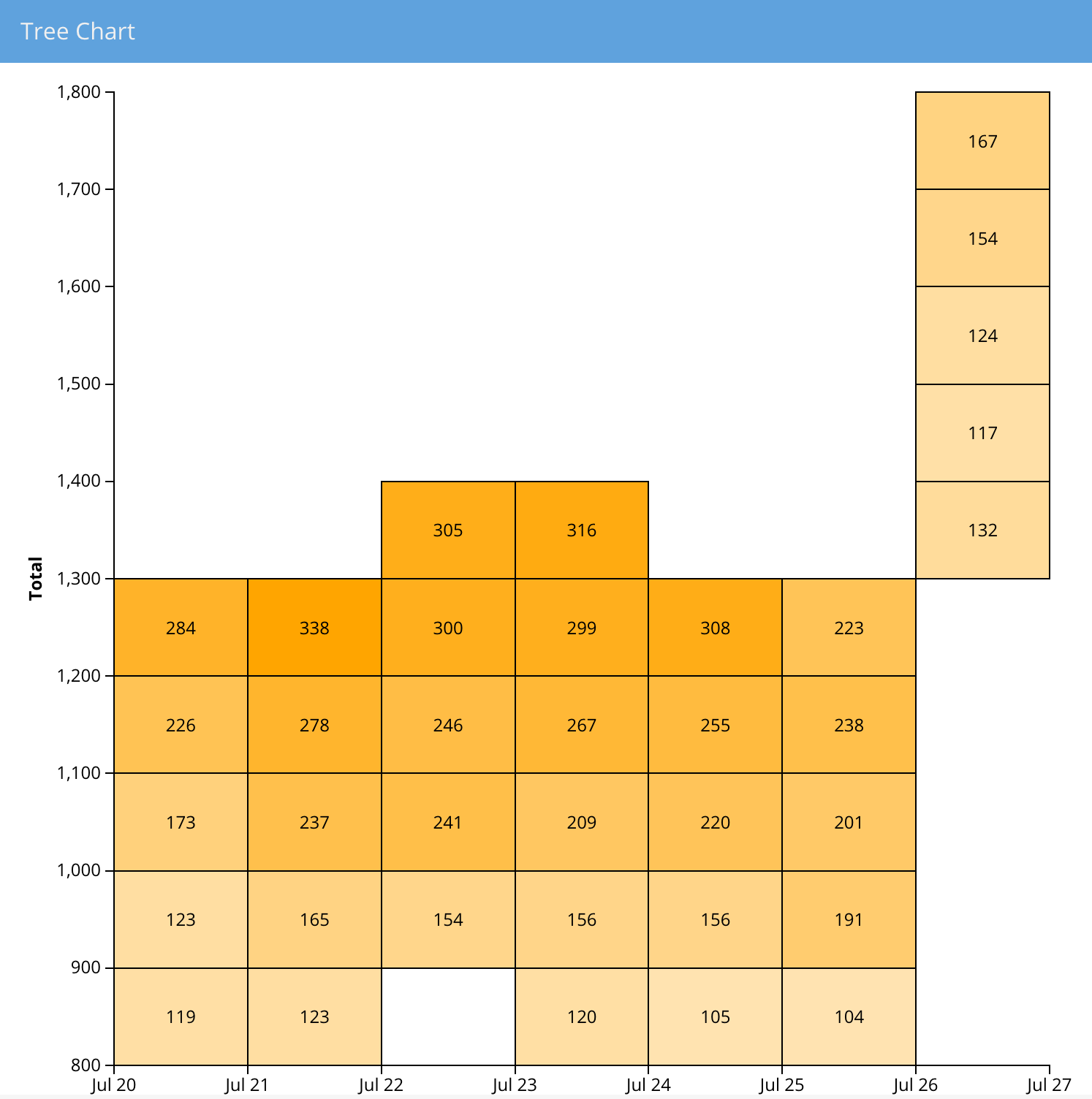
The 'd3-treemap' component uses D3's TreeMap Layout to recursively subdivide area into rectangles, where the area of any node in the tree corresponds to its value.
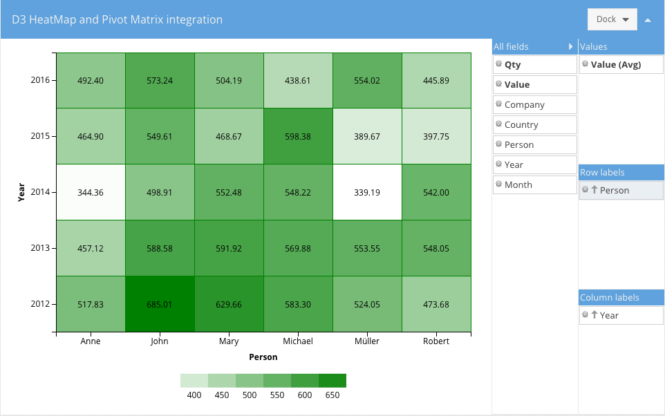
Heatmaps are a great way to present three-dimensional data in a two-dimensional drawing. The HeatMap component maps X and Y values to axes as you might expect. It then maps Z values to a "color axis".
Note: "Heatmap.js" can throw up red flags for some ad blockers. If "Heatmap.js" won't load while you're developing, disable your ad blocker or create an exception for "Heatmap.js".
Ext.d3.svg.Svg has a concept of a scene, which is represented by an SVG group ('g' element) that is designed to hold
all rendered data nodes and other elements of the visualization.
For examples of a pure SVG scene example, see our Kitchen Sink.
Ext.d3.canvas.Canvas deals with the Canvas element and its ('2d') context. Since D3 does not provide resolution independence for crisp looking drawings on HiDPI screens, it's handled by the 'd3-canvas' component. HiDPI support is completely transparent. One just calls native Canvas APIs as they normally would. The HDPI overrides are automatically applied to the canvas context where necessary (see Ext.d3.canvas.HiDPI).
For examples of a pure Canvas example, see our Kitchen Sink.
Themes can be applied in the same fashion as other Ext JS components. However, there is an exception when theming
tree nodes and heatmap cell colors. These will need an Ext.d3.axis.Color.
In our above HeatMap example, You saw that the nodes/cells with the lowest 'performance' are white, while cells with the highest 'performance' are 'orange'.
This representative gradient can be achieved with the following code:
colorAxis: {
    field: 'performance',
    scale: {
        type: 'linear',
        range: ['white', 'orange']
    }
}
D3 has it’s own way of dealing with node events. However, it is incompatible with the Ext JS event system. Additionally, the D3 event system does not automatically map touch events to desktop events and vice versa. Direct use of that event system is discouraged.
Instead, use one of the following approaches:
var sceneElement = Ext.get(me.getScene().node()); // **preferred**

sceneElement.on(‘click’, handlerFn, scope, {
      delegate: ‘g.x-class-name’
});
Ext.fly(selection.node()).on(‘click’, handlerFn, scope);
selection.each(function (node) {

    Ext.fly(this).on(‘click’, handlerFn, scope);

});
Note: D3 4.0 now features automatic event mapping. However, it may be incompatible with the Ext JS event system.
If it does become compatible, using two event systems in a single application is still discouraged.
Instead of making use of D3’s "behaviors", D3 components have a concept of interaction.
Currently only ‘panzoom’ interaction (Ext.d3.interaction.PanZoom) is supported. It is meant to replace and enhance the ‘zoom’ behavior provided by D3. For example, the ‘zoom’ behavior in D3 has no support for constrained panning, kinetic scrolling, scroll indicators and is generally incompatible with ExtJS event system. ‘Panzoom’ interaction fixes all that.
Note: Some of these features made it into D3 4.0, which was released summer 2016.
All high level components support the ‘tooltip’ config via the Ext.d3.mixin.ToolTip mixin.
The tooltip config works just like in other ExtJS components except for one extra property -- ‘renderer’. Renderer is generally the only thing that needs to be specified when configuring a tooltip. Here are two examples of how you might set up your tooltips.
tooltip: {  // inside a D3 component config in a view
    renderer: 'onTooltip'
}

// view controller’s handler

onTooltip: function (component, tooltip, node, element, event) {
    var n = node.childNodes.length;
    tooltip.setHtml(n + ' items' + (n === 1 ? '' : 's') + ' inside.');
}
tooltip :
    renderer: function(component, tooltip, record) {
        tooltip.setHtml(record.get('text'));
    }
}
We can also aggregate local data using a Pivot Matrix. The new "pivot-d3" package contains several useful components that connect these pieces for you.
This component produces a D3 HeatMap after the data is aggregated by the pivot matrix.
{
    xtype: 'pivotheatmap',
    // pivot matrix configurations
    matrix: {
        store: {
            type: 'salesperemployee'
        },
        leftAxis: {
            dataIndex: 'employee',
            header: 'Employee',
            sortable: false
        },
        topAxis: {
            dataIndex: 'day',
            sortIndex: 'dayNumber',
            header: 'Day'
        },
        aggregate: {
            dataIndex: 'sales',
            aggregator: 'sum'
        }
    }
}
When the pivot matrix is configured there should be only one dimension per axis defined.
This component produces a D3 TreeMap after the data is aggregated by the pivot matrix.
{
    xtype: 'pivottreemap',
    // pivot matrix configurations
    matrix: {
        store: {
            type: 'salesperemployee'
        },
        leftAxis: {
            dataIndex: 'employee',
            header: 'Employee',
            sortable: false
        },
        aggregate: {
            dataIndex: 'sales',
            aggregator: 'sum'
        }
    }
}
The topAxis configuration of the pivot matrix is ignored, leftAxis supports multiple dimensions and aggregate
should have only one dimension.
This new component connects the pivot Configurator plugin with any of the the above components to allow the end-user to configure the pivot matrix:
The Configurator can be configured using the "configurator" config:
{
    xtype: 'pivotd3container',
    drawing: {
        xtype:  'something' // one of the above pivot D3 components
        // more configs specific to that component
    },
    configurator: {
        // pivotconfigurator plugin configs
        fields: [{
            dataIndex: 'person',
            header: 'Person',
            settings: {
                // field settings
            }
        },{
            // more fields
        }]
    },
    // following configs are similar to the pivot grid
    matrix: {
        leftAxis: [],
        topAxis: [],
        aggregate: []
    }
}


 Ext JS | Terms of Use
