Creating Images - Pt 3
Many classes have shortcut names used when creating (instantiating) a class with a
configuration object. The shortcut name is referred to as an alias (or xtype if the
class extends Ext.Component). The alias/xtype is listed next to the class name of
applicable classes for quick reference.
Framework classes or their members may be specified as private or protected. Else,
the class / member is public. Public, protected, and private are access
descriptors used to convey how and when the class or class member should be used.
Public classes and class members are available for use by any other class or application code and may be relied upon as a stable and persistent within major product versions. Public classes and members may safely be extended via a subclass.
Protected class members are stable public members intended to be used by the
owning class or its subclasses. Protected members may safely be extended via a subclass.
Private classes and class members are used internally by the framework and are not intended to be used by application developers. Private classes and members may change or be omitted from the framework at any time without notice and should not be relied upon in application logic.
static label next to the
method name. *See Static below.Below is an example class member that we can disect to show the syntax of a class member (the lookupComponent method as viewed from the Ext.button.Button class in this case).
Let's look at each part of the member row:
lookupComponent in this example)( item ) in this example)Ext.Component in this case). This may be omitted for methods that do not
return anything other than undefined or may display as multiple possible values
separated by a forward slash / signifying that what is returned may depend on the
results of the method call (i.e. a method may return a Component if a get method calls is
successful or false if unsuccessful which would be displayed as
Ext.Component/Boolean).PROTECTED in
this example - see the Flags section below)Ext.container.Container in this example). The source
class will be displayed as a blue link if the member originates from the current class
and gray if it is inherited from an ancestor or mixed-in class.view source in the example)item : Object in the example).undefined a "Returns" section
will note the type of class or object returned and a description (Ext.Component in the
example)Available since 3.4.0 - not pictured in
the example) just after the member descriptionDefaults to: false)The API documentation uses a number of flags to further commnicate the class member's function and intent. The label may be represented by a text label, an abbreviation, or an icon.
classInstance.method1().method2().etc();false is returned from
an event handler- Indicates a framework class
- A singleton framework class. *See the singleton flag for more information
- A component-type framework class (any class within the Ext JS framework that extends Ext.Component)
- Indicates that the class, member, or guide is new in the currently viewed version
- Indicates a class member of type config
- Indicates a class member of type property
- Indicates a class member of type
method
- Indicates a class member of type event
- Indicates a class member of type
theme variable
- Indicates a class member of type
theme mixin
- Indicates that the class, member, or guide is new in the currently viewed version
Just below the class name on an API doc page is a row of buttons corresponding to the types of members owned by the current class. Each button shows a count of members by type (this count is updated as filters are applied). Clicking the button will navigate you to that member section. Hovering over the member-type button will reveal a popup menu of all members of that type for quick navigation.
Getting and setter methods that correlate to a class config option will show up in the methods section as well as in the configs section of both the API doc and the member-type menus just beneath the config they work with. The getter and setter method documentation will be found in the config row for easy reference.
Your page history is kept in localstorage and displayed (using the available real estate) just below the top title bar. By default, the only search results shown are the pages matching the product / version you're currently viewing. You can expand what is displayed by clicking on the button on the right-hand side of the history bar and choosing the "All" radio option. This will show all recent pages in the history bar for all products / versions.
Within the history config menu you will also see a listing of your recent page visits. The results are filtered by the "Current Product / Version" and "All" radio options. Clicking on the button will clear the history bar as well as the history kept in local storage.
If "All" is selected in the history config menu the checkbox option for "Show product details in the history bar" will be enabled. When checked, the product/version for each historic page will show alongside the page name in the history bar. Hovering the cursor over the page names in the history bar will also show the product/version as a tooltip.
Both API docs and guides can be searched for using the search field at the top of the page.
On API doc pages there is also a filter input field that filters the member rows using the filter string. In addition to filtering by string you can filter the class members by access level, inheritance, and read only. This is done using the checkboxes at the top of the page.
The checkbox at the bottom of the API class navigation tree filters the class list to include or exclude private classes.
Clicking on an empty search field will show your last 10 searches for quick navigation.
Each API doc page (with the exception of Javascript primitives pages) has a menu view of metadata relating to that class. This metadata view will have one or more of the following:
Ext.button.Button class has an alternate class name of Ext.Button). Alternate class
names are commonly maintained for backward compatibility.Runnable examples (Fiddles) are expanded on a page by default. You can collapse and expand example code blocks individually using the arrow on the top-left of the code block. You can also toggle the collapse state of all examples using the toggle button on the top-right of the page. The toggle-all state will be remembered between page loads.
Class members are collapsed on a page by default. You can expand and collapse members using the arrow icon on the left of the member row or globally using the expand / collapse all toggle button top-right.
Viewing the docs on narrower screens or browsers will result in a view optimized for a smaller form factor. The primary differences between the desktop and "mobile" view are:
The class source can be viewed by clicking on the class name at the top of an API doc page. The source for class members can be viewed by clicking on the "view source" link on the right-hand side of the member row.
In the previous article, we learned how to animate sprites by using animation modifiers. In this section, we'll talk about sprite transformations. There are three standard types of transformations that can be applied to sprites:
Scaling.
Rotation.
Translation.
Note: Standard transformations are always applied in that order.
Let's take a look at these three transformations.
First, let's examine the scaling transformation. There are four sprite attributes to control it:
scaling - the factor of the horizontal scaling of the sprite
scalingY - the factor of the vertical scaling of the sprite
scalingCenterX - the x-coordinate of the center of transformation
scalingCenterY - the y-coordinate of the center of transformation
Each of the three transformation configs have an alias for the transformation that can be used in configuring the
initial transformation. For scaling the config shorthand pseudo config, or alias, is called scaling.
Note: When sprite attributes are set, they normally go through a process of normalization, where known aliases for
a particular sprite type expand into actual attributes. Be mindful of that when looking for sprite attributes inside
the sprite.attr object. You won't find aliases there. This also means that pseudo attributes cannot be used with the
setAttributes method of the sprite, if its bypassNormalization
parameter is true. Finally, aliases are nice for clarity - for example, when declaring sprites in views - but in
performance critical code it is best to use original attributes.
scaling: {
    x: {Number},
    y: {Number},
    centerX: {Number},
    centerY: {Number}
}
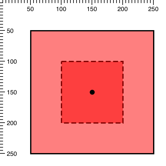
And as with the rotation transformation, the center of scaling is the center of the sprite's bounding box by default.
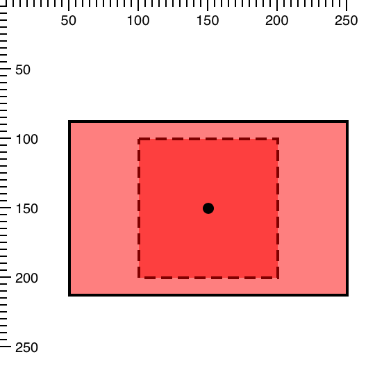
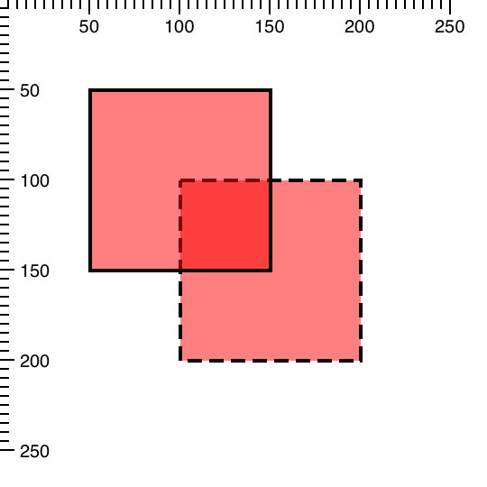
Let's say we want to scale our 'rect' sprite so that it looks like a rectangle rather than a square. To do this, we
can simply use different scale factors for horizontal and vertical scaling like so:
scaling: {
    x: 2,
    y: 1.25
}
If we wanted uniform scaling we could just say:
scaling: 2
Let's say we want to change the center of the scaling to the top-left corner of the sprite while maintaining the previous scaling factors.
{
    type: 'rect',
    x: 50,
    y: 50,

    //...

    scaling: {
        x: 2,
        y: 1.25,
        centerX: 100,
        centerY: 100
    }
}
This is the result of the above code:
The sprite just grew to the bottom/right instead of uniformly in both directions.
The second transformation we'll look at is rotation. There are three sprite attributes that allow us to control it:
rotationRads - the angle of rotation of the sprite in radians, where a positive value means clockwise rotation
Ext.draw.sprite.Sprite#cfg-rotationCenterX - the x-coordinate of the center of rotation
Ext.draw.sprite.Sprite#cfg-rotationCenterY - the y-coordinate of the center of rotation
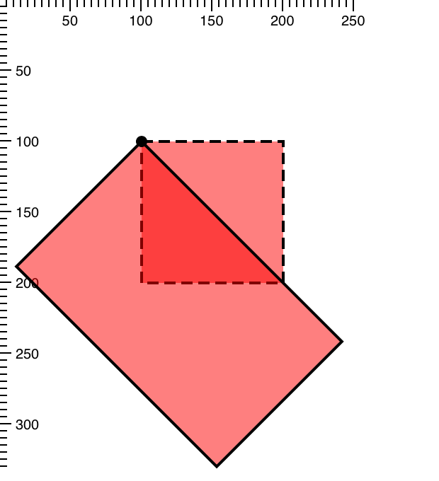
Let's rotate our sprite by 45 degrees clockwise, which is \(\frac{\pi}{4}\) radians. You can always use the
Ext.draw.Draw.rad method to convert degrees to radians, e.g.: Ext.draw.Draw.rad(45).
{
    type: 'rect',

    //...

    rotationRads: Math.PI / 4
}
By default, the center of rotation is the center of the sprite's bounding box. On the image below it is indicated with a black dot.
Let's say we want to rotate our sprite around the top left corner. For this, we can simply move the center of rotation
to the top-left corner of the sprite using rotationCenterX and rotationCenterY attributes:
{
    type: 'rect',
    x: 100,
    y: 100,

    //...

    rotationRads: Math.PI / 4,
    rotationCenterX: 100,
    rotationCenterY: 100
}
There is also a special pseudo attribute called rotation. It can be either a number or an object. If it's a number, it
specifies the angle of rotation of the sprite in degrees, instead of radians. If it's an object, it should be in the
following form (where all properties are optional):
rotation: {
    rads | degrees: {Number},
    centerX: {Number},
    centerY: {Number}
}
We can rewrite the previous example like this:
{
    type: 'rect',
    x: 100,
    y: 100,

    //...

    rotation: {
        degrees: 45,
        centerX: 100,
        centerY: 100
    }
}
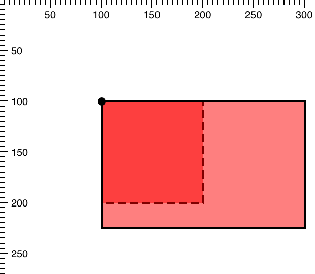
There are two attributes every sprite has to control translation:
translationX - the horizontal distance to move the sprite
translationX - the vertical distance to move the sprite
We'll continue to use the rect sprite from the Part 1 of this series and apply
all transformations to it.
{
type: 'rect',
x: 100,
y: 100,
width: 100,
height: 100,
//...
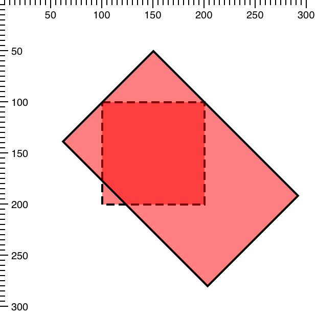
translationX: -50,
translationY: -50
}
The translated sprite will look like the following image, where the dashed line indicates the original untranslated position.
Alternatively, you could specify the same transformation using the following syntax:
translation: {
    x: 100,
    y: -50
}
As with the previous transformations, translation is a pseudo attribute or an alias [^alias].
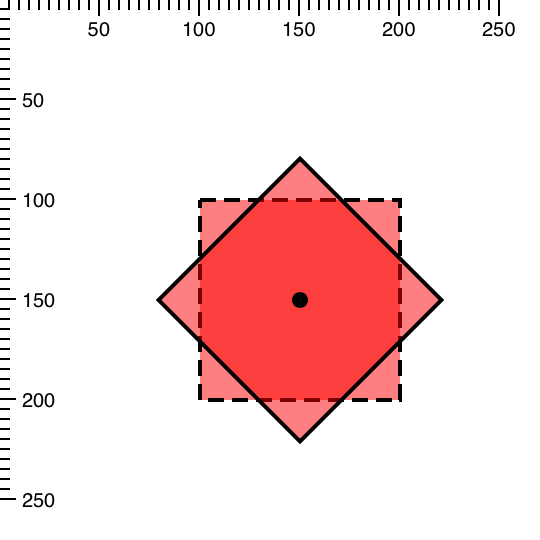
Now that we have looked at each transformation separately, let's combine them by scaling and rotating the sprite simultaneously.
type: 'rect',
x: 100,
y: 100,
width: 100,
height: 100,

//...

rotation: {
    degrees: 45,
    centerX: 100,
    centerY: 100
},

scaling: {
    x: 2,
    y: 1.25,
    centerX: 100,
    centerY: 100
}
In this example the center of transformation is the same for both scaling and rotation. The transformed sprite looks as if the original sprite was first scaled, then rotated.
Finally, let's add the translation transformation to the mix:
translation: {
    x: 50,
    y: -50
},

rotation: {
    degrees: 45,
    centerX: 100,
    centerY: 100
},

scaling: {
    x: 2,
    y: 1.25,
    centerX: 100,
    centerY: 100
}
Notice how translation is applied after scaling and rotation. This order is always the same:
scale -> rotate -> translate
Note: the default order of transformations has changed in Ext JS 6.0.1+ from rotate->scale->translate to
scale->rotate->translate. This has been done to be more compatible with other libraries and to prevent shearing when
transformations are applied. This change won't affect charts, but it may affect your custom drawing code. Please keep
this in mind when upgrading to Ext JS 6.0.1+. You can also use an override, if
you'd rather keep the previous order of transformations.
We just covered all of the standard transformations that are always applied in the same order. But what if we wanted to change this order, apply more than three transformations at once, or maybe use another type of transformation entirely, like shearing? That's where transformation matrices come in handy.
Every sprite has a transformation matrix set by default with no transformations applied. This matrix communicates to the coordinate system of the surface how the sprite should be deformed and / or located within the coordinate plane. The coordinate plane of the draw surface starts with 0,0 as the top-left corner by default. The setTransform method will override the current transformation matrix of a sprite with the given matrix. Alternatively, you can use the transform method of a sprite, which will multiply the given matrix with current transformation matrix. In other words, it will add to the current transformation instead of replacing it.
Since multiplying matrices manually can be rather tedious, the Ext.draw.Matrix class is meant to help us alleviate the task. For example, this is how we can create an identity matrix and then multiply it, first with a rotation matrix, and then with a translation matrix:
var m = new Ext.draw.Matrix().scale(sx, sy).translate(tx, ty);
The matrix m represents a composite transformation that we can pass to the transform and setTransform methods of
a sprite instead of an array of matrix elements.
Let's examine a concrete example of how transformation matrices can be used. Let's say we have a "rect" sprite like this:
{
    type: 'rect',
    x: 0,
    y: 0,
    width: 100,
    height: 100
}
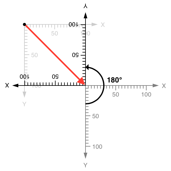
And we want to rotate it around the bottom-right corner counter-clockwise by 180 degrees:
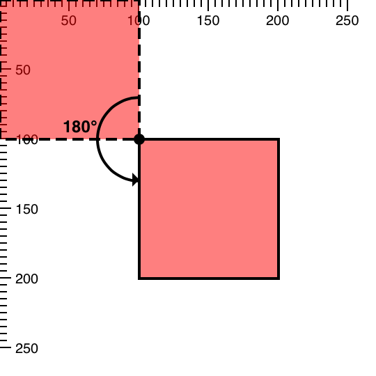
Since we want to rotate the sprite around the bottom-right corner, we can't just apply the rotation transformation:
rectSprite.transform(new Ext.draw.Matrix().rotate(Math.PI));
This will rotate our sprite around the origin in such a way that it will go off-screen:

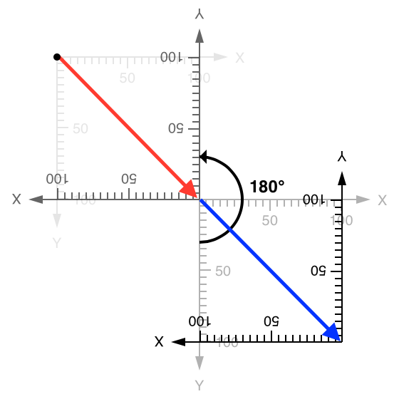
So first we need to translate the origin to the bottom right corner of the sprite or (100, 100) coordinate:

Then rotate the coordinate space by 180°:
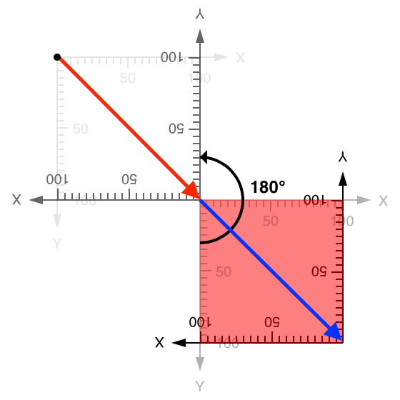
Then we have to translate the origin back by (-100, -100). But now that we rotated the coordinate grid meaning the back (negative coordinates) is forward:
And now our sprite is rendered with (0, 0) as the top-left coordinate and (100, 100) as the bottom-right coordinate (its normal coordinates) in the transformed coordinate space.
This is exactly the type of transformation we wanted. The code for it will look like this:
var M = new Ext.draw.Matrix().translate(100,100).rotate(Math.PI).translate(-100, -100);

rectSprite.setTransform(M);
We only performed the above transformation this way to give an example of how you can combine multiple simple transformations to create a composite transformation with predictable results. You can actually rotate a sprite around a certain point, by passing two extra parameters to the rotate method - the coordinates of the center of rotation:
var M = new Ext.draw.Matrix().rotate(Math.PI, 100, 100);

rectSprite.setTransform(M);
There may be times when the transformation you need to apply cannot be easily accomplished using the sprite’s convenience
transform methods. Or, you may want to pass a matrix directly to the sprite in order to set a transformation. The
setTransform method allows for this sort of advanced usage as well. The following tables show each transformation
matrix used when applying transformations to a sprite.
By multiplying matrices for translation, rotation, scaling, and shearing any number of times in the desired order, you
will get a single matrix for a composite transformation as a result. This matrix can then be used as a value for the
setTransform method of a sprite like so:
mySprite.setTransform([a, b, c, d, e, f]);
In this case, a, b, c, d, e, f are numeric values that correspond to the following transformation
matrix components:
The Draw package enables you to create simple transform methods when needed and gets out of your way when you want to take the wheel. The Draw API simplifies the job of transforming the shape of sprites with its convenient transform methods. It will additionally yield control to the power user needing to articulate a sprite using pre-defined transformation matrices.
Have fun creating your own custom drawings for your apps and as always, reach out to us on the forums if you have questions!


 Ext JS | Terms of Use
