seaborn.boxenplot
-
seaborn.boxenplot(x=None, y=None, hue=None, data=None, order=None, hue_order=None, orient=None, color=None, palette=None, saturation=0.75, width=0.8, dodge=True, k_depth=’proportion’, linewidth=None, scale=’exponential’, outlier_prop=None, ax=None, **kwargs)¶ Draw an enhanced box plot for larger datasets.
This style of plot was originally named a “letter value” plot because it shows a large number of quantiles that are defined as “letter values”. It is similar to a box plot in plotting a nonparametric representation of a distribution in which all features correspond to actual observations. By plotting more quantiles, it provides more information about the shape of the distribution, particularly in the tails. For a more extensive explanation, you can read the paper that introduced the plot:
https://vita.had.co.nz/papers/letter-value-plot.html
Input data can be passed in a variety of formats, including:
- Vectors of data represented as lists, numpy arrays, or pandas Series
objects passed directly to the
x,y, and/orhueparameters. - A “long-form” DataFrame, in which case the
x,y, andhuevariables will determine how the data are plotted. - A “wide-form” DataFrame, such that each numeric column will be plotted.
- An array or list of vectors.
In most cases, it is possible to use numpy or Python objects, but pandas objects are preferable because the associated names will be used to annotate the axes. Additionally, you can use Categorical types for the grouping variables to control the order of plot elements.
This function always treats one of the variables as categorical and draws data at ordinal positions (0, 1, … n) on the relevant axis, even when the data has a numeric or date type.
See the tutorial for more information.
Parameters: - x, y, hue : names of variables in
dataor vector data, optional Inputs for plotting long-form data. See examples for interpretation.
- data : DataFrame, array, or list of arrays, optional
Dataset for plotting. If
xandyare absent, this is interpreted as wide-form. Otherwise it is expected to be long-form.- order, hue_order : lists of strings, optional
Order to plot the categorical levels in, otherwise the levels are inferred from the data objects.
- orient : “v” | “h”, optional
Orientation of the plot (vertical or horizontal). This is usually inferred from the dtype of the input variables, but can be used to specify when the “categorical” variable is a numeric or when plotting wide-form data.
- color : matplotlib color, optional
Color for all of the elements, or seed for a gradient palette.
- palette : palette name, list, or dict, optional
Colors to use for the different levels of the
huevariable. Should be something that can be interpreted bycolor_palette(), or a dictionary mapping hue levels to matplotlib colors.- saturation : float, optional
Proportion of the original saturation to draw colors at. Large patches often look better with slightly desaturated colors, but set this to
1if you want the plot colors to perfectly match the input color spec.- width : float, optional
Width of a full element when not using hue nesting, or width of all the elements for one level of the major grouping variable.
- dodge : bool, optional
When hue nesting is used, whether elements should be shifted along the categorical axis.
- k_depth : “proportion” | “tukey” | “trustworthy”, optional
The number of boxes, and by extension number of percentiles, to draw. All methods are detailed in Wickham’s paper. Each makes different assumptions about the number of outliers and leverages different statistical properties.
- linewidth : float, optional
Width of the gray lines that frame the plot elements.
- scale : “linear” | “exponential” | “area”
Method to use for the width of the letter value boxes. All give similar results visually. “linear” reduces the width by a constant linear factor, “exponential” uses the proportion of data not covered, “area” is proportional to the percentage of data covered.
- outlier_prop : float, optional
Proportion of data believed to be outliers. Used in conjunction with k_depth to determine the number of percentiles to draw. Defaults to 0.007 as a proportion of outliers. Should be in range [0, 1].
- ax : matplotlib Axes, optional
Axes object to draw the plot onto, otherwise uses the current Axes.
- kwargs : key, value mappings
Other keyword arguments are passed through to
plt.plotandplt.scatterat draw time.
Returns: - ax : matplotlib Axes
Returns the Axes object with the plot drawn onto it.
See also
violinplot- A combination of boxplot and kernel density estimation.
boxplot- A traditional box-and-whisker plot with a similar API.
Examples
Draw a single horizontal boxen plot:
>>> import seaborn as sns
>>> sns.set(style="whitegrid")
>>> tips = sns.load_dataset("tips")
>>> ax = sns.boxenplot(x=tips["total_bill"])

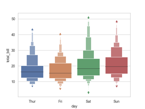
Draw a vertical boxen plot grouped by a categorical variable:
>>> ax = sns.boxenplot(x="day", y="total_bill", data=tips)
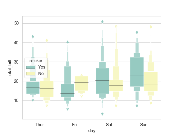
Draw a letter value plot with nested grouping by two categorical variables:
>>> ax = sns.boxenplot(x="day", y="total_bill", hue="smoker",
...                    data=tips, palette="Set3")
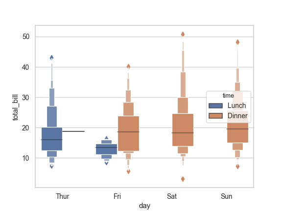
Draw a boxen plot with nested grouping when some bins are empty:
>>> ax = sns.boxenplot(x="day", y="total_bill", hue="time",
...                    data=tips, linewidth=2.5)
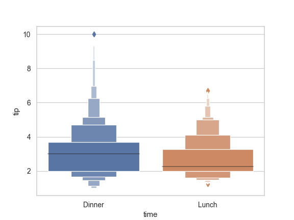
Control box order by passing an explicit order:
>>> ax = sns.boxenplot(x="time", y="tip", data=tips,
...                    order=["Dinner", "Lunch"])
Draw a boxen plot for each numeric variable in a DataFrame:
>>> iris = sns.load_dataset("iris")
>>> ax = sns.boxenplot(data=iris, orient="h", palette="Set2")

Use
stripplot()to show the datapoints on top of the boxes:>>> ax = sns.boxenplot(x="day", y="total_bill", data=tips) >>> ax = sns.stripplot(x="day", y="total_bill", data=tips, ... size=4, jitter=True, color="gray")

Use
catplot()to combineboxenplot()and aFacetGrid. This allows grouping within additional categorical variables. Usingcatplot()is safer than usingFacetGriddirectly, as it ensures synchronization of variable order across facets:>>> g = sns.catplot(x="sex", y="total_bill", ... hue="smoker", col="time", ... data=tips, kind="boxen", ... height=4, aspect=.7);

- Vectors of data represented as lists, numpy arrays, or pandas Series
objects passed directly to the