seaborn.regplot
-
seaborn.regplot(x, y, data=None, x_estimator=None, x_bins=None, x_ci=’ci’, scatter=True, fit_reg=True, ci=95, n_boot=1000, units=None, order=1, logistic=False, lowess=False, robust=False, logx=False, x_partial=None, y_partial=None, truncate=False, dropna=True, x_jitter=None, y_jitter=None, label=None, color=None, marker=’o’, scatter_kws=None, line_kws=None, ax=None)¶ Plot data and a linear regression model fit.
There are a number of mutually exclusive options for estimating the regression model. See the tutorial for more information.
Parameters: - x, y: string, series, or vector array
Input variables. If strings, these should correspond with column names in
data. When pandas objects are used, axes will be labeled with the series name.- data : DataFrame
Tidy (“long-form”) dataframe where each column is a variable and each row is an observation.
- x_estimator : callable that maps vector -> scalar, optional
Apply this function to each unique value of
xand plot the resulting estimate. This is useful whenxis a discrete variable. Ifx_ciis given, this estimate will be bootstrapped and a confidence interval will be drawn.- x_bins : int or vector, optional
Bin the
xvariable into discrete bins and then estimate the central tendency and a confidence interval. This binning only influences how the scatterplot is drawn; the regression is still fit to the original data. This parameter is interpreted either as the number of evenly-sized (not necessary spaced) bins or the positions of the bin centers. When this parameter is used, it implies that the default ofx_estimatorisnumpy.mean.- x_ci : “ci”, “sd”, int in [0, 100] or None, optional
Size of the confidence interval used when plotting a central tendency for discrete values of
x. If"ci", defer to the value of theciparameter. If"sd", skip bootstrapping and show the standard deviation of the observations in each bin.- scatter : bool, optional
If
True, draw a scatterplot with the underlying observations (or thex_estimatorvalues).- fit_reg : bool, optional
If
True, estimate and plot a regression model relating thexandyvariables.- ci : int in [0, 100] or None, optional
Size of the confidence interval for the regression estimate. This will be drawn using translucent bands around the regression line. The confidence interval is estimated using a bootstrap; for large datasets, it may be advisable to avoid that computation by setting this parameter to None.
- n_boot : int, optional
Number of bootstrap resamples used to estimate the
ci. The default value attempts to balance time and stability; you may want to increase this value for “final” versions of plots.- units : variable name in
data, optional If the
xandyobservations are nested within sampling units, those can be specified here. This will be taken into account when computing the confidence intervals by performing a multilevel bootstrap that resamples both units and observations (within unit). This does not otherwise influence how the regression is estimated or drawn.- order : int, optional
If
orderis greater than 1, usenumpy.polyfitto estimate a polynomial regression.- logistic : bool, optional
If
True, assume thatyis a binary variable and usestatsmodelsto estimate a logistic regression model. Note that this is substantially more computationally intensive than linear regression, so you may wish to decrease the number of bootstrap resamples (n_boot) or setcito None.- lowess : bool, optional
If
True, usestatsmodelsto estimate a nonparametric lowess model (locally weighted linear regression). Note that confidence intervals cannot currently be drawn for this kind of model.- robust : bool, optional
If
True, usestatsmodelsto estimate a robust regression. This will de-weight outliers. Note that this is substantially more computationally intensive than standard linear regression, so you may wish to decrease the number of bootstrap resamples (n_boot) or setcito None.- logx : bool, optional
If
True, estimate a linear regression of the form y ~ log(x), but plot the scatterplot and regression model in the input space. Note thatxmust be positive for this to work.- {x,y}_partial : strings in
dataor matrices Confounding variables to regress out of the
xoryvariables before plotting.- truncate : bool, optional
By default, the regression line is drawn to fill the x axis limits after the scatterplot is drawn. If
truncateisTrue, it will instead by bounded by the data limits.- {x,y}_jitter : floats, optional
Add uniform random noise of this size to either the
xoryvariables. The noise is added to a copy of the data after fitting the regression, and only influences the look of the scatterplot. This can be helpful when plotting variables that take discrete values.- label : string
Label to apply to ether the scatterplot or regression line (if
scatterisFalse) for use in a legend.- color : matplotlib color
Color to apply to all plot elements; will be superseded by colors passed in
scatter_kwsorline_kws.- marker : matplotlib marker code
Marker to use for the scatterplot glyphs.
- {scatter,line}_kws : dictionaries
Additional keyword arguments to pass to
plt.scatterandplt.plot.- ax : matplotlib Axes, optional
Axes object to draw the plot onto, otherwise uses the current Axes.
Returns: - ax : matplotlib Axes
The Axes object containing the plot.
See also
Notes
The
regplot()andlmplot()functions are closely related, but the former is an axes-level function while the latter is a figure-level function that combinesregplot()andFacetGrid.It’s also easy to combine combine
regplot()andJointGridorPairGridthrough thejointplot()andpairplot()functions, although these do not directly accept all ofregplot()’s parameters.Examples
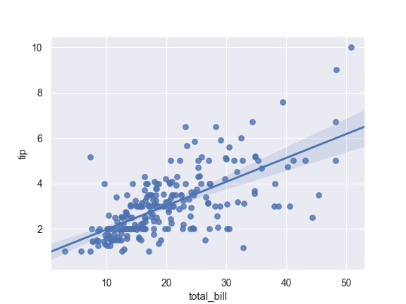
Plot the relationship between two variables in a DataFrame:
>>> import seaborn as sns; sns.set(color_codes=True)
>>> tips = sns.load_dataset("tips")
>>> ax = sns.regplot(x="total_bill", y="tip", data=tips)
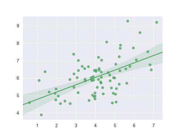
Plot with two variables defined as numpy arrays; use a different color:
>>> import numpy as np; np.random.seed(8)
>>> mean, cov = [4, 6], [(1.5, .7), (.7, 1)]
>>> x, y = np.random.multivariate_normal(mean, cov, 80).T
>>> ax = sns.regplot(x=x, y=y, color="g")
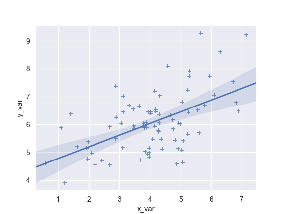
Plot with two variables defined as pandas Series; use a different marker:
>>> import pandas as pd
>>> x, y = pd.Series(x, name="x_var"), pd.Series(y, name="y_var")
>>> ax = sns.regplot(x=x, y=y, marker="+")
Use a 68% confidence interval, which corresponds with the standard error of the estimate:
>>> ax = sns.regplot(x=x, y=y, ci=68)

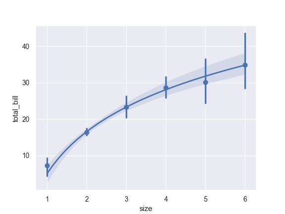
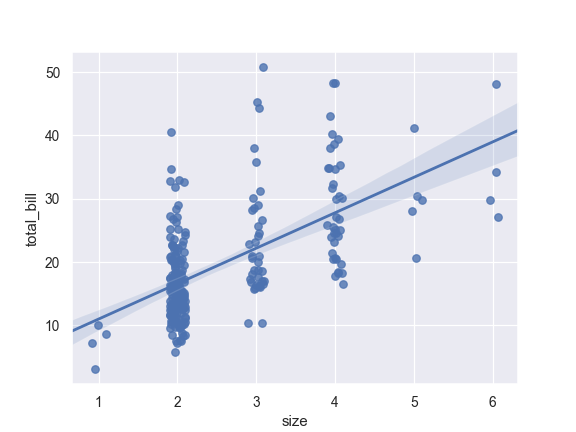
Plot with a discrete
xvariable and add some jitter:>>> ax = sns.regplot(x="size", y="total_bill", data=tips, x_jitter=.1)
Plot with a discrete
xvariable showing means and confidence intervals for unique values:>>> ax = sns.regplot(x="size", y="total_bill", data=tips, ... x_estimator=np.mean)

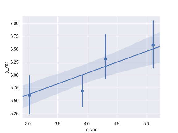
Plot with a continuous variable divided into discrete bins:
>>> ax = sns.regplot(x=x, y=y, x_bins=4)
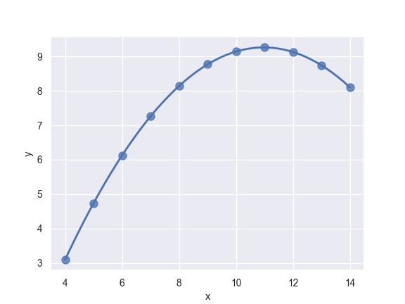
Fit a higher-order polynomial regression and truncate the model prediction:
>>> ans = sns.load_dataset("anscombe")
>>> ax = sns.regplot(x="x", y="y", data=ans.loc[ans.dataset == "II"],
...                  scatter_kws={"s": 80},
...                  order=2, ci=None, truncate=True)
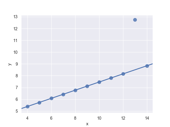
Fit a robust regression and don’t plot a confidence interval:
>>> ax = sns.regplot(x="x", y="y", data=ans.loc[ans.dataset == "III"],
...                  scatter_kws={"s": 80},
...                  robust=True, ci=None)
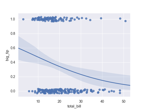
Fit a logistic regression; jitter the y variable and use fewer bootstrap iterations:
>>> tips["big_tip"] = (tips.tip / tips.total_bill) > .175
>>> ax = sns.regplot(x="total_bill", y="big_tip", data=tips,
...                  logistic=True, n_boot=500, y_jitter=.03)
Fit the regression model using log(x) and truncate the model prediction:
>>> ax = sns.regplot(x="size", y="total_bill", data=tips,
...                  x_estimator=np.mean, logx=True, truncate=True)