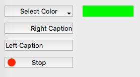
Desktop Bevel Button
From Xojo Documentation
A Bevel Button is a more powerful button. It can be clicked like a standard button, but it can also contain a menu or have a wider variety of appearances, colors and icons.
With a Bevel Button you can:
- Add an image to the button
- Change the color of the button
- Control the alignment of the text and/or the positioning of the text with respect to the image
- Add a popup menu to the button
- Control the feedback the user receives when the button is clicked
Refer to BevelButton in the Language Reference for details on all its events, properties and methods.
Below is a list of the commonly used event, properties and methods.
Events
- This event is called when the Bevel Button is pressed.
- The BevelButton has a menu and the user has selected one of the items on that menu.
Properties
- The Bevel can be a variety of values in the Inspector, although not all types are used on all platforms:
- Small Bevel
- Normal Bevel
- Large Bevel
- Rounded Bevel (Mac-only. The same as Small Bevel on Windows and Linux.)
- No Bevel
- Round (Mac-only. Defaults to Small Bevel on Windows and Linux.)
- Large Round (Mac-only. Defaults to Small Bevel on Windows and Linux.)
- Disclosure (Mac-only. Defaults to Small Bevel on Windows and Linux.)
BackgroundColor, HasBackgroundColor, TextColor
- Used to alter the default colors of the button (only for Windows and Linux).
- The text that appears in the Bevel Button can be changed using the Caption property.
CaptionAlignment, CaptionPosition, CaptionDelta
- These properties control the display of the Caption within the Bevel Button.
Icon, IconAlignment, IconDeltaX, IconDeltaY
- These properties specify an optional Icon for the Bevel Button and its location.
- Used to attach a menu to the Bevel Button.
- The following types are available:
- Button: Behaves as a normal Button.
- Toggles: Button selection remains after it is clicked and can be toggled by repeated clicking. When selected, Value = True.
- Sticky: Button selection “sticks” after it has been clicked. When selected, Value = True.
FontName, FontSize, Bold, Italic, Underline
- Controls the display of the Caption text.
Methods
AddRow, AddSeparator, DeleteAllRows, InsertRow, List, RemoveRow
- Used to manually add MenuItems to the Bevel Button (if the HasMenu property is set to True).
Handling Focus
When a BevelButton gets the focus, a selection rectangle surrounds its caption. When it has the focus, the user can press the button by pressing either the Spacebar or the Enter key. BevelButtons can get the focus on Windows and Linux and you must set the AcceptFocus property to True to enable a BevelButton to get the focus.
Usage
Use a Bevel Button when you need more than just a simple button. As an example, say you want a button that has a drop-down menu allowing you to select a color. You would set up such a button by first turning the HasMenu property to ON in the Inspector. Then you can add this code to its Open event handler:
When the user clicks one of the menu items, the MenuSelected event handler is called. The event handler is passed a parameter named selectedItem which is a MenuItem representing the selected menu item. The selectedItem's Value property provides the text of the selected menu item. In this example, a case statement in the BevelButton's MenuSelected event to set a variable to a color based upon the user's selection of the name of a color from the BevelButton's menu:
Case "Red"
SelectedColor = &cff0000
Case "Green"
SelectedColor = &c00ff00
Case "Blue"
SelectedColor = &c0000ff
Case "None"
SelectedColor = &c000000
End Select
Another common use of Bevel Buttons is to show an icon in the button, often alongside some text. This displays a red circle with the text "stop' in a BevelButton:
Var g As Graphics = p.Graphics
g.DrawingColor = &cff0000
g.FillOval(4, g.Height / 4, g.Width / 2, g.Height / 2)
Me.Icon = p
Me.Caption = "Stop"
See Also
UserGuide:Desktop Button topic; BevelButton class

