Desktop SegmentedButton
From Xojo Documentation
The SegmentedButton is a horizontal button made up of multiple segments (Segment) each of which may be pressed independently.
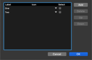
To edit the properties of the segments (Title, Icon and Selected) in the control, use the Segment dialog which you ca display by clicking the Set Default Value button on the Layout Editor command bar, pressing Return when the control is selected or by clicking the "Edit" button in the Inspector for the Segments property. In this dialog you can use the Add and Delete buttons to add and remove segments. Use the Up and Down buttons to re-order segments. Click on individual segments to set the Label or Icon and to choose which segment is selected by default.
Refer to SegmentedButton and Segment in the Language Reference for details on all its events, properties and methods.
Events
- The Pressed event is called when one of the segments in the SegmentedButton is pressed. It supplies an itemIndex parameter that tells you which segment was pressed.
Properties
- An Integer that changes the appearance of the SegmentedButton. It can be one of these values:
- 0: Automatic
- 1: Capsule
- 2: Round Rect
- 3: Rounded
- 4: Textured Rounded
- 5: Textured Square
- 6: Small Square
The SegmentedButton.MacButtonStyles enumeration can also be used for this purpose.
- This property can only be set in the Layout Editor and is used to specify the segments and their names.
- An Integer that indicates how the segments can be used. It can be one of these values:
- 0 (Single): Only one segment can be depressed. The group of segments behaves like a group of RadioButtons. One is selected, the others are deselected automatically.
- 1 (Multiple): The segments behave like a series of checkboxes. Two or more can be selected at the same time.
- 2 (None): Each button behaves like a PushButton. When a segment is selected, it is depressed (highlighted) only for the duration of the press or click.
The SelectionStyles enumeration can be used to get and test this property well.
Methods
- Resizes the SegmentedButton to fit into its space. Call this method after changing the SegmentedButton segments.
Segments
Each segment in a SegmentedButton is referred to as a Segment which has these properties:
- A boolean to indicate if the segment is enabled and thus can be pressed.
- The tooltip that appears when the mouse cursor hovers over the segment.
- An optional icon that is displayed in the segment.
- A boolean that indicates if the segment is selected.
- The text that is displayed in the segment.
- The width of the segment.
Usage
Use the SegmentedButton Pressed event handler to determine which segment was pressed:Case 0
// First button pressed
Case 1
// Second button pressed
End Select
To select a specific segment, set the SelectedSegmentIndex property to the index of the item you want selected. This code (in an Opening event handler for a SegmentedButton) selects the last segment:
Example Project
The SegmentedButton example project demonstrates these features:
- Get the selected segment
- Select a segment
- Add a segment
- Resize segments to fit in window
Examples/Desktop/Controls/SegmentedButton
See Also
SegmentedButton, Segment classes

