Card class
A material design card. A card has slightly rounded corners and a shadow.
A card is a sheet of Material used to represent some related information, for example an album, a geographical location, a meal, contact details, etc.
This is what it looks like when run:
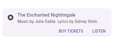
This sample shows creation of a Card widget that shows album information
and two actions.
Center(
  child: Card(
    child: Column(
      mainAxisSize: MainAxisSize.min,
      children: <Widget>[
        const ListTile(
          leading: Icon(Icons.album),
          title: Text('The Enchanted Nightingale'),
          subtitle: Text('Music by Julie Gable. Lyrics by Sidney Stein.'),
        ),
        ButtonTheme.bar( // make buttons use the appropriate styles for cards
          child: ButtonBar(
            children: <Widget>[
              FlatButton(
                child: const Text('BUY TICKETS'),
                onPressed: () { /* ... */ },
              ),
              FlatButton(
                child: const Text('LISTEN'),
                onPressed: () { /* ... */ },
              ),
            ],
          ),
        ),
      ],
    ),
  ),
)
To create a sample project with this code snippet, run:
flutter create --sample=material.Card mysample
flutter create --sample=material.Card mysample
// This sample shows creation of a [Card] widget that shows album information
// and two actions.

import 'package:flutter/material.dart';

void main() => runApp(MyApp());

class MyApp extends StatelessWidget {
  // This widget is the root of your application.
  @override
  Widget build(BuildContext context) {
    return MaterialApp(
      title: 'Flutter Code Sample for material.Card',
      theme: ThemeData(
        primarySwatch: Colors.blue,
      ),
      home: MyStatelessWidget(),
    );
  }
}

class MyStatelessWidget extends StatelessWidget {
  MyStatelessWidget({Key key}) : super(key: key);

  @override
  Widget build(BuildContext context) {
    return Center(
      child: Card(
        child: Column(
          mainAxisSize: MainAxisSize.min,
          children: <Widget>[
            const ListTile(
              leading: Icon(Icons.album),
              title: Text('The Enchanted Nightingale'),
              subtitle: Text('Music by Julie Gable. Lyrics by Sidney Stein.'),
            ),
            ButtonTheme.bar(
              // make buttons use the appropriate styles for cards
              child: ButtonBar(
                children: <Widget>[
                  FlatButton(
                    child: const Text('BUY TICKETS'),
                    onPressed: () {/* ... */},
                  ),
                  FlatButton(
                    child: const Text('LISTEN'),
                    onPressed: () {/* ... */},
                  ),
                ],
              ),
            ),
          ],
        ),
      ),
    );
  }
}
See also:
- ListTile, to display icons and text in a card.
- ButtonBar, to display buttons at the bottom of a card. Typically these would be styled using a ButtonTheme created with new ButtonTheme.bar.
- showDialog, to display a modal card.
- material.google.com/components/cards.html
- Inheritance
Constructors
- Card({Key key, Color color, double elevation, ShapeBorder shape, EdgeInsetsGeometry margin: const EdgeInsets.all(4.0), Clip clipBehavior: Clip.none, Widget child, bool semanticContainer: true })
-
Creates a material design card. [...]
const
Properties
- child → Widget
-
The widget below this widget in the tree. [...]
final
- clipBehavior → Clip
-
The content will be clipped (or not) according to this option. [...]
final
- color → Color
-
The card's background color. [...]
final
- elevation → double
-
The z-coordinate at which to place this card. This controls the size of
the shadow below the card. [...]
final
- margin → EdgeInsetsGeometry
-
The empty space that surrounds the card. [...]
final
- semanticContainer → bool
-
Whether this widget represents a single semantic container, or if false
a collection of individual semantic nodes. [...]
final
- shape → ShapeBorder
-
The shape of the card's Material. [...]
final
- hashCode → int
-
The hash code for this object. [...]
read-only, inherited
- key → Key
-
Controls how one widget replaces another widget in the tree. [...]
final, inherited
- runtimeType → Type
-
A representation of the runtime type of the object.
read-only, inherited
Methods
-
build(
BuildContext context) → Widget -
Describes the part of the user interface represented by this widget. [...]
override
-
createElement(
) → StatelessElement -
Creates a StatelessElement to manage this widget's location in the tree. [...]
inherited
-
debugDescribeChildren(
) → List< DiagnosticsNode> -
Returns a list of DiagnosticsNode objects describing this node's
children. [...]
@protected, inherited
-
debugFillProperties(
DiagnosticPropertiesBuilder properties) → void -
Add additional properties associated with the node. [...]
inherited
-
noSuchMethod(
Invocation invocation) → dynamic -
Invoked when a non-existent method or property is accessed. [...]
inherited
-
toDiagnosticsNode(
{String name, DiagnosticsTreeStyle style }) → DiagnosticsNode -
Returns a debug representation of the object that is used by debugging
tools and by toStringDeep. [...]
inherited
-
toString(
{DiagnosticLevel minLevel: DiagnosticLevel.debug }) → String -
Returns a string representation of this object.
inherited
-
toStringDeep(
{String prefixLineOne: '', String prefixOtherLines, DiagnosticLevel minLevel: DiagnosticLevel.debug }) → String -
Returns a string representation of this node and its descendants. [...]
inherited
-
toStringShallow(
{String joiner: ', ', DiagnosticLevel minLevel: DiagnosticLevel.debug }) → String -
Returns a one-line detailed description of the object. [...]
inherited
-
toStringShort(
) → String -
A short, textual description of this widget.
inherited
Operators
-
operator ==(
dynamic other) → bool -
The equality operator. [...]
inherited