TextTheme class
Material design text theme.
Definitions for the various typographical styles found in material design (e.g., button, caption). Rather than creating a TextTheme directly, you can obtain an instance as Typography.black or Typography.white.
To obtain the current text theme, call Theme.of with the current BuildContext and read the ThemeData.textTheme property.
The Material Design typography scheme was signficantly changed in the current (2018) version of the specification (https://material.io/design/typography).
The 2018 spec has thirteen text styles:
NAME         SIZE  WEIGHT  SPACING
headline1    96.0  light   -1.5
headline2    60.0  light   -0.5
headline3    48.0  normal   0.0
headline4    34.0  normal   0.25
headline5    24.0  normal   0.0
headline6    20.0  medium   0.15
subtitle1    16.0  normal   0.15
subtitle2    14.0  medium   0.1
body1        16.0  normal   0.5
body2        14.0  normal   0.25
button       14.0  medium   0.75
caption      12.0  normal   0.4
overline     10.0  normal   1.5
Where "light" is FontWeight.w300, "normal" is FontWeight.w400 and
"medium" is FontWeight.w500.
The TextTheme API is based on the original material (2014) design spec, which used different text style names. For backwards compatability's sake, this API continues to use the original names. The table below should help with understanding the API in terms of the 2018 material spec.
Each of the TextTheme text styles corresponds to one of the styles from 2018 spec. By default, the font sizes, font weights and letter spacings have not changed from their original, 2014, values.
NAME       SIZE   WEIGHT   SPACING  2018 NAME
display4   112.0  thin     0.0      headline1
display3   56.0   normal   0.0      headline2
display2   45.0   normal   0.0      headline3
display1   34.0   normal   0.0      headline4
headline   24.0   normal   0.0      headline5
title      20.0   medium   0.0      headline6
subhead    16.0   normal   0.0      subtitle1
body2      14.0   medium   0.0      body1
body1      14.0   normal   0.0      body2
caption    12.0   normal   0.0      caption
button     14.0   medium   0.0      button
subtitle   14.0   medium   0.0      subtitle2
overline   10.0   normal   0.0      overline
Where "thin" is FontWeight.w100, "normal" is FontWeight.w400 and
"medium" is FontWeight.w500. Letter spacing for all of the original
text styles was 0.0.
To configure a Theme for the new sizes, weights, and letter spacings, initialize its ThemeData.typography value with a Typography that object that specifies the 2018 versions of the geometry themes: Typography.englishLike2018, Typography.dense2018, and Typography.tall2018.
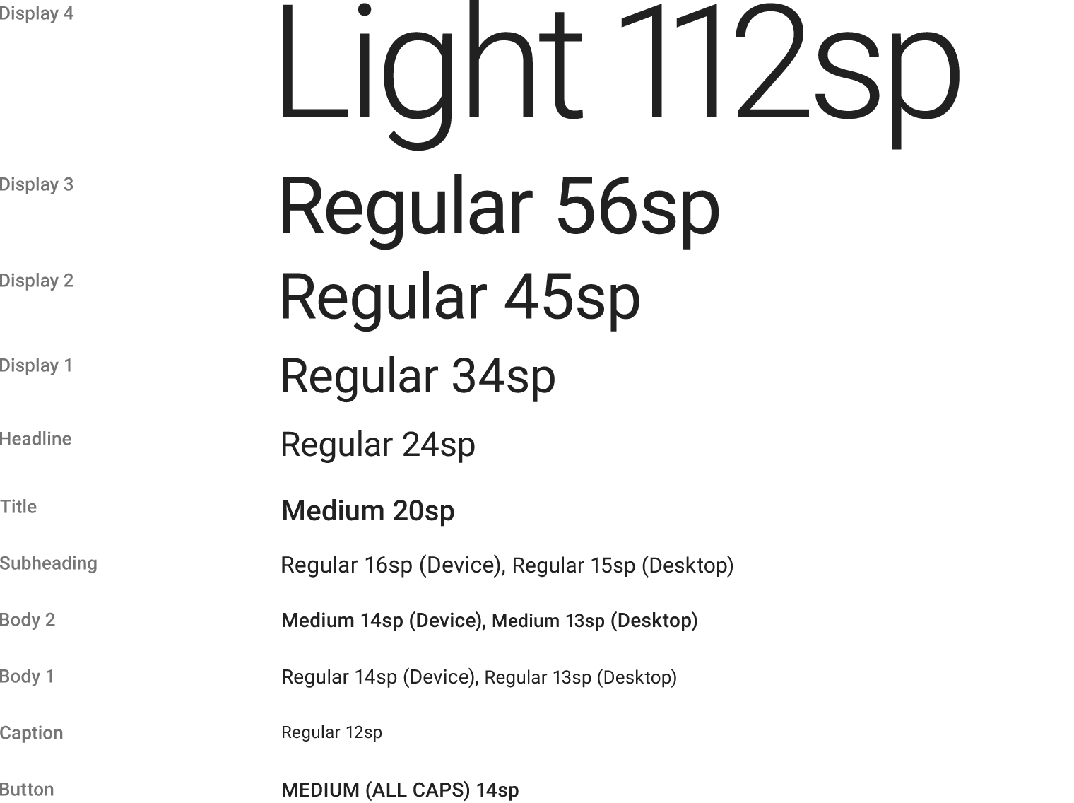
The following image from the material design
specification
shows the recommended styles for each of the properties of a TextTheme.
This image uses the Roboto font, which is the font used on Android. On
iOS, the San Francisco
font
is automatically used instead.
See also:
- Typography, the class that generates TextThemes appropriate for a platform.
- Theme, for other aspects of a material design application that can be globally adjusted, such as the color scheme.
- material.google.com/style/typography.html
- Inheritance
- Object
- Diagnosticable
- TextTheme
- Annotations
- @immutable
Constructors
- TextTheme({TextStyle display4, TextStyle display3, TextStyle display2, TextStyle display1, TextStyle headline, TextStyle title, TextStyle subhead, TextStyle body2, TextStyle body1, TextStyle caption, TextStyle button, TextStyle subtitle, TextStyle overline })
-
Creates a text theme that uses the given values. [...]
const
Properties
- body1 → TextStyle
-
Used for the default text style for Material.
final
- body2 → TextStyle
-
Used for emphasizing text that would otherwise be body1.
final
-
Used for text on RaisedButton and FlatButton.
final
- caption → TextStyle
-
Used for auxiliary text associated with images.
final
- display1 → TextStyle
-
Large text.
final
- display2 → TextStyle
-
Very large text.
final
- display3 → TextStyle
-
Very, very large text. [...]
final
- display4 → TextStyle
-
Extremely large text. [...]
final
- hashCode → int
-
The hash code for this object. [...]
read-only, override
- headline → TextStyle
-
Used for large text in dialogs (e.g., the month and year in the dialog
shown by showDatePicker).
final
- overline → TextStyle
-
The smallest style, [...]
final
- subhead → TextStyle
-
Used for the primary text in lists (e.g., ListTile.title).
final
- subtitle → TextStyle
-
For medium emphasis text that's a little smaller than subhead.
final
- title → TextStyle
-
Used for the primary text in app bars and dialogs (e.g., AppBar.title
and AlertDialog.title).
final
- runtimeType → Type
-
A representation of the runtime type of the object.
read-only, inherited
Methods
-
apply(
{String fontFamily, double fontSizeFactor: 1.0, double fontSizeDelta: 0.0, Color displayColor, Color bodyColor, TextDecoration decoration, Color decorationColor, TextDecorationStyle decorationStyle }) → TextTheme - Creates a copy of this text theme but with the given field replaced in each of the individual text styles. [...]
-
copyWith(
{TextStyle display4, TextStyle display3, TextStyle display2, TextStyle display1, TextStyle headline, TextStyle title, TextStyle subhead, TextStyle body2, TextStyle body1, TextStyle caption, TextStyle button, TextStyle subtitle, TextStyle overline }) → TextTheme - Creates a copy of this text theme but with the given fields replaced with the new values. [...]
-
debugFillProperties(
DiagnosticPropertiesBuilder properties) → void -
Add additional properties associated with the node. [...]
override
-
merge(
TextTheme other) → TextTheme -
Creates a new TextTheme where each text style from this object has been
merged with the matching text style from the
otherobject. [...] -
noSuchMethod(
Invocation invocation) → dynamic -
Invoked when a non-existent method or property is accessed. [...]
inherited
-
toDiagnosticsNode(
{String name, DiagnosticsTreeStyle style }) → DiagnosticsNode -
Returns a debug representation of the object that is used by debugging
tools and by
toStringDeep. [...]inherited -
toString(
{DiagnosticLevel minLevel: DiagnosticLevel.debug }) → String -
Returns a string representation of this object.
inherited
-
toStringShort(
) → String -
A brief description of this object, usually just the runtimeType and the
hashCode. [...]
inherited
Operators
-
operator ==(
dynamic other) → bool -
The equality operator. [...]
override