wx.BitmapToggleButton
wx.BitmapToggleButton is a wx.ToggleButton that contains a bitmap instead of text.
This class is not available in all ports currently (although it is available in the major ones), test for HAS_BITMAPTOGGLEBUTTON to determine whether it can be used (in addition for possibly testing for USE_TOGGLEBTN which can be set to 0 to explicitly disable support for this class and wx.ToggleButton).
This control emits an update UI event.
 Events Emitted by this Class
Handlers bound for the following event types will receive a wx.CommandEvent parameter.
 Methods Summary
__init__ |
Default constructor. |
Create |
Create method for two-step construction. |
GetValue |
Gets the state of the toggle button. |
SetValue |
Sets the toggle button to the given state. |
 Class API
wx.BitmapToggleButton(ToggleButton)¶Possible constructors:
BitmapToggleButton()

BitmapToggleButton(parent, id=ID_ANY, label=NullBitmap,
                   pos=DefaultPosition, size=DefaultSize, style=0, val=DefaultValidator,
                   name=CheckBoxNameStr)
BitmapToggleButton is a ToggleButton that contains a bitmap instead of text.
__init__(self, *args, **kw)¶ Overloaded Implementations:
__init__ (self)
Default constructor.
__init__ (self, parent, id=ID_ANY, label=NullBitmap, pos=DefaultPosition, size=DefaultSize, style=0, val=DefaultValidator, name=CheckBoxNameStr)
Constructor, creating and showing a toggle button with the bitmap label.
Internally calls Create .
| Parameters: |
|
|---|
Create(self, parent, id=ID_ANY, label=NullBitmap, pos=DefaultPosition, size=DefaultSize, style=0, val=DefaultValidator, name=CheckBoxNameStr)¶Create method for two-step construction.
| Parameters: |
|
|---|---|
| Return type: | bool |
GetValue(self)¶Gets the state of the toggle button.
| Return type: | bool |
|---|---|
| Returns: | Returns True if it is pressed, False otherwise. |
SetValue(self, state)¶Sets the toggle button to the given state.
This does not cause a EVT_TOGGLEBUTTON event to be emitted.
| Parameters: | state (bool) – If True, the button is pressed. |
|---|


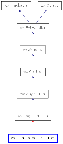
 Inheritance diagram for class BitmapToggleButton: