wx.ListBox
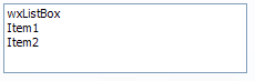
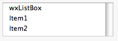
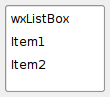
A listbox is used to select one or more of a list of strings.
The strings are displayed in a scrolling box, with the selected string(s) marked in reverse video. A listbox can be single selection (if an item is selected, the previous selection is removed) or multiple selection (clicking an item toggles the item on or off independently of other selections).
List box elements are numbered from zero and while the maximal number of elements is unlimited, it is usually better to use a virtual control, not requiring to add all the items to it at once, such as wx.dataview.DataViewCtrl or wx.ListCtrl with LC_VIRTUAL style, once more than a few hundreds items need to be displayed because this control is not optimized, neither from performance nor from user interface point of view, for large number of items.
Notice that currently TAB characters in list box items text are not handled consistently under all platforms, so they should be replaced by spaces to display strings properly everywhere. The list box doesn’t support any other control characters at all.
 Window Styles
This class supports the following styles:
wx.LB_SINGLE: Single-selection list.wx.LB_MULTIPLE: Multiple-selection list: the user can toggle multiple items on and off. This is the same as wx.LB_EXTENDED in wxGTK2 port.wx.LB_EXTENDED: Extended-selection list: the user can extend the selection by using SHIFT or CTRL keys together with the cursor movement keys or the mouse.wx.LB_HSCROLL: Create horizontal scrollbar if contents are too wide (Windows only).wx.LB_ALWAYS_SB: Always show a vertical scrollbar.wx.LB_NEEDED_SB: Only create a vertical scrollbar if needed.wx.LB_NO_SB: Don’t create vertical scrollbar (wxMSW and wxGTK only).wx.LB_SORT: The listbox contents are sorted in alphabetical order.LB_SINGLE , LB_MULTIPLE and LB_EXTENDED styles are mutually exclusive and you can specify at most one of them (single selection is the default). See also Window Styles. Events Emitted by this Class
Handlers bound for the following event types will receive a wx.CommandEvent parameter.
wxEVT_LISTBOX event, when an item on the list is selected or the selection changes.wxEVT_LISTBOX_DCLICK event, when the listbox is double-clicked.See also
wx.adv.EditableListBox, wx.Choice, wx.ComboBox, wx.ListCtrl, wx.CommandEvent
 Methods Summary
__init__ |
Default constructor. |
Create |
Creates the listbox for two-step construction. |
Deselect |
Deselects an item in the list box. |
EnsureVisible |
Ensure that the item with the given index is currently shown. |
FindString |
Finds an item whose label matches the given string. |
GetCount |
Returns the number of items in the control. |
GetSelection |
Returns the index of the selected item or NOT_FOUND if no item is selected. |
GetSelections |
Fill an array of ints with the positions of the currently selected items. |
GetString |
Returns the label of the item with the given index. |
HitTest |
Returns the item located at point, or NOT_FOUND if there is no item located at point. |
InsertItems |
Insert the given number of strings before the specified position. |
IsSelected |
Determines whether an item is selected. |
IsSorted |
Return True if the listbox has LB_SORT style. |
SetFirstItem |
Set the specified item to be the first visible item. |
SetSelection |
Sets the selection to the given item n or removes the selection entirely if n == NOT_FOUND . |
SetString |
Sets the label for the given item. |
SetStringSelection |
 Properties Summary
Count |
See GetCount |
Selection |
See GetSelection and SetSelection |
Selections |
See GetSelections |
 Class API
wx.ListBox(Control, ItemContainer)¶Possible constructors:
ListBox()

ListBox(parent, id=ID_ANY, pos=DefaultPosition, size=DefaultSize,
        choices=[], style=0, validator=DefaultValidator, name=ListBoxNameStr)
A listbox is used to select one or more of a list of strings.
__init__(self, *args, **kw)¶ Overloaded Implementations:
__init__ (self)
Default constructor.
__init__ (self, parent, id=ID_ANY, pos=DefaultPosition, size=DefaultSize, choices=[], style=0, validator=DefaultValidator, name=ListBoxNameStr)
Constructor, creating and showing a list box.
See the other wx.ListBox constructor; the only difference is that this overload takes a list of strings instead of a pointer to an array of String .
Create(self, parent, id=ID_ANY, pos=DefaultPosition, size=DefaultSize, choices=[], style=0, validator=DefaultValidator, name=ListBoxNameStr)¶Creates the listbox for two-step construction.
See wx.ListBox for further details.
| Parameters: |
|
|---|---|
| Return type: | bool |
Deselect(self, n)¶Deselects an item in the list box.
| Parameters: | n (int) – The zero-based item to deselect. |
|---|
Note
This applies to multiple selection listboxes only.
EnsureVisible(self, n)¶Ensure that the item with the given index is currently shown.
Scroll the listbox if necessary.
This method is currently only implemented in wxGTK and wxOSX and does nothing in other ports.
| Parameters: | n (int) – |
|---|
See also
FindString(self, string, caseSensitive=False)¶Finds an item whose label matches the given string.
| Parameters: |
|
|---|---|
| Return type: | int |
| Returns: | The zero-based position of the item, or |
GetCount(self)¶Returns the number of items in the control.
| Return type: | int |
|---|
See also
IsEmpty
GetSelection(self)¶Returns the index of the selected item or NOT_FOUND if no item is selected.
| Return type: | int |
|---|---|
| Returns: | The position of the current selection. |
Note
This method can be used with single selection list boxes only, you should use wx.ListBox.GetSelections for the list boxes with wx.LB_MULTIPLE style.
See also
SetSelection , GetStringSelection
GetSelections(self)¶Fill an array of ints with the positions of the currently selected items.
| Return type: | list of integers |
|---|
GetString(self, n)¶Returns the label of the item with the given index.
| Parameters: | n (int) – The zero-based index. |
|---|---|
| Return type: | string |
| Returns: | The label of the item or an empty string if the position was invalid. |
HitTest(self, *args, **kw)¶ Overloaded Implementations:
HitTest (self, point)
Returns the item located at point, or NOT_FOUND if there is no item located at point.
It is currently implemented for wxMSW, Mac and wxGTK2 ports.
| Parameters: | point (wx.Point) – Point of item (in client coordinates) to obtain |
|---|---|
| Return type: | int |
| Returns: | Item located at point, or wx.NOT_FOUND if unimplemented or the item does not exist. |
New in version 2.7.0.
HitTest (self, x, y)
This is an overloaded member function, provided for convenience. It differs from the above function only in what argument(s) it accepts.
| Parameters: |
|
|---|---|
| Return type: | int |
InsertItems(self, items, pos)¶Insert the given number of strings before the specified position.
| Parameters: |
|
|---|
IsSelected(self, n)¶Determines whether an item is selected.
| Parameters: | n (int) – The zero-based item index. |
|---|---|
| Return type: | bool |
| Returns: | True if the given item is selected, False otherwise. |
IsSorted(self)¶Return True if the listbox has LB_SORT style.
This method is mostly meant for internal use only.
| Return type: | bool |
|---|
SetFirstItem(self, *args, **kw)¶ Overloaded Implementations:
SetFirstItem (self, n)
Set the specified item to be the first visible item.
| Parameters: | n (int) – The zero-based item index that should be visible. |
|---|
SetFirstItem (self, string)
Set the specified item to be the first visible item.
| Parameters: | string (string) – The string that should be visible. |
|---|
SetSelection(self, n)¶Sets the selection to the given item n or removes the selection entirely if n == NOT_FOUND .
Note that this does not cause any command events to be emitted nor does it deselect any other items in the controls which support multiple selections.
| Parameters: | n (int) – The string position to select, starting from zero. |
|---|
See also
SetString(self, n, string)¶Sets the label for the given item.
| Parameters: |
|
|---|
SetStringSelection(self, *args, **kw)¶ Overloaded Implementations:
SetStringSelection (self, s, select)
| Parameters: |
|
|---|---|
| Return type: | bool |
SetStringSelection (self, s)
| Parameters: | s (string) – |
|---|---|
| Return type: | bool |
Selection¶See GetSelection and SetSelection
Selections¶See GetSelections


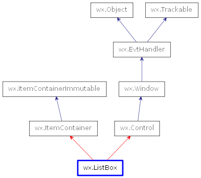
 Inheritance diagram for class ListBox: