wx.StatusBar
A status bar is a narrow window that can be placed along the bottom of a frame to give small amounts of status information.
It can contain one or more fields, one or more of which can be variable length according to the size of the window.
wx.StatusBar also maintains an independent stack of status texts for each field (see PushStatusText and PopStatusText).
Note that in wx.StatusBar context, the terms pane and field are synonyms.
 Window Styles
This class supports the following styles:
wx.STB_SIZEGRIP: Displays a gripper at the right-hand side of the status bar which can be used to resize the parent window.wx.STB_SHOW_TIPS: Displays tooltips for those panes whose status text has been ellipsized/truncated because the status text doesn’t fit the pane width. Note that this style has effect only on wxGTK (with GTK+ >= 2.12) currently.wx.STB_ELLIPSIZE_START: Replace the beginning of the status texts with an ellipsis when the status text widths exceed the status bar pane’s widths (uses wx.Control.Ellipsize ).wx.STB_ELLIPSIZE_MIDDLE: Replace the middle of the status texts with an ellipsis when the status text widths exceed the status bar pane’s widths (uses wx.Control.Ellipsize ).wx.STB_ELLIPSIZE_END: Replace the end of the status texts with an ellipsis when the status text widths exceed the status bar pane’s widths (uses wx.Control.Ellipsize ).wx.STB_DEFAULT_STYLE: The default style: includes STB_SIZEGRIP|wxSTB_SHOW_TIPS|wxSTB_ELLIPSIZE_END|wxFULL_REPAINT_ON_RESIZE .Note
It is possible to create controls and other windows on the status bar. Position these windows from an OnSize() event handler.
Note
Notice that only the first 127 characters of a string will be shown in status bar fields under pre-XP MSW systems (or even under later systems if a proper manifest indicating that the program uses version 6 of common controls library is not used). This is a limitation of the native control on these platforms.
See also
wx.StatusBarPane, wx.Frame, Status Bar Sample
 Methods Summary
__init__ |
Default constructor. |
Create |
Creates the window, for two-step construction. |
GetBorders |
Returns the horizontal and vertical borders used when rendering the field text inside the field area. |
GetField |
Returns the wx.StatusBarPane representing the n-th field. |
GetFieldRect |
Returns the size and position of a field’s internal bounding rectangle. |
GetFieldsCount |
Returns the number of fields in the status bar. |
GetStatusStyle |
Returns the style of the n-th field. |
GetStatusText |
Returns the string associated with a status bar field. |
GetStatusWidth |
Returns the width of the n-th field. |
PopStatusText |
Restores the text to the value it had before the last call to PushStatusText . |
PushStatusText |
Saves the current field text in a per-field stack, and sets the field text to the string passed as argument. |
SetFieldsCount |
Sets the number of fields, and optionally the field widths. |
SetMinHeight |
Sets the minimal possible height for the status bar. |
SetStatusStyles |
Sets the styles of the fields in the status line which can make fields appear flat or raised instead of the standard sunken 3D border. |
SetStatusText |
Sets the status text for the i-th field. |
SetStatusWidths |
Sets the widths of the fields in the status line. |
 Properties Summary
Borders |
See GetBorders |
FieldRect |
See GetFieldRect |
FieldsCount |
See GetFieldsCount and SetFieldsCount |
StatusText |
See GetStatusText and SetStatusText |
 Class API
wx.StatusBar(Control)¶Possible constructors:
StatusBar()

StatusBar(parent, id=ID_ANY, style=STB_DEFAULT_STYLE,
          name=StatusBarNameStr)
A status bar is a narrow window that can be placed along the bottom of a frame to give small amounts of status information.
__init__(self, *args, **kw)¶ Overloaded Implementations:
__init__ (self)
Default constructor.
__init__ (self, parent, id=ID_ANY, style=STB_DEFAULT_STYLE, name=StatusBarNameStr)
Constructor, creating the window.
| Parameters: |
|
|---|
See also
Create(self, parent, id=ID_ANY, style=STB_DEFAULT_STYLE, name=StatusBarNameStr)¶Creates the window, for two-step construction.
See wx.StatusBar for details.
| Parameters: |
|
|---|---|
| Return type: | bool |
GetBorders(self)¶Returns the horizontal and vertical borders used when rendering the field text inside the field area.
Note that the rect returned by GetFieldRect already accounts for the presence of horizontal and vertical border returned by this function.
| Return type: | wx.Size |
|---|
GetField(self, n)¶Returns the wx.StatusBarPane representing the n-th field.
| Parameters: | n (int) – |
|---|---|
| Return type: | wx.StatusBarPane |
GetFieldRect(self, i)¶Returns the size and position of a field’s internal bounding rectangle.
| Return type: | wx.Rect |
|---|
GetFieldsCount(self)¶Returns the number of fields in the status bar.
| Return type: | int |
|---|
GetStatusStyle(self, n)¶Returns the style of the n-th field.
See wx.StatusBarPane.GetStyle for more info.
| Parameters: | n (int) – |
|---|---|
| Return type: | int |
GetStatusText(self, i=0)¶Returns the string associated with a status bar field.
| Parameters: | i (int) – The number of the status field to retrieve, starting from zero. |
|---|---|
| Return type: | string |
| Returns: | The status field string if the field is valid, otherwise the empty string. |
See also
GetStatusWidth(self, n)¶Returns the width of the n-th field.
See wx.StatusBarPane.GetWidth for more info.
| Parameters: | n (int) – |
|---|---|
| Return type: | int |
PopStatusText(self, field=0)¶Restores the text to the value it had before the last call to PushStatusText .
Notice that if SetStatusText had been called in the meanwhile, PopStatusText will not change the text, i.e. it does not override explicit changes to status text but only restores the saved text if it hadn’t been changed since.
| Parameters: | field (int) – |
|---|
See also
PushStatusText(self, string, field=0)¶Saves the current field text in a per-field stack, and sets the field text to the string passed as argument.
| Parameters: |
|
|---|
See also
SetFieldsCount(self, number=1, widths=None)¶Sets the number of fields, and optionally the field widths.
| Parameters: |
|
|---|
SetMinHeight(self, height)¶Sets the minimal possible height for the status bar.
The real height may be bigger than the height specified here depending on the size of the font used by the status bar.
| Parameters: | height (int) – |
|---|
SetStatusStyles(self, styles)¶Sets the styles of the fields in the status line which can make fields appear flat or raised instead of the standard sunken 3D border.
| Parameters: | styles (list of integers) – Contains an array of n integers with the styles for each field. There are four possible styles:
|
|---|
SetStatusText(self, text, i=0)¶Sets the status text for the i-th field.
The given text will replace the current text.
Note that if PushStatusText had been called before the new text will also replace the last saved value to make sure that the next call to PopStatusText doesn’t restore the old value, which was overwritten by the call to this function.
| Parameters: |
|
|---|
See also
SetStatusWidths(self, widths)¶Sets the widths of the fields in the status line.
There are two types of fields: fixed widths and variable width fields. For the fixed width fields you should specify their (constant) width in pixels. For the variable width fields, specify a negative number which indicates how the field should expand: the space left for all variable width fields is divided between them according to the absolute value of this number. A variable width field with width of -2 gets twice as much of it as a field with width -1 and so on.
For example, to create one fixed width field of width 100 in the right part of the status bar and two more fields which get 66% and 33% of the remaining space correspondingly, you should use an array containing -2, -1 and 100.
| Parameters: | widths (list of integers) – Contains an array of n integers, each of which is either an absolute status field width in pixels if positive or indicates a variable width field if negative. The special value None means that all fields should get the same width. |
|---|
Borders¶See GetBorders
FieldRect¶See GetFieldRect
FieldsCount¶See GetFieldsCount and SetFieldsCount
StatusText¶See GetStatusText and SetStatusText


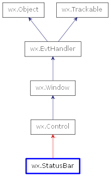
 Inheritance diagram for class StatusBar: