Navigation

- Home |
- Gallery |
- API Docs »
- wx.lib »
- wx.lib.agw »
- wx.lib.agw.hypertreelist »
- wx.lib.agw.hypertreelist.TreeListItem
- index
- modules |
- next |
- previous |

 wx.lib.agw.hypertreelist.TreeListItem
This class holds all the information and methods for every single item in
HyperTreeList.
Note
Subclassed from GenericTreeItem.
 Methods Summary
__init__ |
Default class constructor. |
DeleteChildren |
Deletes the item children. |
DeleteWindow |
Deletes the window associated to the item (if any). |
GetCurrentImage |
Returns the current item image. |
GetImage |
Returns the item image for a particular item state. |
GetText |
Returns the item text label. |
GetTextX |
Returns the x position of the item text. |
GetWindow |
Returns the window associated to the item. |
GetWindowEnabled |
Returns whether the window associated with an item is enabled or not. |
GetWindowSize |
Returns the associated window size. |
Hide |
Hides/shows the TreeListItem. |
HitTest |
HitTest method for an item. Called from the main window HitTest. |
IsHidden |
Returns whether the item is hidden or not. |
OnSetFocus |
Handles the wx.EVT_SET_FOCUS event for a window associated to an item. |
SetImage |
Sets the item image for a particular item state. |
SetText |
Sets the item text label. |
SetTextX |
Sets the x position of the item text. |
SetWindow |
Sets the window associated to the item. |
SetWindowEnabled |
Sets whether the window associated with an item is enabled or not. |
 Class API
TreeListItem(GenericTreeItem)¶This class holds all the information and methods for every single item in
HyperTreeList.
Note
Subclassed from GenericTreeItem.
__init__(self, mainWin, parent, text="", ct_type=0, wnd=None, image=-1, selImage=-1, data=None)¶Default class constructor. For internal use: do not call it in your code!
| Parameters: |
|
|---|
Note
Regarding radiobutton-type items (with ct_type = 2), the following approach is used:
DeleteChildren(self, tree)¶Deletes the item children.
| Parameters: | tree – the main TreeListMainWindow instance. |
|---|
DeleteWindow(self, column=None)¶Deletes the window associated to the item (if any).
| Parameters: | column – if not None, an integer specifying the column index.
If it is None, the main column index is used. |
|---|
GetCurrentImage(self, column=None)¶Returns the current item image.
| Parameters: | column – if not None, an integer specifying the column index.
If it is None, the main column index is used. |
|---|
GetImage(self, which=wx.TreeItemIcon_Normal, column=None)¶Returns the item image for a particular item state.
| Parameters: |
|
|---|
GetText(self, column=None)¶Returns the item text label.
| Parameters: | column – if not None, an integer specifying the column index.
If it is None, the main column index is used. |
|---|
GetTextX(self)¶Returns the x position of the item text.
GetWindow(self, column=None)¶Returns the window associated to the item.
| Parameters: | column – if not None, an integer specifying the column index.
If it is None, the main column index is used. |
|---|
GetWindowEnabled(self, column=None)¶Returns whether the window associated with an item is enabled or not.
| Parameters: | column – if not None, an integer specifying the column index.
If it is None, the main column index is used. |
|---|
GetWindowSize(self, column=None)¶Returns the associated window size.
| Parameters: | column – if not None, an integer specifying the column index.
If it is None, the main column index is used. |
|---|
Hide(self, hide)¶Hides/shows the TreeListItem.
| Parameters: | hide – True to hide the item, False to show it. |
|---|
HitTest(self, point, theCtrl, flags, column, level)¶HitTest method for an item. Called from the main window HitTest.
| Parameters: |
|
|---|
See also
TreeListMainWindow.HitTest() method for the flags explanation.
IsHidden(self)¶Returns whether the item is hidden or not.
OnSetFocus(self, event)¶Handles the wx.EVT_SET_FOCUS event for a window associated to an item.
| Parameters: | event – a FocusEvent event to be processed. |
|---|
SetImage(self, column, image, which)¶Sets the item image for a particular item state.
| Parameters: |
|
|---|
See also
GetImage for a list of valid item states.
SetText(self, column, text)¶Sets the item text label.
| Parameters: |
|
|---|
SetTextX(self, text_x)¶Sets the x position of the item text.
| Parameters: | text_x – the x position of the item text. |
|---|
SetWindow(self, wnd, column=None)¶Sets the window associated to the item.
| Parameters: |
|
|---|
SetWindowEnabled(self, enable=True, column=None)¶Sets whether the window associated with an item is enabled or not.
| Parameters: |
|
|---|


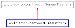
 Inheritance diagram for class TreeListItem: