Navigation

- Home |
- Gallery |
- API Docs »
- wx.lib »
- wx.lib.agw »
- wx.lib.agw.infobar »
- wx.lib.agw.infobar.InfoBar
- index
- modules |
- next |
- previous |

 wx.lib.agw.infobar.InfoBar
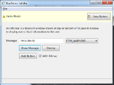
An info bar is a transient window shown at top or bottom of its parent window to display non-critical information to the user.
This is the main class implementation, plainly translated from C++.
 Methods Summary
__init__ |
Default class constructor. |
AddButton |
Adds a button to be shown in the info bar. |
Dismiss |
Hides the InfoBar window. |
DoHide |
Hides this InfoBar with whatever hiding effect has been chosen. |
DoShow |
Shows this InfoBar with whatever showing effect has been chosen. |
GetBarPlacement |
Determines the placement of the bar from its position in the containing |
GetDefaultBorder |
Returns the default border style for InfoBar. |
GetEffectDuration |
Return the effect animation duration currently used, in milliseconds. |
GetHideEffect |
Return the effect currently used for hiding the bar. |
GetShowEffect |
Return the effect currently used for showing the bar. |
Init |
Common initialization code. |
OnButton |
Default event handler for the Close button in InfoBar. |
RemoveButton |
Remove a button previously added by AddButton. |
SetEffectDuration |
Sets the duration of the animation used when showing or hiding the bar. |
SetFont |
Overridden base class methods changes the font of the text message. |
SetShowHideEffects |
Set the effects to use when showing and hiding the bar. |
ShowMessage |
Show a message in the bar. |
UpdateParent |
Updates the parent layout appearance, but only if this InfoBar parent is not managed |
 Class API
InfoBar(wx.Control)¶An info bar is a transient window shown at top or bottom of its parent window to display non-critical information to the user.
This is the main class implementation, plainly translated from C++.
__init__(self, parent, id=wx.ID_ANY, pos=wx.DefaultPosition, size=wx.DefaultSize, style=0, name='InfoBar')¶Default class constructor.
| Parameters: |
|
|---|
AddButton(self, btnid, label='', bitmap=wx.NullBitmap)¶Adds a button to be shown in the info bar.
The button added by this method will be shown to the right of the text (in LTR layout),
with each successive button being added to the right of the previous one. If any buttons
are added to the info bar using this method, the default Close button is not shown
as it is assumed that the extra buttons already allow the user to close it.
Clicking the button will generate a normal wx.wxEVT_COMMAND_BUTTON_CLICKED event which
can be handled as usual. The default handler in InfoBar itself closes the window
whenever a button in it is clicked so if you wish the info bar to be hidden when the button
is clicked, simply call event.Skip() in the button handler to let the base class handler
do it (calling Dismiss explicitly works too, of course). On the other hand, if you don’t
skip the event, the info bar will remain opened so make sure to do it for at least some
buttons to allow the user to close it.
| Parameters: |
|
|---|
Dismiss(self)¶Hides the InfoBar window.
This method hides the window and lays out the parent window to account for
its disappearance (unlike a simple Hide()), but only if this InfoBar
parent is not managed by framemanager or AuiManager.
GetBarPlacement(self)¶Determines the placement of the bar from its position in the containing sizer.
| Returns: | One of these integer bits:
|
|---|
GetEffectDuration(self)¶Return the effect animation duration currently used, in milliseconds.
GetHideEffect(self)¶Return the effect currently used for hiding the bar.
| Returns: | One of the following integer bits:
|
|---|
GetShowEffect(self)¶Return the effect currently used for showing the bar.
| Returns: | One of the following integer bits:
|
|---|
Init(self)¶Common initialization code.
OnButton(self, event)¶Default event handler for the Close button in InfoBar.
| Parameters: | event – a CommandEvent to be processed. |
|---|
RemoveButton(self, btnid)¶Remove a button previously added by AddButton.
| Parameters: | btnid (integer) – id of the button to remove. If more than one button with the
same id is used in the InfoBar (which is in any case not recommended), the last,
i.e. most recently added, button with this id is removed. |
|---|
SetEffectDuration(self, duration)¶Sets the duration of the animation used when showing or hiding the bar.
By default, 500ms duration is used.
| Parameters: | duration (integer) – duration of the animation, in milliseconds. |
|---|
SetFont(self, font)¶Overridden base class methods changes the font of the text message.
InfoBar overrides this method to use the font passed to it for its text
message part. By default a larger and bold version of the standard font is used.
| Parameters: | font – a valid instance of wx.Font. |
|---|
Note
Reimplemented from wx.Window.
SetShowHideEffects(self, showEffect, hideEffect)¶Set the effects to use when showing and hiding the bar.
Either or both of the parameters can be set to wx.SHOW_EFFECT_NONE to disable using
effects entirely.
By default, the info bar uses wx.SHOW_EFFECT_SLIDE_TO_BOTTOM effect for showing itself
and wx.SHOW_EFFECT_SLIDE_TO_TOP for hiding if it is the first element of the containing
sizer and reverse effects if it’s the last one. If it is neither the first nor the last element,
no effect is used to avoid the use of an inappropriate one and this function must be called
if an effect is desired.
| Parameters: |
|
|---|
The showEffect and hideEffect parameters can take one of the following bit:
| ShowEffect Flag | Description |
|---|---|
SHOW_EFFECT_NONE |
No effect, equivalent to normal Show() or Hide() call. |
SHOW_EFFECT_ROLL_TO_LEFT |
Roll window to the left. |
SHOW_EFFECT_ROLL_TO_RIGHT |
Roll window to the right. |
SHOW_EFFECT_ROLL_TO_TOP |
Roll window to the top. |
SHOW_EFFECT_ROLL_TO_BOTTOM |
Roll window to the bottom. |
SHOW_EFFECT_SLIDE_TO_LEFT |
Slide window to the left. |
SHOW_EFFECT_SLIDE_TO_RIGHT |
Slide window to the right. |
SHOW_EFFECT_SLIDE_TO_TOP |
Slide window to the top. |
SHOW_EFFECT_SLIDE_TO_BOTTOM |
Slide window to the bottom. |
SHOW_EFFECT_BLEND |
Fade in or out effect. |
SHOW_EFFECT_EXPAND |
Expanding or collapsing effect. |
ShowMessage(self, msg, flags=wx.ICON_INFORMATION)¶Show a message in the bar.
If the bar is currently hidden, it will be shown. Otherwise its message will be updated in place.
| Parameters: |
|
|---|
UpdateParent(self)¶Updates the parent layout appearance, but only if this InfoBar parent is not managed
by framemanager or AuiManager.


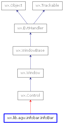
 Inheritance diagram for class InfoBar: