Navigation

- Home |
- Gallery |
- API Docs »
- wx.lib »
- wx.lib.agw »
- wx.lib.agw.pyprogress »
- wx.lib.agw.pyprogress.PyProgress
- index
- modules |
- next |
- previous |

 wx.lib.agw.pyprogress.PyProgress
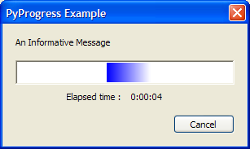
PyProgress is similar to ProgressDialog in indeterminated mode, but with a
different gauge appearance and a different spinning behavior. The moving gauge
can be drawn with a single solid colour or with a shading gradient foreground.
The gauge background colour is user customizable.
The bar does not move always from the beginning to the end as in ProgressDialog
in indeterminated mode, but spins cyclically forward and backward.
 Methods Summary
__init__ |
Default class constructor. |
CreateLabel |
Creates the StaticText that holds the elapsed time label. |
DisableAbort |
Disables the Cancel button. |
EnableAbort |
Enables or disables the Cancel button. |
EnableClose |
Enables or disables the Close button. |
GetAGWWindowStyleFlag |
Returns the PyProgress style. |
GetFirstGradientColour |
Returns the gauge first gradient colour. |
GetGaugeBackground |
Returns the gauge background colour. |
GetGaugeProportion |
Returns the relative proportion between the sliding bar and the |
GetGaugeSteps |
Returns the number of steps the gauge performs before switching from |
GetSecondGradientColour |
Returns the gauge second gradient colour. |
OnCancel |
Handles the wx.EVT_BUTTON event for the dialog. |
OnClose |
Handles the wx.EVT_CLOSE event for PyProgress. |
OnDestroy |
Handles the wx.EVT_WINDOW_DESTROY event for PyProgress. |
ReenableOtherWindows |
Re-enables the other windows if using wx.WindowDisabler. |
SetFirstGradientColour |
Sets the gauge first gradient colour. |
SetGaugeBackground |
Sets the gauge background colour. |
SetGaugeProportion |
Sets the relative proportion between the sliding bar and the |
SetGaugeSteps |
Sets the number of steps the gauge performs before switching from |
SetSecondGradientColour |
Sets the gauge second gradient colour. |
SetTimeLabel |
Sets the elapsed time label. |
ShowDialog |
Show the dialog. |
UpdatePulse |
Updates the dialog, setting the progress bar to the new value and, if given |
 Class API
PyProgress(wx.Dialog)¶PyProgress is similar to ProgressDialog in indeterminated mode, but with a
different gauge appearance and a different spinning behavior. The moving gauge
can be drawn with a single solid colour or with a shading gradient foreground.
The gauge background colour is user customizable.
The bar does not move always from the beginning to the end as in ProgressDialog
in indeterminated mode, but spins cyclically forward and backward.
__init__(self, parent=None, id=-1, title="", message="", agwStyle=wx.PD_APP_MODAL|wx.PD_AUTO_HIDE)¶Default class constructor.
| Parameters: |
|
|---|
CreateLabel(self, text, sizer)¶Creates the StaticText that holds the elapsed time label.
| Parameters: |
|
|---|
DisableAbort(self)¶Disables the Cancel button.
EnableAbort(self, enable=True)¶Enables or disables the Cancel button.
| Parameters: | enable – True to enable the Cancel button, False to disable it. |
|---|
EnableClose(self, enable=True)¶Enables or disables the Close button.
| Parameters: | enable – True to enable the Close button, False to disable it. |
|---|
GetAGWWindowStyleFlag(self)¶Returns the PyProgress style.
See also
The __init__ method for a list of possible style flags.
GetFirstGradientColour(self)¶Returns the gauge first gradient colour.
GetGaugeBackground(self)¶Returns the gauge background colour.
GetGaugeProportion(self)¶Returns the relative proportion between the sliding bar and the whole gauge.
GetGaugeSteps(self)¶Returns the number of steps the gauge performs before switching from forward to backward (or vice-versa) movement.
GetSecondGradientColour(self)¶Returns the gauge second gradient colour.
OnCancel(self, event)¶Handles the wx.EVT_BUTTON event for the dialog.
| Parameters: | event – a CommandEvent event to be processed. |
|---|
Note
This method handles the Cancel button press.
OnClose(self, event)¶Handles the wx.EVT_CLOSE event for PyProgress.
| Parameters: | event – a CloseEvent event to be processed. |
|---|
OnDestroy(self, event)¶Handles the wx.EVT_WINDOW_DESTROY event for PyProgress.
| Parameters: | event – a wx.WindowDestroyEvent event to be processed. |
|---|
ReenableOtherWindows(self)¶Re-enables the other windows if using wx.WindowDisabler.
SetFirstGradientColour(self, colour)¶Sets the gauge first gradient colour.
| Parameters: | colour – a valid wx.Colour object. |
|---|
SetGaugeBackground(self, colour)¶Sets the gauge background colour.
| Parameters: | colour – a valid wx.Colour object. |
|---|
SetGaugeProportion(self, proportion)¶Sets the relative proportion between the sliding bar and the whole gauge.
| Parameters: | proportion – a floating point number representing the relative proportion between the sliding bar and the whole gauge. |
|---|
SetGaugeSteps(self, steps)¶Sets the number of steps the gauge performs before switching from forward to backward (or vice-versa) movement.
| Parameters: | steps – the number of steps the gauge performs before switching from forward to backward (or vice-versa) movement. |
|---|
SetSecondGradientColour(self, colour)¶Sets the gauge second gradient colour.
| Parameters: | colour – a valid wx.Colour object. |
|---|
SetTimeLabel(self, val, label=None)¶Sets the elapsed time label.
| Parameters: |
|
|---|
ShowDialog(self, show=True)¶Show the dialog.
| Parameters: | show – True to show the dialog and re-enable all the other windows,
False otherwise. |
|---|
UpdatePulse(self, newmsg="")¶Updates the dialog, setting the progress bar to the new value and, if given
changes the message above it. Returns True unless the Cancel button
has been pressed.
If False is returned, the application can either immediately destroy the
dialog or ask the user for the confirmation.
| Parameters: | newmsg – The new messages for the progress dialog text, if it is empty (which is the default) the message is not changed. |
|---|


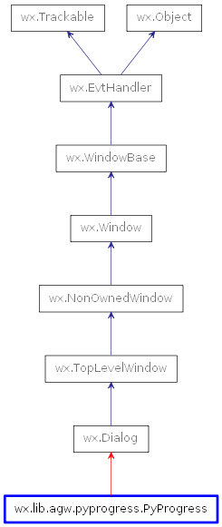
 Inheritance diagram for class PyProgress: