Navigation

- Home |
- Gallery |
- API Docs »
- wx.lib »
- wx.lib.agw »
- wx.lib.agw.ribbon »
- wx.lib.agw.ribbon.buttonbar »
- wx.lib.agw.ribbon.buttonbar.RibbonButtonBar
- index
- modules |
- next |
- previous |

 wx.lib.agw.ribbon.buttonbar.RibbonButtonBar
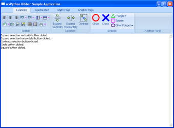
A ribbon button bar is similar to a traditional toolbar.
 Methods Summary
__init__ |
Default class constructor. |
AddButton |
Add a button to the button bar. |
AddDropdownButton |
Add a dropdown button to the button bar (simple version). |
AddHybridButton |
Add a hybrid button to the button bar (simple version). |
AddSimpleButton |
Add a button to the button bar (simple version). |
AddToggleButton |
Add a toggle button to the button bar. |
ClearButtons |
Delete all buttons from the button bar. |
CommonInit |
Common initialization procedures. |
DeleteButton |
Delete a single button from the button bar. |
DoGetBestSize |
Gets the size which best suits the window: for a control, it would be the |
DoGetNextLargerSize |
Implementation of RibbonControl.GetNextLargerSize(). |
DoGetNextSmallerSize |
Implementation of RibbonControl.GetNextSmallerSize(). |
EnableButton |
Enable or disable a single button on the bar. |
FetchButtonSizeInfo |
|
GetButtonCount |
Returns the number of buttons in this RibbonButtonBar. |
GetDefaultBorder |
Returns the default border style for RibbonButtonBar. |
GetMinSize |
Returns the minimum size of the window, an indication to the sizer layout mechanism |
InsertButton |
Inserts a button in the button bar at the position specified by pos. |
InsertDropdownButton |
Inserts a dropdown button in the button bar at the position specified by pos. |
InsertHybridButton |
Inserts a hybrid button in the button bar at the position specified by pos. |
InsertToggleButton |
Inserts a toggle button in the button bar at the position specified by pos. |
IsButtonEnabled |
Returns whether a button in the bar is enabled or not. |
IsSizingContinuous |
Returns True if this window can take any size (greater than its minimum size), |
MakeDisabledBitmap |
Converts the original bitmap into a visually-looking disabled one. |
MakeLayouts |
|
MakeResizedBitmap |
Resize and scale the original bitmap to the dimensions specified in size. |
OnEraseBackground |
Handles the wx.EVT_ERASE_BACKGROUND event for RibbonButtonBar. |
OnMouseDown |
Handles the wx.EVT_LEFT_DOWN event for RibbonButtonBar. |
OnMouseEnter |
Handles the wx.EVT_ENTER_WINDOW event for RibbonButtonBar. |
OnMouseLeave |
Handles the wx.EVT_LEAVE_WINDOW event for RibbonButtonBar. |
OnMouseMove |
Handles the wx.EVT_MOTION event for RibbonButtonBar. |
OnMouseUp |
Handles the wx.EVT_LEFT_UP event for RibbonButtonBar. |
OnPaint |
Handles the wx.EVT_PAINT event for RibbonButtonBar. |
OnSize |
Handles the wx.EVT_SIZE event for RibbonButtonBar. |
Realize |
Calculate button layouts and positions. |
SetArtProvider |
Set the art provider to be used. |
ToggleButton |
Toggles/untoggles a RibbonButtonBar toggle button. |
TryCollapseLayout |
|
UpdateWindowUI |
This function sends one or more UpdateUIEvent to the window. |
 Class API
A ribbon button bar is similar to a traditional toolbar.
Default class constructor.
| Parameters: |
|
|---|
Add a button to the button bar.
| Parameters: |
|
|||||||||||||||
|---|---|---|---|---|---|---|---|---|---|---|---|---|---|---|---|---|
| Returns: | An opaque pointer which can be used only with other button bar methods. |
See also
Add a dropdown button to the button bar (simple version).
| Parameters: |
|
|---|---|
| Returns: | An opaque pointer which can be used only with other button bar methods. |
See also
Add a hybrid button to the button bar (simple version).
| Parameters: |
|
|---|---|
| Returns: | An opaque pointer which can be used only with other button bar methods. |
See also
Add a button to the button bar (simple version).
| Parameters: |
|
|---|---|
| Returns: | An opaque pointer which can be used only with other button bar methods. |
See also
AddButton for a list of valid button kind values.
Add a toggle button to the button bar.
| Parameters: |
|
|---|---|
| Returns: | An opaque pointer which can be used only with other button bar methods. |
See also
Delete all buttons from the button bar.
See also
Common initialization procedures.
| Parameters: | agwStyle (integer) – the AGW-specific window style, currently unused. |
|---|
Delete a single button from the button bar.
| Parameters: | button_id (integer) – id of the button to delete. |
|---|---|
| Returns: | True if the button has been found and successfully deleted, False otherwise. |
See also
Gets the size which best suits the window: for a control, it would be the minimal size which doesn’t truncate the control, for a panel - the same size as it would have after a call to Fit().
| Returns: | An instance of wx.Size. |
|---|
Note
Overridden from wx.Control.
Implementation of RibbonControl.GetNextLargerSize().
Controls which have non-continuous sizing must override this virtual function
rather than RibbonControl.GetNextLargerSize().
| Returns: | An instance of wx.Size. |
|---|
Implementation of RibbonControl.GetNextSmallerSize().
Controls which have non-continuous sizing must override this virtual function
rather than RibbonControl.GetNextSmallerSize().
| Returns: | An instance of wx.Size. |
|---|
Enable or disable a single button on the bar.
| Parameters: |
|
|---|---|
| Raise: | Exception when the input button_id could not be associated
with a |
Returns the number of buttons in this RibbonButtonBar.
New in version 0.9.5.
Returns the default border style for RibbonButtonBar.
Returns the minimum size of the window, an indication to the sizer layout mechanism that this is the minimum required size.
This method normally just returns the value set by SetMinSize, but it can be
overridden to do the calculation on demand.
| Returns: | An instance of wx.Size. |
|---|
Inserts a button in the button bar at the position specified by pos.
| Parameters: |
|
|---|---|
| Returns: | An opaque pointer which can be used only with other button bar methods. |
| Raise: | Exception if both bitmap and bitmap_small are invalid or if the input help_string is not a valid Python basestring. |
See also
AddDropdownButton, AddHybridButton and AddButton for a list of valid button kind values.
New in version 0.9.5.
Inserts a dropdown button in the button bar at the position specified by pos.
| Parameters: |
|
|---|---|
| Returns: | An opaque pointer which can be used only with other button bar methods. |
See also
New in version 0.9.5.
Inserts a hybrid button in the button bar at the position specified by pos.
| Parameters: |
|
|---|---|
| Returns: | An opaque pointer which can be used only with other button bar methods. |
See also
New in version 0.9.5.
Inserts a toggle button in the button bar at the position specified by pos.
| Parameters: |
|
|---|---|
| Returns: | An opaque pointer which can be used only with other button bar methods. |
See also
New in version 0.9.5.
Returns whether a button in the bar is enabled or not.
| Parameters: | button_id (integer) – id of the button to check. |
|---|---|
| Returns: | True if the button is enabled, False otherwise. |
| Raise: | Exception when the input button_id could not be associated
with a RibbonButtonBar button. |
Returns True if this window can take any size (greater than its minimum size),
False if it can only take certain sizes.
See also
RibbonControl.GetNextSmallerSize(),
RibbonControl.GetNextLargerSize()
Converts the original bitmap into a visually-looking disabled one.
| Parameters: | original – the original bitmap, an instance of wx.Bitmap. |
|---|---|
| Returns: | A visually-looking disabled representation of the input bitmap. |
Resize and scale the original bitmap to the dimensions specified in size.
| Parameters: | |
|---|---|
| Returns: | A scaled representation of the input bitmap. |
Handles the wx.EVT_ERASE_BACKGROUND event for RibbonButtonBar.
| Parameters: | event – a EraseEvent event to be processed. |
|---|
Handles the wx.EVT_LEFT_DOWN event for RibbonButtonBar.
| Parameters: | event – a MouseEvent event to be processed. |
|---|
Handles the wx.EVT_ENTER_WINDOW event for RibbonButtonBar.
| Parameters: | event – a MouseEvent event to be processed. |
|---|
Handles the wx.EVT_LEAVE_WINDOW event for RibbonButtonBar.
| Parameters: | event – a MouseEvent event to be processed. |
|---|
Handles the wx.EVT_MOTION event for RibbonButtonBar.
| Parameters: | event – a MouseEvent event to be processed. |
|---|
Handles the wx.EVT_LEFT_UP event for RibbonButtonBar.
| Parameters: | event – a MouseEvent event to be processed. |
|---|
Handles the wx.EVT_PAINT event for RibbonButtonBar.
| Parameters: | event – a PaintEvent event to be processed. |
|---|
Handles the wx.EVT_SIZE event for RibbonButtonBar.
| Parameters: | event – a wx.SizeEvent event to be processed. |
|---|
Calculate button layouts and positions.
Must be called after buttons are added to the button bar, as otherwise the newly
added buttons will not be displayed. In normal situations, it will be called
automatically when RibbonBar.Realize() is called.
Note
Reimplemented from RibbonControl.
Set the art provider to be used.
In many cases, setting the art provider will also set the art provider on all
child windows which extend RibbonControl. In most cases, controls will not
take ownership of the given pointer, with the notable exception being
RibbonBar.SetArtProvider().
| Parameters: | art – an art provider. |
|---|
Toggles/untoggles a RibbonButtonBar toggle button.
| Parameters: |
|
|---|---|
| Raise: | Exception when the input button_id could not be associated
with a |
This function sends one or more UpdateUIEvent to the window.
The particular implementation depends on the window; for example a ToolBar will
send an update UI event for each toolbar button, and a wx.Frame will send an
update UI event for each menubar menu item.
You can call this function from your application to ensure that your UI is up-to-date
at this point (as far as your UpdateUIEvent handlers are concerned). This may be
necessary if you have called UpdateUIEvent.SetMode or UpdateUIEvent.SetUpdateInterval
to limit the overhead that wxWidgets incurs by sending update UI events in idle time.
| Parameters: | flags (integer) – should be a bitlist of one or more of wx.UPDATE_UI_NONE,
wx.UPDATE_UI_RECURSE or wx.UPDATE_UI_FROMIDLE. |
|---|
If you are calling this function from an OnInternalIdle or OnIdle function, make sure
you pass the wx.UPDATE_UI_FROMIDLE flag, since this tells the window to only update
the UI elements that need to be updated in idle time. Some windows update their elements
only when necessary, for example when a menu is about to be shown. The following is an
example of how to call UpdateWindowUI from an idle function:
def OnInternalIdle(self):

    if wx.UpdateUIEvent.CanUpdate(self):
        self.UpdateWindowUI(wx.UPDATE_UI_FROMIDLE)
New in version 0.9.5.


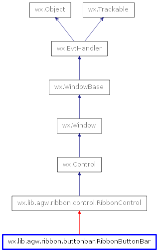
 Inheritance diagram for class RibbonButtonBar: