Scene Graph - Painted Item
Shows how to implement QPainter-based custom scenegraph items.
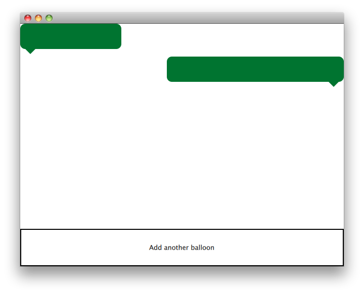
The Painted Item example shows how to use the QML Scene Graph framework to implement custom scenegraph items using QPainter.

The QQuickPaintedItem class is a class derived from QQuickItem for implementing custom QML Scene Graph items using the QPainter interfaces.
The example consists of an item class, a plugin class and a QML file to use this plugin. The TextBalloon class represents the individual text balloons extending QQuickPaintedItem, the TextBalloonPlugin class represents the skeleton code for a Qt Quick plugin and the textballoons.qml file is used to load the plugin and display the text balloons.
We will focus on the TextBalloon class first and continue with the textballoons.qml file. For an example on how to implement a Qt Quick plugin please look at Writing an Extension Plugin
TextBalloon Class Declaration
The TextBalloon class inherits from QQuickPaintedItem. QQuickPaintedItem is the base class for all QPainter based items in the QML Scene Graph framework.
class TextBalloon : public QQuickPaintedItem
{
    Q_OBJECT
    Q_PROPERTY(bool rightAligned READ isRightAligned WRITE setRightAligned NOTIFY rightAlignedChanged)

    public:
        TextBalloon(QQuickItem *parent = 0);
        void paint(QPainter *painter);

        bool isRightAligned();
        void setRightAligned(bool rightAligned);

    private:
        bool rightAligned;

    signals:
        void rightAlignedChanged();
};
To implement a QQuickPaintedItem you must implement QQuickPaintedIem's pure virtual function paint() which implements the painting of the type.
TextBalloon Class Definition
We have to be sure to initialize the rightAligned property for a TextBalloon item.
TextBalloon::TextBalloon(QQuickItem *parent)
    : QQuickPaintedItem(parent)
    , rightAligned(false)
{
}
Then we implement the paint() function which is automatically called by the Scene Graph framework to paint the contents of the item. The function paints the item in local coordinates.
void TextBalloon::paint(QPainter *painter)
{
    QBrush brush(QColor("#007430"));

    painter->setBrush(brush);
    painter->setPen(Qt::NoPen);
    painter->setRenderHint(QPainter::Antialiasing);

    QSizeF itemSize = size();
    painter->drawRoundedRect(0, 0, itemSize.width(), itemSize.height() - 10, 10, 10);

    if (rightAligned)
    {
        const QPointF points[3] = {
            QPointF(itemSize.width() - 10.0, itemSize.height() - 10.0),
            QPointF(itemSize.width() - 20.0, itemSize.height()),
            QPointF(itemSize.width() - 30.0, itemSize.height() - 10.0),
        };
        painter->drawConvexPolygon(points, 3);
    }
    else
    {
        const QPointF points[3] = {
            QPointF(10.0, itemSize.height() - 10.0),
            QPointF(20.0, itemSize.height()),
            QPointF(30.0, itemSize.height() - 10.0),
        };
        painter->drawConvexPolygon(points, 3);
    }
}
We start with setting the pen and brush on the item to define the look of the item. After that we start drawing. Note that the contentsBoundingRect() item is called to draw depending on the size of the item. The rectangle returned by the contentsBoundingRect() function is the size of the item as defined in the QML file.
Textballoons.qml File
The Interface consists of two main parts. The scrollable area with the textballoons and the controls button to add new balloons.
BalloonView
ListModel {
    id: balloonModel
    ListElement {
        balloonWidth: 200
    }
    ListElement {
        balloonWidth: 120
    }
}

ListView {
    anchors.bottom: controls.top
    anchors.bottomMargin: 2
    anchors.top: parent.top
    id: balloonView
    delegate: TextBalloon {
        anchors.right: index % 2 == 0 ? undefined : parent.right
        height: 60
        rightAligned: index % 2 == 0 ? false : true
        width: balloonWidth
    }
    model: balloonModel
    spacing: 5
    width: parent.width
}
The balloonModel contains two types at application start which will be displayed by the balloonView. The balloonView alernates the TextBalloon delegate items between left-aligned and right-aligned.
Controls
Rectangle {
    id: controls

    anchors.bottom: parent.bottom
    anchors.left: parent.left
    anchors.margins: 1
    anchors.right: parent.right
    border.width: 2
    color: "white"
    height: parent.height * 0.15

    Text {
        anchors.centerIn: parent
        text: "Add another balloon"
    }

    MouseArea {
        anchors.fill: parent
        hoverEnabled: true
        onClicked: {
            balloonModel.append({"balloonWidth": Math.floor(Math.random() * 200 + 100)})
            balloonView.positionViewAtIndex(balloonView.count -1, ListView.End)
        }
        onEntered: {
            parent.color = "#8ac953"
        }
        onExited: {
            parent.color = "white"
        }
    }
}
The controls part of the UI contains a rectangle with a MouseArea which changes color when the mouse hovers over it. This control 'button' adds a new object to the end of the model with a random width.
Files:
© 2019 The Qt Company Ltd. Documentation contributions included herein are the copyrights of their respective owners. The documentation provided herein is licensed under the terms of the GNU Free Documentation License version 1.3 as published by the Free Software Foundation. Qt and respective logos are trademarks of The Qt Company Ltd. in Finland and/or other countries worldwide. All other trademarks are property of their respective owners.
