
Note
Click here to download the full example code
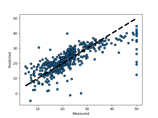
Plotting Cross-Validated Predictions
This example shows how to use cross_val_predict to visualize prediction errors.
from sklearn import datasets
from sklearn.model_selection import cross_val_predict
from sklearn import linear_model
import matplotlib.pyplot as plt

lr = linear_model.LinearRegression()
boston = datasets.load_boston()
y = boston.target

# cross_val_predict returns an array of the same size as `y` where each entry
# is a prediction obtained by cross validation:
predicted = cross_val_predict(lr, boston.data, y, cv=10)

fig, ax = plt.subplots()
ax.scatter(y, predicted, edgecolors=(0, 0, 0))
ax.plot([y.min(), y.max()], [y.min(), y.max()], 'k--', lw=4)
ax.set_xlabel('Measured')
ax.set_ylabel('Predicted')
plt.show()
Total running time of the script: ( 0 minutes 0.047 seconds)