public static bool Toggle(bool value,
string text,
params GUILayoutOption[] options);
public static bool Toggle(bool value,
Texture image,
GUIStyle style,
params GUILayoutOption[] options);
public static bool Toggle(bool value,
string text,
GUIStyle style,
params GUILayoutOption[] options);
public static bool Toggle(bool value,
GUIContent content,
GUIStyle style,
params GUILayoutOption[] options);
Parameters
| value | Is the button on or off? |
| text | Text to display on the button. |
| image | Texture to display on the button. |
| content | Text, image and tooltip for this button. |
| style | The style to use. If left out, the button style from the current GUISkin is used. |
| options | An optional list of layout options that specify extra layouting properties. Any values passed in here will override settings defined by the style.See Also: GUILayout.Width, GUILayout.Height, GUILayout.MinWidth, GUILayout.MaxWidth, GUILayout.MinHeight, GUILayout.MaxHeight, GUILayout.ExpandWidth, GUILayout.ExpandHeight. |
Returns
bool The new value of the button.
Description
Make an on/off toggle button.
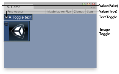
Toggle button in the Game View.
using UnityEngine;

public class ExampleScript : MonoBehaviour
{
    // Draws 2 toggle controls, one with a text, the other with an image.
    Texture aTexture;

    bool toggleTxt = false;
    bool toggleImg = false;

    void OnGUI()
    {
        if (!aTexture)
        {
            Debug.LogError("Please assign a texture in the inspector.");
            return;
        }
        toggleTxt = GUILayout.Toggle(toggleTxt, "A Toggle text");
        toggleImg = GUILayout.Toggle(toggleImg, aTexture);
    }
}
Did you find this page useful? Please give it a rating: