RectControl
From Xojo Documentation
RectControl is the base class for most other control classes. This means that all controls inherit the properties of the RectControl. A RectControl cannot be created or modified directly. Instead, you create and modify the RectControl subclasses like PushButtons, TextFields, ListBoxes, etc.
| Events | ||||||||||||||
|
| Methods | |||||||||
|
Class Constants
The following class constants of the DragItem class can be used to specify the value of the Action parameter with the DragEnter, DragExit, and DragOver events.
| Class Constant | Description |
|---|---|
| DragActionDefault | Default action. |
| DragActionCopy | Copy the dragged item. |
| DragActionMove | Move the dragged item. |
| DragActionLink | Link the dragged item. |
Notes
The Control Hierarchy
In some cases you build portions of your interface by placing some controls within another control. For example, you use the GroupBox control to organize other controls, usually RadioButtons or possibly Checkboxes. The TabPanel and PagePanel controls also designed to enclose other controls.
The control that encloses the others is known as the parent control and the controls that are entirely within its borders are the child controls. This works automatically if you create the controls in the order of: parent-child. That is, create the control that encloses the others first, then create the child controls or duplicate existing child controls and keep them inside the parent control.
You can use the Parent property of the RectControl class to either get or set the parent of an existing control. If you create a child control before its parent, you can set its parent using its Parent property.
If a control is not completely enclosed by another control then it doesn't automatically become a child; it simply overlaps the other control.
If you move a child outside its parent, it is no longer a child of that control. If you move it completely inside another control, it becomes the child of that control.
When you copy a parent control, you copy all its child controls as well.
You can create more than one level of nesting. For example, you can place a GroupBox within a TabPanel and then place several RadioButtons within the GroupBox. In this case, the GroupBox is the parent of the RadioButtons and the TabPanel is the parent of the GroupBox. To make this work automatically, you must create them in the order that respects the hierarchy: first create the TabPanel, then the GroupBox, and then the RadioButtons.
Obviously, the parent control must be in the same window as its child controls. If you attempt to get the parent of a control whose parent is in another window, you will get an InvalidParentException error.
If a control is not enclosed by another control, then its “parent” is its window. But, since the Parent property of a control is a Control, the Parent property will be Nil-since a Window is not subclassed from the Control class. Before trying to access the Parent property of a control, be sure to first test whether it is Nil. If you don't, you will get a NilObjectException error if the control's "parent" is the parent window.
If a control is enclosed by another control, but you don't want it to behave as a child, then set its Parent property to Nil. This breaks the default Parent-Child relationship that is normally maintained by the control hierarchy.
Control Hierarchy Features
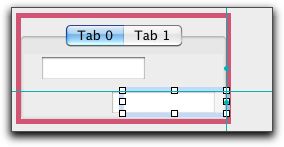
To take advantage of the features of the control hierarchy automatically, create the parent control first and then add the child controls by dragging fully into the interior of the parent control. When you add a child to a parent in this manner, a marquee surrounds the parent. A marquee also surrounds the parent control whenever you select an existing child control. You can disable the marquee in Preferences/Options.
If you duplicate a child control and leave the duplicate within the parent, then it is automatically a child. However, if you move the duplicate outside the parent, it is no longer a child. A control must be fully enclosed by the parent to be considered a child.
In the following example, both TextFields report the identity of their parents. The bottom one was duplicated from the top one but has been moved out of the TabPanel. It is no longer a child.
When you move a child out of the 'scope' of the parent, the marquee surrounding the parent is turned off, indicating that the child is not under parental control anymore.
If you move the bottom TextField back within the TabPanel, it becomes a child of the TabPanel once again.
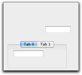
Moving a parent control moves its child controls as well. In the following example, the TabPanel shown above was moved down. It takes the top TextField with it, but leaves the bottom one orphaned.
- Deleting a parent control deletes all child controls.
- Hiding a parent hides all child controls, but retains the previous visibility status of all children.
- Showing a parent control shows only the child controls whose visibility is set.
- Disabling a parent control disables all its child controls, but retains the previous visibility status of all children. In the IDE, disabling a container visually disables all the child controls, but does not update the Enabled property.
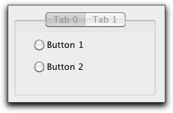
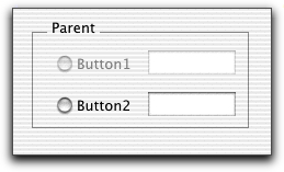
Here is a disabled GroupBox in the IDE in which two RadioButtons and two TextFields are children. When the GroupBox is disabled, all four children are disabled. Since all children are disabled when a parent is disabled, the TextFields are not enterable.
- Enabling a parent control enables only the child controls whose Enabled property is set.
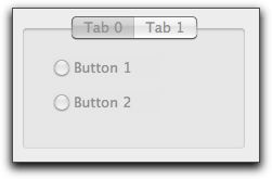
In the following example, only the bottom row of child controls have the Enabled property set. When the GroupBox is enabled the top row of controls remains disabled.
- Disabling the GroupBox disables all child controls, as expected.
Dragging
There are three possible items a user can drag from a control: text, a picture, and/or a FolderItem. In order for the user to be able to drag, the control must create a DragItem object in the appropriate event handler. The appropriate event handler depends on the type of object. For example, the appropriate event handler for a Canvas control is the MouseDown event handler since the user must be holding down the mouse button to drag.
The DragItem object represents the data that the user is dragging. DragItem objects have properties to hold text, pictures, and folderItems. One or more of these properties must be populated with the values the user wishes to drag. When you create a new DragItem object using the DragItem constructor, you specify the drag rectangle that will appear as the user drags from the control.
TextFields, TextAreas, and ListBoxes have implicit dragging built in to them. This means that they will create a new DragItem and drag rectangle for you. TextFields and TextAreas automatically populate the Text property of the DragItem with the text the user is dragging. ListBoxes have a DragRow event handler where you can populate the DragItem with the data to be dragged.
Dropping
Before a control will accept an item being dropped on it, you must call the AcceptFileDrop, AcceptPictureDrop, AcceptRawDataDrop, and/or AcceptTextDrop methods to indicate the drop types that will be allowed. This is usually done in the control's Open event handler. When an acceptable item is dropped on the control, the control's DropObject event handler will execute and will be passed the DragItem that has been dropped on the control. At that point you can use the DragItem's methods to determine what kind of data is available and access it. If you are only allowing a particular type of drag data (text for example) then there would be no need to test the type of data that is being dragged. You can simply get the text from the Text property of the DragItem.
Handling Contextual Menus
The following code in a ConstructContextualMenu event builds a simple contextual menu. The parameter Base as MenuItem is passed in as a parameter.
base.AddMenu(New MenuItem("Export"))
Return True //display the contextual menu
The following Select statement in the ContextualMenuAction event handler inspects the selected menu item, which is passed in as the HitItem as MenuItem parameter.
Case "Import"
MessageBox("You chose Import")
Case "Export"
MessageBox("You chose export")
End Select
Return True
On macOS, standard controls no longer filter contextual clicks. This responsibility can always be overridden by you in the MouseDown event for the control.
Changing the Cursor
The MouseCursor property controls which cursor will be displayed while the mouse is within the control, assuming that the MouseCursor properties of the Application and parent Window classes are Nil. You can, for example, assign different MouseCursors to different controls within a window and the shape of the pointer will change whenever it is over a particular control. The Cursors module contains a library of custom cursors that you access with the syntax System.Cursors.MouseCursorName. Please see the MouseCursor class for information about the library of custom cursors.
If you also need custom cursors at the Window or Application levels, you need to manage them along the lines described in the section on the MouseCursor class.
Custom Cursors in Windows
If you need to use custom cursors in the Windows build of your application, you can do so using a slightly modified version of this technique.
1. With a resource editor, create a CURS resource that contains only one cursor. Give the resource file a name that indicates the type of cursor contained in the resource file.
2. Repeat this process for each custom cursor.
3. Add all the resource files to the Project Editor.
4. You can then access each custom cursor by name, e.g.
Examples
This example shows how the DropObject event handler of a TextArea (named TextArea1 in this example) would be coded to handle one or more text documents or some text being dropped on it:
If Obj.TextAvailable Then
TextArea1.Value = Obj.Text
ElseIf Obj.FolderItemAvailable Then
Do
// Load the styled text from the document
// into TextArea1
If Not TextArea1.Open(Obj.FolderItem) Then
MessageBox("Drag Failed")
End If
Loop Until Not Obj.NextItem
End If
See Also
Control class.

