Web Toolbar
From Xojo Documentation
Contents
A Toolbar is a series of buttons that appear in one place on the web page.
To add buttons to the Toolbar, use the Set Default Value button on the Layout Editor toolbar, click the small pencil overlay or press Return when the control is selected to put the Toolbar in Edit Mode. While in Edit Mode, you can add new buttons by clicking the “+” indicator in the top left of the Toolbar. You can remove buttons by clicking the “-” on the button. You can click on an individual button to see its properties in the Inspector.
There are several types of buttons you can add to a Toolbar:
- Button: A Button can be either a standard push button or a toggle button.
- Menu: This type of button displays a drop-down menu when it is clicked. The actual menu has to be added programmatically (usually in the Open event handler).
- Separator: Adds a vertical separator to the toolbar. It cannot be clicked.
- Space: Adds a fixed space to the toolbar. It cannot be clicked.
- Flexible space: A flexible space fills all space to the right of the toolbar. Buttons added after the flexible space appear right-justified on the right side of the toolbar.
- Container: A container allows you to add any container control to the toolbar. Use this to add any type of control you want to the Toolbar. Refer to UserGuide:Web Container Control for more information.
Using UserGuide:Web Styles you can dramatically alter the look of the toolbar and its buttons. With styles you can set the appearance of buttons in their normal, toggled, and disabled states and buttons in their normal and disabled states.
Below is a list of commonly used events, properties and methods for the Toolbar. Refer to WebToolbar in the Language Reference for the complete list.
| In Desktop projects, a Toolbar is a Project Item that you add to a Layout. In Web projects, a Toolbar is a control you add to a Layout. |
Events
- Called when a toolbar button is clicked. Supplies the button that was clicked as an Item parameter (of type WebToolbarButton).
- Called when a toolbar menu is clicked. Supplies the button that was clicked (Item) and the menu that was clicked (Choice).
Properties
ButtonDisabledStyle, ButtonStyle, ItemStyle, ToggleDisabledStyle, ToggledStyle
- Used to set the style to use for these button states.
- Indicates the number of buttons on the toolbar.
Methods
- Used to get a specific button by either its index (0-based) or its name.
Toolbar Buttons
Standard buttons can be clicked and are called Toolbar Buttons.
Below is a list of commonly used properties for Toolbar Buttons. Refer to the WebToolbarButton class for the complete list.
Properties
- The name of the button.
- The caption for the button.
Has Icon (only available in the Inspector)
- Indicates if the button has an icon.
- If the button has an icon, this is the image to use.
- Changes the button from a normal push button to a toggle button that stays selected when clicked.
- Used to enable or disable the button.
Toolbar Containers
A container lets you embed any Container Control directly into the Toolbar. This lets you have your own custom controls in the Toolbar, such as search fields.
Below is a list of commonly used properties for Toolbar Containers. Refer to WebToolbarContainer in the Language Reference for the complete list.
Properties
- The name of the container.
- The caption for the container.
- The name of the container control class to display in the toolbar.
- The size (width) of the container.
Usage
When a button on the toolbar is clicked, the ButtonAction event handler is called. You can use the supplied Item parameter to determine which button was clicked:
Case "SaveButton"
MsgBox("You clicked Save.")
End Select
To add a menu to a menu button, you have to create the menu programmatically using the WebMenuItem class (learn more in UserGuide:Web Menus) and then assign it to the Menu property. This code in the Shown event handler of the toolbar assigns a menu to a menu button on a toolbar called ChartsButton:
Var chartMenu As New WebMenuItem
chartMenu.Append(New WebMenuItem("Line"))
// Assign it to the button
Var chartButton As WebToolbarMenu
chartButton = WebToolbarMenu(Me.ItemWithName("ChartsButton"))
chartButton.Menu = chartMenu
Because ItemWithName returns a WebToolbarItem, the value has to be cast to the correct type, in this case WebToolbarMenu.
When a menu is selected, the MenuAction event handler is called. You can use it to determine both the menu button and menu selection on the button:
Case "ChartsButton"
MsgBox(choice.Text)
End Select
Example Projects
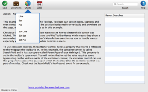
The ToolbarExample project demonstrates a toolbar with these features:
- Standard buttons
- Drop-down menu button
- Container button for search field
Examples/Web/Controls/Toolbar/ToolbarExample
This example shows a menu on a toolbar button:
Examples/Web/Menus/WebToolbarMenu
See Also
WebToolbar, WebToolbarButton, WebToolbarContainer, WebMenuItem classes; UserGuide:Web UI, UserGuide:Web Menus topics

