wx.ComboCtrl
A combo control is a generic combobox that allows totally custom popup.
In addition it has other customization features. For instance, position and size of the dropdown button can be changed.
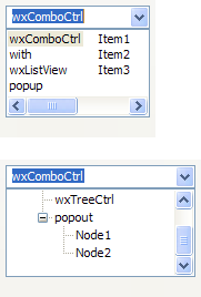
Setting Custom Popup for ComboCtrl¶ wx.ComboCtrl needs to be told somehow which control to use and this is done by SetPopupControl. However, we need something more than just a wx.Control in this method as, for example, we need to call SetStringValue(“initial text value”) and wx.Control doesn’t have such method. So we also need a wx.ComboPopup which is an interface which must be implemented by a control to be usable as a popup. We couldn’t derive wx.ComboPopup from wx.Control as this would make it impossible to have a class deriving from a wxWidgets control and from it, so instead it is just a mix-in. Here’s a minimal sample of wx.ListView popup:
"""
A simple test case for wx.ComboCtrl using a wx.ListCtrl for the popup
"""

import wx

#----------------------------------------------------------------------
# This class is used to provide an interface between a ComboCtrl and the
# ListCtrl that is used as the popoup for the combo widget.

class ListCtrlComboPopup(wx.ComboPopup):

    def __init__(self):
        wx.ComboPopup.__init__(self)
        self.lc = None

    def AddItem(self, txt):
        self.lc.InsertItem(self.lc.GetItemCount(), txt)

    def OnMotion(self, evt):
        item, flags = self.lc.HitTest(evt.GetPosition())
        if item >= 0:
            self.lc.Select(item)
            self.curitem = item

    def OnLeftDown(self, evt):
        self.value = self.curitem
        self.Dismiss()


    # The following methods are those that are overridable from the
    # ComboPopup base class.  Most of them are not required, but all
    # are shown here for demonstration purposes.

    # This is called immediately after construction finishes.  You can
    # use self.GetCombo if needed to get to the ComboCtrl instance.
    def Init(self):
        self.value = -1
        self.curitem = -1

    # Create the popup child control.  Return true for success.
    def Create(self, parent):
        self.lc = wx.ListCtrl(parent, style=wx.LC_LIST | wx.LC_SINGLE_SEL | wx.SIMPLE_BORDER)
        self.lc.Bind(wx.EVT_MOTION, self.OnMotion)
        self.lc.Bind(wx.EVT_LEFT_DOWN, self.OnLeftDown)
        return True

    # Return the widget that is to be used for the popup
    def GetControl(self):
        return self.lc

    # Called just prior to displaying the popup, you can use it to
    # 'select' the current item.
    def SetStringValue(self, val):
        idx = self.lc.FindItem(-1, val)
        if idx != wx.NOT_FOUND:
            self.lc.Select(idx)

    # Return a string representation of the current item.
    def GetStringValue(self):
        if self.value >= 0:
            return self.lc.GetItemText(self.value)
        return ""

    # Called immediately after the popup is shown
    def OnPopup(self):
        wx.ComboPopup.OnPopup(self)

    # Called when popup is dismissed
    def OnDismiss(self):
        wx.ComboPopup.OnDismiss(self)

    # This is called to custom paint in the combo control itself
    # (ie. not the popup).  Default implementation draws value as
    # string.
    def PaintComboControl(self, dc, rect):
        wx.ComboPopup.PaintComboControl(self, dc, rect)

    # Receives key events from the parent ComboCtrl.  Events not
    # handled should be skipped, as usual.
    def OnComboKeyEvent(self, event):
        wx.ComboPopup.OnComboKeyEvent(self, event)

    # Implement if you need to support special action when user
    # double-clicks on the parent wxComboCtrl.
    def OnComboDoubleClick(self):
        wx.ComboPopup.OnComboDoubleClick(self)

    # Return final size of popup. Called on every popup, just prior to OnPopup.
    # minWidth = preferred minimum width for window
    # prefHeight = preferred height. Only applies if > 0,
    # maxHeight = max height for window, as limited by screen size
    #   and should only be rounded down, if necessary.
    def GetAdjustedSize(self, minWidth, prefHeight, maxHeight):
        return wx.ComboPopup.GetAdjustedSize(self, minWidth, prefHeight, maxHeight)

    # Return true if you want delay the call to Create until the popup
    # is shown for the first time. It is more efficient, but note that
    # it is often more convenient to have the control created
    # immediately.
    # Default returns false.
    def LazyCreate(self):
        return wx.ComboPopup.LazyCreate(self)
Here’s how you would create and populate it in a dialog constructor:
comboCtrl = wx.ComboCtrl(self, wx.ID_ANY, "")

popupCtrl = ListViewComboPopup()

# It is important to call SetPopupControl() as soon as possible
comboCtrl.SetPopupControl(popupCtrl)

# Populate using wx.ListView methods
popupCtrl.InsertItem(popupCtrl.GetItemCount(), "First Item")
popupCtrl.InsertItem(popupCtrl.GetItemCount(), "Second Item")
popupCtrl.InsertItem(popupCtrl.GetItemCount(), "Third Item")
 Window Styles
This class supports the following styles:
wx.CB_READONLY: Text will not be editable.wx.CB_SORT: Sorts the entries in the list alphabetically.wx.TE_PROCESS_ENTER: The control will generate the event wxEVT_TEXT_ENTER (otherwise pressing Enter key is either processed internally by the control or used for navigation between dialog controls). Windows only.wx.CC_SPECIAL_DCLICK: Double-clicking triggers a call to popup’s OnComboDoubleClick. Actual behaviour is defined by a derived class. For instance, wx.adv.OwnerDrawnComboBox will cycle an item. This style only applies if wx.CB_READONLY is used as well.wx.CC_STD_BUTTON: Drop button will behave more like a standard push button. Events Emitted by this Class
Handlers bound for the following event types will receive one of the wx.CommandEvent parameters.
wxEVT_TEXT event, when the text changes.wxEVT_TEXT_ENTER event, when RETURN is pressed in the combo control.wxEVT_COMBOBOX_DROPDOWN event, which is generated when the popup window is shown (drops down).wxEVT_COMBOBOX_CLOSEUP event, which is generated when the popup window of the combo control disappears (closes up). You should avoid adding or deleting items in this event. Methods Summary
__init__ |
Default constructor. |
AnimateShow |
This member function is not normally called in application code. |
Copy |
Copies the selected text to the clipboard. |
Create |
Creates the combo control for two-step construction. |
Cut |
Copies the selected text to the clipboard and removes the selection. |
Dismiss |
Dismisses the popup window. |
DoSetPopupControl |
This member function is not normally called in application code. |
DoShowPopup |
This member function is not normally called in application code. |
EnablePopupAnimation |
Enables or disables popup animation, if any, depending on the value of the argument. |
GetBitmapDisabled |
Returns disabled button bitmap that has been set with SetButtonBitmaps . |
GetBitmapHover |
Returns button mouse hover bitmap that has been set with SetButtonBitmaps . |
GetBitmapNormal |
Returns default button bitmap that has been set with SetButtonBitmaps . |
GetBitmapPressed |
Returns depressed button bitmap that has been set with SetButtonBitmaps . |
GetButtonSize |
Returns current size of the dropdown button. |
GetCustomPaintWidth |
Returns custom painted area in control. |
GetFeatures |
Returns features supported by wx.ComboCtrl. |
GetHint |
Returns the current hint string. |
GetInsertionPoint |
Returns the insertion point for the combo control’s text field. |
GetLastPosition |
Returns the last position in the combo control text field. |
GetMargins |
Returns the margins used by the control. |
GetPopupControl |
Returns current popup interface that has been set with SetPopupControl . |
GetPopupWindow |
Returns popup window containing the popup control. |
GetTextCtrl |
Get the text control which is part of the combo control. |
GetTextIndent |
Returns actual indentation in pixels. |
GetTextRect |
Returns area covered by the text field (includes everything except borders and the dropdown button). |
GetValue |
Returns text representation of the current value. |
HidePopup |
Dismisses the popup window. |
IsKeyPopupToggle |
Returns True if given key combination should toggle the popup. |
IsPopupShown |
Returns True if the popup is currently shown. |
IsPopupWindowState |
Returns True if the popup window is in the given state. |
OnButtonClick |
Implement in a derived class to define what happens on dropdown button click. |
Paste |
Pastes text from the clipboard to the text field. |
Popup |
Shows the popup portion of the combo control. |
PrepareBackground |
Prepare background of combo control or an item in a dropdown list in a way typical on platform. |
Remove |
Removes the text between the two positions in the combo control text field. |
Replace |
Replaces the text between two positions with the given text, in the combo control text field. |
SetButtonBitmaps |
Sets custom dropdown button graphics. |
SetButtonPosition |
Sets size and position of dropdown button. |
SetCustomPaintWidth |
Set width, in pixels, of custom painted area in control without CB_READONLY style. |
SetHint |
Sets a hint shown in an empty unfocused combo control. |
SetInsertionPoint |
Sets the insertion point in the text field. |
SetInsertionPointEnd |
Sets the insertion point at the end of the combo control text field. |
SetMargins |
Attempts to set the control margins. |
SetPopupAnchor |
Set side of the control to which the popup will align itself. |
SetPopupControl |
Set popup interface class derived from wx.ComboPopup. |
SetPopupExtents |
Extends popup size horizontally, relative to the edges of the combo control. |
SetPopupMaxHeight |
Sets preferred maximum height of the popup. |
SetPopupMinWidth |
Sets minimum width of the popup. |
SetSelection |
Selects the text between the two positions, in the combo control text field. |
SetText |
Sets the text for the text field without affecting the popup. |
SetTextCtrlStyle |
Set a custom window style for the embedded wx.TextCtrl. |
SetTextIndent |
This will set the space in pixels between left edge of the control and the text, regardless whether control is read-only or not. |
SetValue |
Sets the text for the combo control text field. |
SetValueByUser |
Changes value of the control as if user had done it by selecting an item from a combo box drop-down list. |
ShouldDrawFocus |
Returns True if focus indicator should be drawn in the control. |
ShowPopup |
Show the popup. |
Undo |
Undoes the last edit in the text field. |
UseAltPopupWindow |
Enable or disable usage of an alternative popup window, which guarantees ability to focus the popup control, and allows common native controls to function normally. |
 Properties Summary
BitmapDisabled |
See GetBitmapDisabled |
BitmapHover |
See GetBitmapHover |
BitmapNormal |
See GetBitmapNormal |
BitmapPressed |
See GetBitmapPressed |
ButtonSize |
See GetButtonSize |
CustomPaintWidth |
See GetCustomPaintWidth and SetCustomPaintWidth |
Hint |
See GetHint and SetHint |
InsertionPoint |
See GetInsertionPoint and SetInsertionPoint |
LastPosition |
See GetLastPosition |
Margins |
See GetMargins and SetMargins |
PopupControl |
See GetPopupControl and SetPopupControl |
PopupWindow |
See GetPopupWindow |
TextCtrl |
See GetTextCtrl |
TextIndent |
See GetTextIndent and SetTextIndent |
TextRect |
See GetTextRect |
Value |
See GetValue and SetValue |
 Class API
wx.ComboCtrl(Control, TextEntry)¶Possible constructors:
ComboCtrl()

ComboCtrl(parent, id=ID_ANY, value="", pos=DefaultPosition,
          size=DefaultSize, style=0, validator=DefaultValidator,
          name=ComboBoxNameStr)
A combo control is a generic combobox that allows totally custom popup.
__init__(self, *args, **kw)¶ Overloaded Implementations:
__init__ (self)
Default constructor.
__init__ (self, parent, id=ID_ANY, value=””, pos=DefaultPosition, size=DefaultSize, style=0, validator=DefaultValidator, name=ComboBoxNameStr)
Constructor, creating and showing a combo control.
| Parameters: |
|
|---|
See also
AnimateShow(self, rect, flags)¶This member function is not normally called in application code.
Instead, it can be implemented in a derived class to create a custom popup animation.
The parameters are the same as those for DoShowPopup .
| Parameters: |
|
|---|---|
| Return type: | bool |
| Returns: |
|
Copy(self)¶Copies the selected text to the clipboard.
Create(self, parent, id=ID_ANY, value="", pos=DefaultPosition, size=DefaultSize, style=0, validator=DefaultValidator, name=ComboBoxNameStr)¶Creates the combo control for two-step construction.
Derived classes should call or replace this function. See wx.ComboCtrl for further details.
| Parameters: |
|
|---|---|
| Return type: | bool |
Cut(self)¶Copies the selected text to the clipboard and removes the selection.
Dismiss(self)¶Dismisses the popup window.
Notice that calling this function will generate a wxEVT_COMBOBOX_CLOSEUP event.
New in version 2.9.2.
DoSetPopupControl(self, popup)¶This member function is not normally called in application code.
Instead, it can be implemented in a derived class to return default wx.ComboPopup, in case popup is None.
| Parameters: | popup (wx.ComboPopup) – |
|---|
Note
If you have implemented OnButtonClick to do something else than show the popup, then DoSetPopupControl must always set popup to None.
DoShowPopup(self, rect, flags)¶This member function is not normally called in application code.
Instead, it must be called in a derived class to make sure popup is properly shown after a popup animation has finished (but only if AnimateShow did not finish the animation within its function scope).
| Parameters: |
|
|---|
EnablePopupAnimation(self, enable=True)¶Enables or disables popup animation, if any, depending on the value of the argument.
| Parameters: | enable (bool) – |
|---|
GetBitmapDisabled(self)¶Returns disabled button bitmap that has been set with SetButtonBitmaps .
| Return type: | wx.Bitmap |
|---|---|
| Returns: | A reference to the disabled state bitmap. |
GetBitmapHover(self)¶Returns button mouse hover bitmap that has been set with SetButtonBitmaps .
| Return type: | wx.Bitmap |
|---|---|
| Returns: | A reference to the mouse hover state bitmap. |
GetBitmapNormal(self)¶Returns default button bitmap that has been set with SetButtonBitmaps .
| Return type: | wx.Bitmap |
|---|---|
| Returns: | A reference to the normal state bitmap. |
GetBitmapPressed(self)¶Returns depressed button bitmap that has been set with SetButtonBitmaps .
| Return type: | wx.Bitmap |
|---|---|
| Returns: | A reference to the depressed state bitmap. |
GetCustomPaintWidth(self)¶Returns custom painted area in control.
| Return type: | int |
|---|
See also
GetFeatures()¶Returns features supported by wx.ComboCtrl.
If needed feature is missing, you need to instead use GenericComboCtrl, which however may lack a native look and feel (but otherwise sports identical API).
| Return type: | int |
|---|---|
| Returns: | Value returned is a combination of the flags defined in wx.ComboCtrlFeatures. |
GetHint(self)¶Returns the current hint string.
See SetHint for more information about hints.
| Return type: | string |
|---|
New in version 2.9.1.
GetInsertionPoint(self)¶Returns the insertion point for the combo control’s text field.
| Return type: | long |
|---|
Note
Under Windows, this function always returns 0 if the combo control doesn’t have the focus.
GetLastPosition(self)¶Returns the last position in the combo control text field.
| Return type: | long |
|---|
GetMargins(self)¶Returns the margins used by the control.
The x field of the returned point is the horizontal margin and the y field is the vertical one.
| Return type: | wx.Point |
|---|
New in version 2.9.1.
Note
If given margin cannot be accurately determined, its value will be set to -1.
See also
GetPopupControl(self)¶Returns current popup interface that has been set with SetPopupControl .
| Return type: | wx.ComboPopup |
|---|
GetTextCtrl(self)¶Get the text control which is part of the combo control.
| Return type: | wx.TextCtrl |
|---|
GetTextIndent(self)¶Returns actual indentation in pixels.
| Return type: | wx.Coord |
|---|
Deprecated since version 4.0.1: Use GetMargins instead.
GetTextRect(self)¶Returns area covered by the text field (includes everything except borders and the dropdown button).
| Return type: | wx.Rect |
|---|
GetValue(self)¶Returns text representation of the current value.
For writable combo control it always returns the value in the text field.
| Return type: | string |
|---|
HidePopup(self, generateEvent=False)¶Dismisses the popup window.
| Parameters: | generateEvent (bool) – Set this to True in order to generate wxEVT_COMBOBOX_CLOSEUP event. |
|---|
Deprecated since version 4.0.1: Use Dismiss instead.
IsKeyPopupToggle(self, event)¶Returns True if given key combination should toggle the popup.
| Parameters: | event (wx.KeyEvent) – |
|---|---|
| Return type: | bool |
IsPopupShown(self)¶Returns True if the popup is currently shown.
| Return type: | bool |
|---|
IsPopupWindowState(self, state)¶Returns True if the popup window is in the given state.
Possible values are:
| ComboCtrl.Hidden | Popup window is hidden. |
| ComboCtrl.Animating | Popup window is being shown, but the popup animation has not yet finished. |
| ComboCtrl.Visible | Popup window is fully visible. |
| Parameters: | state (int) – |
|---|---|
| Return type: | bool |
OnButtonClick(self)¶Implement in a derived class to define what happens on dropdown button click.
Default action is to show the popup.
Note
If you implement this to do something else than show the popup, you must then also implement DoSetPopupControl to always return None.
Paste(self)¶Pastes text from the clipboard to the text field.
Popup(self)¶Shows the popup portion of the combo control.
Notice that calling this function will generate a wxEVT_COMBOBOX_DROPDOWN event.
New in version 2.9.2.
PrepareBackground(self, dc, rect, flags)¶Prepare background of combo control or an item in a dropdown list in a way typical on platform.
This includes painting the focus/disabled background and setting the clipping region.
Unless you plan to paint your own focus indicator, you should always call this in your wx.ComboPopup.PaintComboControl implementation. In addition, it sets pen and text colour to what looks good and proper against the background.
flags: wx.RendererNative flags: wx.CONTROL_ISSUBMENU: is drawing a list item instead of combo control wx.CONTROL_SELECTED: list item is selected wx.CONTROL_DISABLED: control/item is disabled
| Parameters: |
|---|
Remove(self, frm, to)¶Removes the text between the two positions in the combo control text field.
| Parameters: |
|
|---|
The first position.
Replace(self, frm, to, text)¶Replaces the text between two positions with the given text, in the combo control text field.
| Parameters: |
|
|---|
The first position.
SetButtonBitmaps(self, bmpNormal, pushButtonBg=False, bmpPressed=NullBitmap, bmpHover=NullBitmap, bmpDisabled=NullBitmap)¶Sets custom dropdown button graphics.
| Parameters: |
|
|---|
SetButtonPosition(self, width=-1, height=-1, side=RIGHT, spacingX=0)¶Sets size and position of dropdown button.
| Parameters: |
|
|---|
SetCustomPaintWidth(self, width)¶Set width, in pixels, of custom painted area in control without CB_READONLY style.
In read-only wx.adv.OwnerDrawnComboBox, this is used to indicate area that is not covered by the focus rectangle.
| Parameters: | width (int) – |
|---|
SetHint(self, hint)¶Sets a hint shown in an empty unfocused combo control.
Notice that hints are known as cue banners under MSW or placeholder strings under OS X.
| Parameters: | hint (string) – |
|---|---|
| Return type: | bool |
New in version 2.9.1.
See also
SetInsertionPoint(self, pos)¶Sets the insertion point in the text field.
| Parameters: | pos (long) – The new insertion point. |
|---|
SetInsertionPointEnd(self)¶Sets the insertion point at the end of the combo control text field.
SetMargins(self, *args, **kw)¶Attempts to set the control margins.
When margins are given as wx.Point, x indicates the left and y the top margin. Use -1 to indicate that an existing value should be used.
| Returns: | True if setting of all requested margins was successful. |
|---|
New in version 2.9.1.
Overloaded Implementations:
SetMargins (self, pt)
| Parameters: | pt (wx.Point) – |
|---|---|
| Return type: | bool |
SetMargins (self, left, top=-1)
| Parameters: |
|
|---|---|
| Return type: | bool |
SetPopupAnchor(self, anchorSide)¶Set side of the control to which the popup will align itself.
Valid values are LEFT , RIGHT and 0. The default value 0 means that the most appropriate side is used (which, currently, is always LEFT ).
| Parameters: | anchorSide (int) – |
|---|
SetPopupControl(self, popup)¶Set popup interface class derived from wx.ComboPopup.
This method should be called as soon as possible after the control has been created, unless OnButtonClick has been overridden.
| Parameters: | popup (wx.ComboPopup) – |
|---|
SetPopupExtents(self, extLeft, extRight)¶Extends popup size horizontally, relative to the edges of the combo control.
| Parameters: |
|
|---|
Note
Popup minimum width may override arguments. It is up to the popup to fully take this into account.
SetPopupMaxHeight(self, height)¶Sets preferred maximum height of the popup.
| Parameters: | height (int) – |
|---|
Note
Value -1 indicates the default.
SetPopupMinWidth(self, width)¶Sets minimum width of the popup.
If wider than combo control, it will extend to the left.
| Parameters: | width (int) – |
|---|
Note
Value -1 indicates the default. Also, popup implementation may choose to ignore this.
SetSelection(self, frm, to)¶Selects the text between the two positions, in the combo control text field.
| Parameters: |
|
|---|
The first position.
SetText(self, value)¶Sets the text for the text field without affecting the popup.
Thus, unlike SetValue , it works equally well with combo control using CB_READONLY style.
| Parameters: | value (string) – |
|---|
SetTextCtrlStyle(self, style)¶Set a custom window style for the embedded wx.TextCtrl.
Usually you will need to use this during two-step creation, just before Create . For example:
comboCtrl = wx.ComboCtrl()

# Let's make the text right-aligned
comboCtrl.SetTextCtrlStyle(wx.TE_RIGHT)

comboCtrl.Create(parent, wx.ID_ANY, "")
| Parameters: | style (int) – |
|---|
SetTextIndent(self, indent)¶This will set the space in pixels between left edge of the control and the text, regardless whether control is read-only or not.
Value -1 can be given to indicate platform default.
| Parameters: | indent (int) – |
|---|
Deprecated since version 4.0.1: Use SetMargins instead.
SetValue(self, value)¶Sets the text for the combo control text field.
| Parameters: | value (string) – |
|---|
Note
For a combo control with CB_READONLY style the string must be accepted by the popup (for instance, exist in the dropdown list), otherwise the call to SetValue is ignored.
SetValueByUser(self, value)¶Changes value of the control as if user had done it by selecting an item from a combo box drop-down list.
| Parameters: | value (string) – |
|---|
ShouldDrawFocus(self)¶Returns True if focus indicator should be drawn in the control.
| Return type: | bool |
|---|
Undo(self)¶Undoes the last edit in the text field.
Windows only.
UseAltPopupWindow(self, enable=True)¶Enable or disable usage of an alternative popup window, which guarantees ability to focus the popup control, and allows common native controls to function normally.
This alternative popup window is usually a wx.Dialog, and as such, when it is shown, its parent top-level window will appear as if the focus has been lost from it.
| Parameters: | enable (bool) – |
|---|
BitmapDisabled¶BitmapHover¶See GetBitmapHover
BitmapNormal¶See GetBitmapNormal
BitmapPressed¶See GetBitmapPressed
ButtonSize¶See GetButtonSize
CustomPaintWidth¶InsertionPoint¶See GetInsertionPoint and SetInsertionPoint
LastPosition¶See GetLastPosition
Margins¶See GetMargins and SetMargins
PopupControl¶See GetPopupControl and SetPopupControl
PopupWindow¶See GetPopupWindow
TextCtrl¶See GetTextCtrl
TextIndent¶See GetTextIndent and SetTextIndent
TextRect¶See GetTextRect


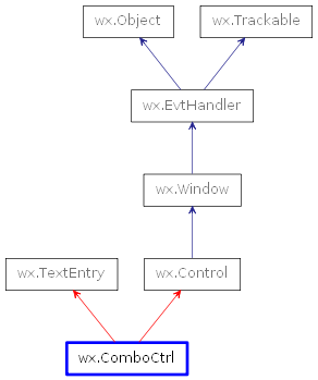
 Inheritance diagram for class ComboCtrl: