wx.adv.OwnerDrawnComboBox
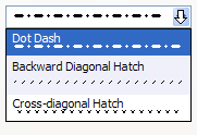
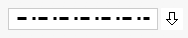
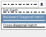
wx.adv.OwnerDrawnComboBox is a combobox with owner-drawn list items.
In essence, it is a wx.ComboCtrl with wx.VListBox popup and wx.ControlWithItems interface.
Implementing item drawing and measuring is similar to wx.VListBox. Application needs to subclass wx.adv.OwnerDrawnComboBox and implement OnDrawItem, OnMeasureItem and OnMeasureItemWidth.
 Window Styles
This class supports the following styles:
wx.adv.ODCB_DCLICK_CYCLES: Double-clicking cycles item if wx.CB_READONLY is also used. Synonymous with wx.CC_SPECIAL_DCLICK.wx.adv.ODCB_STD_CONTROL_PAINT: Control itself is not custom painted using OnDrawItem. Even if this style is not used, writable wx.adv.OwnerDrawnComboBox is never custom painted unless SetCustomPaintWidth is called. Events Emitted by this Class
Handlers bound for the following event types will receive a wx.CommandEvent parameter.
GetValue returns the new value of selection.See also
wx.ComboCtrl window styles and Window Styles.
See also
Events emitted by wx.ComboCtrl.
See also
 Methods Summary
__init__ |
Default constructor. |
Create |
Creates the combobox for two-step construction. |
GetWidestItem |
Returns index to the widest item in the list. |
GetWidestItemWidth |
Returns width of the widest item in the list. |
OnDrawBackground |
This method is used to draw the items background and, maybe, a border around it. |
OnDrawItem |
The derived class may implement this function to actually draw the item with the given index on the provided DC. |
OnMeasureItem |
The derived class may implement this method to return the height of the specified item (in pixels). |
OnMeasureItemWidth |
The derived class may implement this method to return the width of the specified item (in pixels). |
 Class API
wx.adv.OwnerDrawnComboBox(ComboCtrl, ItemContainer)¶Possible constructors:
OwnerDrawnComboBox()

OwnerDrawnComboBox(parent, id=ID_ANY, value="", pos=DefaultPosition,
                   size=DefaultSize, choices=[], style=0, validator=DefaultValidator,
                   name="comboBox")
OwnerDrawnComboBox is a combobox with owner-drawn list items.
__init__(self, *args, **kw)¶ Overloaded Implementations:
__init__ (self)
Default constructor.
__init__ (self, parent, id=ID_ANY, value=””, pos=DefaultPosition, size=DefaultSize, choices=[], style=0, validator=DefaultValidator, name=”comboBox”)
Constructor, creating and showing a owner-drawn combobox.
| Parameters: |
|
|---|
See also
Create(self, parent, id=ID_ANY, value="", pos=DefaultPosition, size=DefaultSize, choices=[], style=0, validator=DefaultValidator, name=ComboBoxNameStr)¶Creates the combobox for two-step construction.
See wx.adv.OwnerDrawnComboBox for further details.
| Parameters: |
|
|---|---|
| Return type: | bool |
Note
Derived classes should call or replace this function.
GetWidestItem(self)¶Returns index to the widest item in the list.
| Return type: | int |
|---|
GetWidestItemWidth(self)¶Returns width of the widest item in the list.
| Return type: | int |
|---|
OnDrawBackground(self, dc, rect, item, flags)¶This method is used to draw the items background and, maybe, a border around it.
The base class version implements a reasonable default behaviour which consists in drawing the selected item with the standard background colour and drawing a border around the item if it is either selected or current.
| Parameters: |
|---|
Note
flags has the same meaning as with OnDrawItem .
OnDrawItem(self, dc, rect, item, flags)¶The derived class may implement this function to actually draw the item with the given index on the provided DC.
If function is not implemented, the item text is simply drawn, as if the control was a normal combobox.
| Parameters: |
|
|---|
OnMeasureItem(self, item)¶The derived class may implement this method to return the height of the specified item (in pixels).
The default implementation returns text height, as if this control was a normal combobox.
| Parameters: | item (int) – |
|---|---|
| Return type: | wx.Coord |
OnMeasureItemWidth(self, item)¶The derived class may implement this method to return the width of the specified item (in pixels).
If -1 is returned, then the item text width is used.
The default implementation returns -1.
| Parameters: | item (int) – |
|---|---|
| Return type: | wx.Coord |
WidestItem¶See GetWidestItem
WidestItemWidth


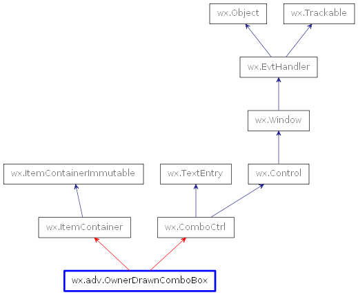
 Inheritance diagram for class OwnerDrawnComboBox: