wx.VListBox
 wx.VListBox is a ListBox-like control with the following two main differences from a regular wx.ListBox: it can have an arbitrarily huge number of items because it doesn’t store them itself but uses the OnDrawItem callback to draw them (so it is a virtual listbox) and its items can have variable height as determined by OnMeasureItem (so it is also a listbox with the lines of variable height).
Also, as a consequence of its virtual nature, it doesn’t have any methods to append or insert items in it as it isn’t necessary to do it: you just have to call SetItemCount to tell the control how many items it should display. Of course, this also means that you will never use this class directly because it has pure virtual functions, but will need to derive your own class from it (for example, wx.html.HtmlListBox).
However it emits the same events as wx.ListBox and the same event macros may be used with it. Since wx.VListBox does not store its items itself, the events will only contain the index, not any contents such as the string of an item.
See also
 Methods Summary
__init__ |
Default constructor, you must call Create later. |
Clear |
Deletes all items from the control. |
Create |
Creates the control. |
DeselectAll |
Deselects all the items in the listbox. |
GetFirstSelected |
Returns the index of the first selected item in the listbox or NOT_FOUND if no items are currently selected. |
GetItemCount |
Get the number of items in the control. |
GetItemRect |
Returns the rectangle occupied by this item in physical coordinates. |
GetMargins |
Returns the margins used by the control. |
GetNextSelected |
Returns the index of the next selected item or NOT_FOUND if there are no more. |
GetSelectedCount |
Returns the number of the items currently selected. |
GetSelection |
Get the currently selected item or NOT_FOUND if there is no selection. |
GetSelectionBackground |
Returns the background colour used for the selected cells. |
HasMultipleSelection |
Returns True if the listbox was created with LB_MULTIPLE style and so supports multiple selection or False if it is a single selection listbox. |
IsCurrent |
Returns True if this item is the current one, False otherwise. |
IsSelected |
Returns True if this item is selected, False otherwise. |
OnDrawBackground |
This method is used to draw the item’s background and, maybe, a border around it. |
OnDrawItem |
The derived class must implement this function to actually draw the item with the given index on the provided DC. |
OnDrawSeparator |
This method may be used to draw separators between the lines. |
OnMeasureItem |
The derived class must implement this method to return the height of the specified item (in pixels). |
Select |
Selects or deselects the specified item which must be valid (i.e. not equal to NOT_FOUND ). |
SelectAll |
Selects all the items in the listbox. |
SelectRange |
Selects all items in the specified range which may be given in any order. |
SetItemCount |
Set the number of items to be shown in the control. |
SetMargins |
Set the margins: horizontal margin is the distance between the window border and the item contents while vertical margin is half of the distance between items. |
SetSelection |
Set the selection to the specified item, if it is -1 the selection is unset. |
SetSelectionBackground |
Sets the colour to be used for the selected cells background. |
Toggle |
Toggles the state of the specified item, i.e. selects it if it was unselected and deselects it if it was selected. |
 Properties Summary
ItemCount |
See GetItemCount and SetItemCount |
Margins |
See GetMargins and SetMargins |
SelectedCount |
See GetSelectedCount |
Selection |
See GetSelection and SetSelection |
SelectionBackground |
See GetSelectionBackground and SetSelectionBackground |
 Class API
wx.VListBox(VScrolledWindow)¶Possible constructors:
VListBox()

VListBox(parent, id=ID_ANY, pos=DefaultPosition, size=DefaultSize,
         style=0, name=VListBoxNameStr)
VListBox is a ListBox-like control with the following two main differences from a regular ListBox: it can have an arbitrarily huge number of items because it doesn’t store them itself but uses the OnDrawItem() callback to draw them (so it is a virtual listbox) and its items can have variable height as determined by OnMeasureItem() (so it is also a listbox with the lines of variable height).
__init__(self, *args, **kw)¶ Overloaded Implementations:
__init__ (self)
Default constructor, you must call Create later.
__init__ (self, parent, id=ID_ANY, pos=DefaultPosition, size=DefaultSize, style=0, name=VListBoxNameStr)
Normal constructor which calls Create internally.
| Parameters: |
|---|
Clear(self)¶Deletes all items from the control.
Create(self, parent, id=ID_ANY, pos=DefaultPosition, size=DefaultSize, style=0, name=VListBoxNameStr)¶Creates the control.
To finish creating it you also should call SetItemCount to let it know about the number of items it contains.
The only special style which may be used with wx.VListBox is LB_MULTIPLE which indicates that the listbox should support multiple selection.
| Parameters: | |
|---|---|
| Return type: | bool |
| Returns: |
|
DeselectAll(self)¶Deselects all the items in the listbox.
This method is only valid for multi selection listboxes.
| Return type: | bool |
|---|---|
| Returns: | True if any items were changed, i.e. if there had been any selected items before, or False if all the items were already deselected. |
GetFirstSelected(self)¶Returns the index of the first selected item in the listbox or NOT_FOUND if no items are currently selected.
cookie is an opaque parameter which should be passed to the subsequent calls to GetNextSelected . It is needed in order to allow parallel iterations over the selected items.
Here is a typical example of using these functions:
item, cookie = vlbox.GetFirstSelected()
while item != wx.NOT_FOUND:
    # ... process item ...
    item, cookie = vlbox.GetNextSelected(cookie)
This method is only valid for multi selection listboxes.
| Return type: | tuple |
|---|---|
| Returns: | ( int, cookie ) |
GetItemCount(self)¶Get the number of items in the control.
| Return type: | int |
|---|
See also
GetItemRect(self, item)¶Returns the rectangle occupied by this item in physical coordinates.
If the item is not currently visible, returns an empty rectangle.
| Parameters: | item (int) – |
|---|---|
| Return type: | wx.Rect |
New in version 2.9.0.
GetMargins(self)¶Returns the margins used by the control.
The x field of the returned point is the horizontal margin and the y field is the vertical one.
| Return type: | wx.Point |
|---|
See also
GetNextSelected(self, cookie)¶Returns the index of the next selected item or NOT_FOUND if there are no more.
This method is only valid for multi selection listboxes.
| Parameters: | cookie (long) – |
|---|---|
| Return type: | tuple |
| Returns: | ( int, cookie ) |
See also
GetSelectedCount(self)¶Returns the number of the items currently selected.
It is valid for both single and multi selection controls. In the former case it may only return 0 or 1 however.
| Return type: | int |
|---|
See also
GetSelection(self)¶Get the currently selected item or NOT_FOUND if there is no selection.
| Return type: | int |
|---|
GetSelectionBackground(self)¶Returns the background colour used for the selected cells.
By default the standard system colour is used.
| Return type: | wx.Colour |
|---|
HasMultipleSelection(self)¶Returns True if the listbox was created with LB_MULTIPLE style and so supports multiple selection or False if it is a single selection listbox.
| Return type: | bool |
|---|
IsCurrent(self, item)¶Returns True if this item is the current one, False otherwise.
The current item is always the same as selected one for the single selection listbox and in this case this method is equivalent to IsSelected but they are different for multi selection listboxes where many items may be selected but only one (at most) is current.
| Parameters: | item (int) – |
|---|---|
| Return type: | bool |
IsSelected(self, item)¶Returns True if this item is selected, False otherwise.
| Parameters: | item (int) – |
|---|---|
| Return type: | bool |
OnDrawBackground(self, dc, rect, n)¶This method is used to draw the item’s background and, maybe, a border around it.
The base class version implements a reasonable default behaviour which consists in drawing the selected item with the standard background colour and drawing a border around the item if it is either selected or current.
| Parameters: |
|---|
Todo
Change this function signature to non-const.
OnDrawItem(self, dc, rect, n)¶The derived class must implement this function to actually draw the item with the given index on the provided DC.
| Parameters: |
|---|
Todo
Change this function signature to non-const.
OnDrawSeparator(self, dc, rect, n)¶This method may be used to draw separators between the lines.
The rectangle passed to it may be modified, typically to deflate it a bit before passing to OnDrawItem .
The base class version of this method doesn’t do anything.
| Parameters: |
|---|
Todo
Change this function signature to non-const.
OnMeasureItem(self, n)¶The derived class must implement this method to return the height of the specified item (in pixels).
| Parameters: | n (int) – |
|---|---|
| Return type: | wx.Coord |
Select(self, item, select=True)¶Selects or deselects the specified item which must be valid (i.e. not equal to NOT_FOUND ).
This function is only valid for the multiple selection listboxes, use SetSelection for the single selection ones.
| Parameters: |
|
|---|---|
| Return type: | bool |
| Returns: |
|
SelectAll(self)¶Selects all the items in the listbox.
This method is only valid for multi selection listboxes.
| Return type: | bool |
|---|---|
| Returns: | True if any items were changed, i.e. if there had been any unselected items before, or False if all the items were already selected. |
See also
SelectRange(self, from_, to_)¶Selects all items in the specified range which may be given in any order.
This method is only valid for multi selection listboxes.
| Parameters: |
|
|---|---|
| Return type: | bool |
| Returns: |
|
SetItemCount(self, count)¶Set the number of items to be shown in the control.
This is just a synonym for wx.VScrolledWindow.SetRowCount .
| Parameters: | count (int) – |
|---|
SetMargins(self, *args, **kw)¶Set the margins: horizontal margin is the distance between the window border and the item contents while vertical margin is half of the distance between items.
By default both margins are 0.
Overloaded Implementations:
SetMargins (self, pt)
| Parameters: | pt (wx.Point) – |
|---|
SetMargins (self, x, y)
| Parameters: |
|
|---|
SetSelection(self, selection)¶Set the selection to the specified item, if it is -1 the selection is unset.
The selected item will be automatically scrolled into view if it isn’t currently visible.
This method may be used both with single and multiple selection listboxes.
| Parameters: | selection (int) – |
|---|
SetSelectionBackground(self, col)¶Sets the colour to be used for the selected cells background.
The background of the standard cells may be changed by simply calling wx.Window.SetBackgroundColour .
| Parameters: | col (wx.Colour) – |
|---|
Note
Using a non-default background colour may result in control having an appearance different from the similar native controls and should be avoided in general.
See also
Toggle(self, item)¶Toggles the state of the specified item, i.e. selects it if it was unselected and deselects it if it was selected.
This method is only valid for multi selection listboxes.
| Parameters: | item (int) – |
|---|
See also
ItemCount¶See GetItemCount and SetItemCount
Margins¶See GetMargins and SetMargins
SelectedCount¶See GetSelectedCount
Selection¶See GetSelection and SetSelection
SelectionBackground


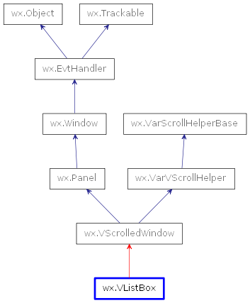
 Inheritance diagram for class VListBox: