Navigation

- Home |
- Gallery |
- API Docs »
- wx.lib »
- wx.lib.agw »
- wx.lib.agw.ultimatelistctrl »
- wx.lib.agw.ultimatelistctrl.UltimateListCtrl
- index
- modules |
- next |
- previous |

 wx.lib.agw.ultimatelistctrl.UltimateListCtrl
UltimateListCtrl is a class that mimics the behaviour of ListCtrl, with almost
the same base functionalities plus some more enhancements. This class does
not rely on the native control, as it is a full owner-drawn list control.
 Methods Summary
__init__ |
Default class constructor. |
Append |
Append an item to the UltimateListCtrl. |
Arrange |
Arranges the items in icon or small icon view. |
AssignImageList |
Assigns the image list associated with the control. |
ClearAll |
Deletes everything in UltimateListCtrl. |
ClearColumnImage |
Clears all the images in the specified column. |
ClientToScreen |
Converts to screen coordinates from coordinates relative to this window. |
ClientToScreenXY |
Converts to screen coordinates from coordinates relative to this window. |
CreateOrDestroyFooterWindowAsNeeded |
Creates or destroys the footer window depending on the window style flags. |
CreateOrDestroyHeaderWindowAsNeeded |
Creates or destroys the header window depending on the window style flags. |
DeleteAllColumns |
Deletes all the column in UltimateListCtrl. |
DeleteAllItems |
Deletes all items in the UltimateListCtrl. |
DeleteColumn |
Deletes the specified column. |
DeleteItem |
Deletes the specified item. |
DeleteItemWindow |
Deletes the window associated to an item (if any). |
DoGetBestSize |
Gets the size which best suits the window: for a control, it would be the |
DoLayout |
Layouts the header, main and footer windows. This is an auxiliary method to avoid code |
EditLabel |
Starts editing an item label. |
EnableItem |
Enables/disables an item. |
EnableSelectionGradient |
Globally enables/disables drawing of gradient selections. |
EnableSelectionVista |
Globally enables/disables drawing of Windows Vista selections. |
EnsureVisible |
Ensures this item is visible. |
FindItem |
Find an item whose label matches this string. |
FindItemAtPos |
Find an item nearest this position. |
FindItemData |
Find an item whose data matches this data. |
Focus |
Focus and show the given item. |
GetAGWWindowStyleFlag |
Returns the UltimateListCtrl AGW-specific style flag. |
GetBackgroundColour |
Returns the background colour of the window. |
GetBackgroundImage |
Returns the UltimateListCtrl background image (if any). |
GetClassDefaultAttributes |
Returns the default font and colours which are used by the control. This is |
GetColumn |
Returns information about this column. |
GetColumnCount |
Returns the total number of columns in the UltimateListCtrl. |
GetColumnWidth |
Returns the column width for the input column. |
GetCountPerPage |
Returns the number of items that can fit vertically in the visible area |
GetDefaultBorder |
Returns the default window border. |
GetDisabledTextColour |
Returns the items disabled colour. |
GetDropTarget |
Returns the associated drop target, which may be None. |
GetEditControl |
Returns a pointer to the edit UltimateListTextCtrl if the item is being edited or |
GetFirstGradientColour |
Returns the first gradient colour for gradient-style selections. |
GetFirstSelected |
Return first selected item, or -1 when none is selected. |
GetFocusedItem |
Returns the currently focused item or -1 if none is focused. |
GetFooterHeight |
Returns the UltimateListHeaderWindow height, in pixels. |
GetForegroundColour |
Returns the foreground colour of the window. |
GetGradientStyle |
Returns the gradient style for gradient-style selections. |
GetHeaderHeight |
Returns the UltimateListHeaderWindow height, in pixels. |
GetHyperTextFont |
Returns the font used to render an hypertext item. |
GetHyperTextNewColour |
Returns the colour used to render a non-visited hypertext item. |
GetHyperTextVisitedColour |
Returns the colour used to render a visited hypertext item. |
GetImageList |
Returns the image list associated with the control. |
GetItem |
Returns the information about the input item. |
GetItemBackgroundColour |
Returns the item background colour. |
GetItemCount |
Returns the number of items in the UltimateListCtrl. |
GetItemCustomRenderer |
Returns the custom renderer used to draw the input item (if any). |
GetItemData |
Gets the application-defined data associated with this item. |
GetItemFont |
Returns the item font. |
GetItemKind |
Returns the item kind. |
GetItemOverFlow |
Returns if the item is in the overflow state. |
GetItemPosition |
Returns the position of the item, in icon or small icon view. |
GetItemPyData |
Returns the data for the item, which can be any Python object. |
GetItemRect |
Returns the rectangle representing the item’s size and position, in physical |
GetItemSpacing |
Returns the spacing between item texts and icons, in pixels. |
GetItemState |
Returns the item state flags for the input item. |
GetItemText |
Returns the item text. |
GetItemTextColour |
Returns the item text colour. |
GetItemVisited |
Returns whether an hypertext item was visited. |
GetItemWindow |
Returns the window associated to the item (if any). |
GetItemWindowEnabled |
Returns whether the window associated to the item is enabled. |
GetNextItem |
Searches for an item with the given geometry or state, starting from item |
GetNextSelected |
Returns subsequent selected items, or -1 when no more are selected. |
GetScrolledWin |
Returns the header window owner. |
GetScrollPos |
Returns the scrollbar position. |
GetScrollRange |
Returns the scrollbar range in pixels. |
GetScrollThumb |
Returns the scrollbar size in pixels. |
GetSecondGradientColour |
Returns the second gradient colour for gradient-style selections. |
GetSelectedItemCount |
Returns the number of selected items in UltimateListCtrl. |
GetSubItemRect |
Returns the rectangle representing the size and position, in physical coordinates, |
GetTextColour |
Returns the UltimateListCtrl foreground colour. |
GetTopItem |
Gets the index of the topmost visible item when in list or report view. |
GetUserLineHeight |
Returns the custom value for the UltimateListCtrl item height, if previously set with |
GetViewRect |
Returns the rectangle taken by all items in the control. In other words, |
GetWaterMark |
Returns the UltimateListCtrl watermark image (if any), displayed in the |
HasAGWFlag |
Returns True if the window has the given flag bit set. |
HasFooter |
Returns True if UltimateListCtrl has a footer window. |
HasHeader |
Returns True if UltimateListCtrl has a header window. |
HitTest |
HitTest method for a UltimateListCtrl. |
InsertColumn |
Inserts a column into UltimateListCtrl. |
InsertColumnInfo |
Inserts a column into UltimateListCtrl. |
InsertImageItem |
Inserts an image item at the given location. |
InsertImageStringItem |
Inserts an image+string item at the given location. |
InsertItem |
Inserts an item into UltimateListCtrl. |
InsertStringItem |
Inserts a string item at the given location. |
IsColumnShown |
Returns True if the input column is shown, False if it is hidden. |
IsItemChecked |
Returns whether an item is checked or not. |
IsItemEnabled |
Returns whether an item is enabled or not. |
IsItemHyperText |
Returns whether an item is hypertext or not. |
IsSelected |
Returns True if the item is selected. |
IsVirtual |
Returns True if the UltimateListCtrl has the ULC_VIRTUAL style set. |
OnGetItemAttr |
This function may be overloaded in the derived class for a control with |
OnGetItemCheck |
This function may be overloaded in the derived class for a control with |
OnGetItemColumnCheck |
This function must be overloaded in the derived class for a control with |
OnGetItemColumnImage |
This function must be overloaded in the derived class for a control with |
OnGetItemColumnKind |
This function must be overloaded in the derived class for a control with |
OnGetItemImage |
This function must be overloaded in the derived class for a control with |
OnGetItemKind |
This function must be overloaded in the derived class for a control with |
OnGetItemText |
This function must be overloaded in the derived class for a control with |
OnGetItemTextColour |
This function must be overloaded in the derived class for a control with |
OnGetItemToolTip |
This function must be overloaded in the derived class for a control with |
OnInternalIdle |
This method is normally only used internally, but sometimes an application |
OnSetFocus |
Handles the wx.EVT_SET_FOCUS event for UltimateListCtrl. |
OnSize |
Handles the wx.EVT_SIZE event for UltimateListCtrl. |
PopupMenu |
Pops up the given menu at the specified coordinates, relative to this window, |
Refresh |
Causes this window, and all of its children recursively (except under wxGTK1 |
RefreshItem |
Redraws the given item. |
RefreshItems |
Redraws the items between itemFrom and itemTo. |
ScreenToClient |
Converts from screen to client window coordinates. |
ScreenToClientXY |
Converts from screen to client window coordinates. |
ScrollList |
Scrolls the UltimateListCtrl. |
Select |
Selects/deselects an item. |
SetAGWWindowStyleFlag |
Sets the UltimateListCtrl AGW-specific style flag. |
SetBackgroundColour |
Changes the background colour of UltimateListCtrl. |
SetBackgroundImage |
Sets the UltimateListCtrl background image. |
SetColumn |
Sets information about this column. |
SetColumnCustomRenderer |
Associate a custom renderer to this column’s header. |
SetColumnImage |
Sets one or more images to the specified column. |
SetColumnShown |
Sets the specified column as shown or hidden. |
SetColumnToolTip |
Sets the tooltip for the column header |
SetColumnWidth |
Sets the column width. |
SetCursor |
Sets the window’s cursor. |
SetDisabledTextColour |
Sets the items disabled colour. |
SetDropTarget |
Associates a drop target with this window. |
SetFirstGradientColour |
Sets the first gradient colour for gradient-style selections. |
SetFocus |
This sets the window to receive keyboard input. |
SetFont |
Sets the UltimateListCtrl font. |
SetFooterCustomRenderer |
Associate a custom renderer with the footer - all columns will use it. |
SetFooterHeight |
Sets the UltimateListHeaderWindow height, in pixels. This overrides the default |
SetForegroundColour |
Changes the foreground colour of UltimateListCtrl. |
SetGradientStyle |
Sets the gradient style for gradient-style selections. |
SetHeaderCustomRenderer |
Associate a custom renderer with the header - all columns will use it. |
SetHeaderHeight |
Sets the UltimateListHeaderWindow height, in pixels. This overrides the default |
SetHyperTextFont |
Sets the font used to render hypertext items. |
SetHyperTextNewColour |
Sets the colour used to render a non-visited hypertext item. |
SetHyperTextVisitedColour |
Sets the colour used to render a visited hypertext item. |
SetImageList |
Sets the image list associated with the control. |
SetItem |
Sets the information about the input item. |
SetItemBackgroundColour |
Sets the item background colour. |
SetItemColumnImage |
Sets a Python list of image indexes associated with the item in the input |
SetItemCount |
Sets the total number of items we handle. |
SetItemCustomRenderer |
Associate a custom renderer to this item. |
SetItemData |
Sets the application-defined data associated with this item. |
SetItemFont |
Sets the item font. |
SetItemHyperText |
Sets whether the item is hypertext or not. |
SetItemImage |
Sets a Python list of image indexes associated with the item. |
SetItemKind |
Sets the item kind. |
SetItemOverFlow |
Sets the item in the overflow/non overflow state. |
SetItemPosition |
Sets the position of the item, in icon or small icon view. |
SetItemPyData |
Sets the data for the item, which can be any Python object. |
SetItemSpacing |
Sets the spacing between item texts and icons. |
SetItemState |
Sets the item state flags for the input item. |
SetItemText |
Sets the item text. |
SetItemTextColour |
Sets the item text colour. |
SetItemVisited |
Sets whether an hypertext item was visited or not. |
SetItemWindow |
Sets the window for the given item. |
SetItemWindowEnabled |
Enables/disables the window associated to the item. |
SetScrollPos |
Sets the scrollbar position. |
SetSecondGradientColour |
Sets the second gradient colour for gradient-style selections. |
SetSingleStyle |
Adds or removes a single window style. |
SetStringItem |
Sets a string or image at the given location. |
SetTextColour |
Sets the UltimateListCtrl foreground colour. |
SetUserLineHeight |
Sets a custom value for the UltimateListCtrl item height. |
SetWaterMark |
Sets the UltimateListCtrl watermark image to be displayed in the bottom |
SortItems |
Call this function to sort the items in the UltimateListCtrl. Sorting is done |
Update |
Calling this method immediately repaints the invalidated area of the window |
 Class API
UltimateListCtrl(wx.Control)¶UltimateListCtrl is a class that mimics the behaviour of ListCtrl, with almost
the same base functionalities plus some more enhancements. This class does
not rely on the native control, as it is a full owner-drawn list control.
__init__(self, parent, id=wx.ID_ANY, pos=wx.DefaultPosition, size=wx.DefaultSize, style=0, agwStyle=0, validator=wx.DefaultValidator, name="UltimateListCtrl")¶Default class constructor.
| Parameters: |
|
|---|
Append(self, entry)¶Append an item to the UltimateListCtrl.
| Parameters: | entry – should be a sequence with an item for each column. |
|---|
Arrange(self, flag)¶Arranges the items in icon or small icon view.
| Parameters: | flag – one of the following bits:
|
|---|
Note
This method is currently unimplemented and does nothing.
AssignImageList(self, imageList, which)¶Assigns the image list associated with the control.
| Parameters: |
|
|---|
Note
Using PyImageList enables you to have images of different size inside the
image list. In your derived class, instead of doing this:
imageList = wx.ImageList(16, 16)
imageList.Add(someBitmap)
self.SetImageList(imageList, wx.IMAGE_LIST_SMALL)
You should do this:
imageList = PyImageList(16, 16)
imageList.Add(someBitmap)
self.SetImageList(imageList, wx.IMAGE_LIST_SMALL)
ClearAll(self)¶Deletes everything in UltimateListCtrl.
ClearColumnImage(self, col)¶Clears all the images in the specified column.
| Parameters: | col – the column index; |
|---|
ClientToScreen(self, pointOrTuple)¶Converts to screen coordinates from coordinates relative to this window.
| Parameters: | pointOrTuple – an instance of wx.Point or a tuple representing the
x, y coordinates for this point. |
|---|---|
| Returns: | the coordinates relative to the screen. |
Note
Overridden from wx.Control.
ClientToScreenXY(self, x, y)¶Converts to screen coordinates from coordinates relative to this window.
| Parameters: |
|
|---|---|
| Returns: | the coordinates relative to the screen. |
Note
Overridden from wx.Control.
Creates or destroys the footer window depending on the window style flags.
CreateOrDestroyHeaderWindowAsNeeded(self)¶Creates or destroys the header window depending on the window style flags.
DeleteAllColumns(self)¶Deletes all the column in UltimateListCtrl.
DeleteAllItems(self)¶Deletes all items in the UltimateListCtrl.
Note
This function does not send the EVT_LIST_DELETE_ITEM event because
deleting many items from the control would be too slow then (unlike DeleteItem).
DeleteColumn(self, col)¶Deletes the specified column.
| Parameters: | col – the index of the column to delete. |
|---|
DeleteItem(self, item)¶Deletes the specified item.
| Parameters: | item – the index of the item to delete. |
|---|
Note
This function sends the EVT_LIST_DELETE_ITEM event for the item
being deleted.
DeleteItemWindow(self, itemOrId, col=0)¶Deletes the window associated to an item (if any).
| Parameters: |
|
|---|
DoGetBestSize(self)¶Gets the size which best suits the window: for a control, it would be the minimal size which doesn’t truncate the control, for a panel - the same size as it would have after a call to Fit().
DoLayout(self)¶Layouts the header, main and footer windows. This is an auxiliary method to avoid code duplication.
EditLabel(self, item)¶Starts editing an item label.
| Parameters: | item – the index of the item to edit. |
|---|
EnableItem(self, itemOrId, col=0, enable=True)¶Enables/disables an item.
| Parameters: |
|
|---|
EnableSelectionGradient(self, enable=True)¶Globally enables/disables drawing of gradient selections.
| Parameters: | enable – True to enable gradient-style selections, False
to disable it. |
|---|
Note
Calling this method disables any Vista-style selection previously enabled.
EnableSelectionVista(self, enable=True)¶Globally enables/disables drawing of Windows Vista selections.
| Parameters: | enable – True to enable Vista-style selections, False to
disable it. |
|---|
Note
Calling this method disables any gradient-style selection previously enabled.
EnsureVisible(self, item)¶Ensures this item is visible.
| Parameters: | index – the index of the item to scroll into view. |
|---|
FindItem(self, start, str, partial=False)¶Find an item whose label matches this string.
| Parameters: |
|
|---|
Note
The string comparison is case insensitive.
FindItemAtPos(self, start, pt)¶Find an item nearest this position.
| Parameters: | pt – an instance of wx.Point. |
|---|
FindItemData(self, start, data)¶Find an item whose data matches this data.
| Parameters: |
|
|---|
Focus(self, idx)¶Focus and show the given item.
| Parameters: | idx – the index of the item to be focused. |
|---|
GetAGWWindowStyleFlag(self)¶Returns the UltimateListCtrl AGW-specific style flag.
See also
SetAGWWindowStyleFlag for a list of possible style flags.
GetBackgroundColour(self)¶Returns the background colour of the window.
Note
Overridden from wx.Control.
GetBackgroundImage(self)¶Returns the UltimateListCtrl background image (if any).
Note
At present, the background image can only be used in “tile” mode.
Todo
Support background images also in stretch and centered modes.
GetClassDefaultAttributes(self, variant)¶Returns the default font and colours which are used by the control. This is useful if you want to use the same font or colour in your own control as in a standard control – which is a much better idea than hard coding specific colours or fonts which might look completely out of place on the users system, especially if it uses themes.
This static method is “overridden’’ in many derived classes and so calling,
for example, Button.GetClassDefaultAttributes () will typically return the
values appropriate for a button which will be normally different from those
returned by, say, ListCtrl.GetClassDefaultAttributes ().
Note
The VisualAttributes structure has at least the fields font,
colFg and colBg. All of them may be invalid if it was not possible to
determine the default control appearance or, especially for the background
colour, if the field doesn’t make sense as is the case for colBg for the
controls with themed background.
Note
Overridden from wx.Control.
GetColumn(self, col)¶Returns information about this column.
| Parameters: | col – an integer specifying the column index. |
|---|
GetColumnCount(self)¶Returns the total number of columns in the UltimateListCtrl.
GetColumnWidth(self, col)¶Returns the column width for the input column.
| Parameters: | col – an integer specifying the column index. |
|---|
GetCountPerPage(self)¶Returns the number of items that can fit vertically in the visible area
of the UltimateListCtrl (list or report view) or the total number of
items in the list control (icon or small icon view).
GetDefaultBorder(self)¶Returns the default window border.
GetDisabledTextColour(self)¶Returns the items disabled colour.
GetDropTarget(self)¶Returns the associated drop target, which may be None.
Note
Overridden from wx.Control.
GetEditControl(self)¶Returns a pointer to the edit UltimateListTextCtrl if the item is being edited or
None otherwise (it is assumed that no more than one item may be edited
simultaneously).
GetFirstGradientColour(self)¶Returns the first gradient colour for gradient-style selections.
GetFirstSelected(self)¶Return first selected item, or -1 when none is selected.
GetFocusedItem(self)¶Returns the currently focused item or -1 if none is focused.
Returns the UltimateListHeaderWindow height, in pixels.
GetForegroundColour(self)¶Returns the foreground colour of the window.
Note
Overridden from wx.Control.
GetGradientStyle(self)¶Returns the gradient style for gradient-style selections.
| Returns: | 0 for horizontal gradient-style selections, 1 for vertical gradient-style selections. |
|---|
GetHeaderHeight(self)¶Returns the UltimateListHeaderWindow height, in pixels.
GetHyperTextFont(self)¶Returns the font used to render an hypertext item.
GetHyperTextNewColour(self)¶Returns the colour used to render a non-visited hypertext item.
GetHyperTextVisitedColour(self)¶Returns the colour used to render a visited hypertext item.
GetImageList(self, which)¶Returns the image list associated with the control.
| Parameters: | which – one of wx.IMAGE_LIST_NORMAL, wx.IMAGE_LIST_SMALL,
wx.IMAGE_LIST_STATE (the last is unimplemented). |
|---|
Note
As UltimateListCtrl allows you to use a standard wx.ImageList or
PyImageList, the returned object depends on which kind of image list you
chose.
GetItem(self, itemOrId, col=0)¶Returns the information about the input item.
| Parameters: |
|
|---|
GetItemBackgroundColour(self, item)¶Returns the item background colour.
| Parameters: | item – the index of the item. |
|---|
GetItemCount(self)¶Returns the number of items in the UltimateListCtrl.
GetItemCustomRenderer(self, itemOrId, col=0)¶Returns the custom renderer used to draw the input item (if any).
| Parameters: |
|
|---|
GetItemData(self, item)¶Gets the application-defined data associated with this item.
| Parameters: | item – an integer specifying the item index. |
|---|
GetItemFont(self, item)¶Returns the item font.
| Parameters: | item – the index of the item. |
|---|
GetItemKind(self, itemOrId, col=0)¶Returns the item kind.
| Parameters: |
|
|---|
See also
SetItemKind for a list of valid item kinds.
GetItemOverFlow(self, itemOrId, col=0)¶Returns if the item is in the overflow state.
An item/subitem may overwrite neighboring items/subitems if its text would not normally fit in the space allotted to it.
| Parameters: |
|
|---|
GetItemPosition(self, item)¶Returns the position of the item, in icon or small icon view.
| Parameters: | item – the row in which the item lives. |
|---|
GetItemPyData(self, item)¶Returns the data for the item, which can be any Python object.
| Parameters: | item – an integer specifying the item index. |
|---|
Note
Please note that Python data is associated with the item and not with subitems.
GetItemRect(self, item, code=ULC_RECT_BOUNDS)¶Returns the rectangle representing the item’s size and position, in physical coordinates.
| Parameters: |
|
|---|
GetItemSpacing(self, isSmall=False)¶Returns the spacing between item texts and icons, in pixels.
| Parameters: | isSmall – True if using a wx.IMAGE_LIST_SMALL image list,
False if using a wx.IMAGE_LIST_NORMAL image list. |
|---|
GetItemState(self, item, stateMask)¶Returns the item state flags for the input item.
| Parameters: |
|
|---|
See also
SetItemState for a list of valid state flags.
GetItemText(self, item)¶Returns the item text.
| Parameters: | item – an instance of UltimateListItem or an integer specifying
the item index. |
|---|
GetItemTextColour(self, item)¶Returns the item text colour.
| Parameters: | item – the index of the item. |
|---|
GetItemVisited(self, itemOrId, col=0)¶Returns whether an hypertext item was visited.
| Parameters: |
|
|---|
GetItemWindow(self, itemOrId, col=0)¶Returns the window associated to the item (if any).
| Parameters: |
|
|---|
GetItemWindowEnabled(self, itemOrId, col=0)¶Returns whether the window associated to the item is enabled.
| Parameters: |
|
|---|
GetNextItem(self, item, geometry=ULC_NEXT_ALL, state=ULC_STATE_DONTCARE)¶Searches for an item with the given geometry or state, starting from item but excluding the item itself.
| Parameters: |
|
|||||||||||||||||||||||||||||||||||||||||||||||||||
|---|---|---|---|---|---|---|---|---|---|---|---|---|---|---|---|---|---|---|---|---|---|---|---|---|---|---|---|---|---|---|---|---|---|---|---|---|---|---|---|---|---|---|---|---|---|---|---|---|---|---|---|---|
| Returns: | The first item with given state following item or -1 if no such item found. |
Note
This function may be used to find all selected items in the control like this:
item = -1

while 1:
    item = listctrl.GetNextItem(item, ULC_NEXT_ALL, ULC_STATE_SELECTED)

    if item == -1:
        break

    # This item is selected - do whatever is needed with it

    wx.LogMessage("Item %ld is selected."%item)
GetNextSelected(self, item)¶Returns subsequent selected items, or -1 when no more are selected.
| Parameters: | item – the index of the item. |
|---|
GetScrolledWin(self)¶Returns the header window owner.
GetScrollPos(self)¶Returns the scrollbar position.
Note
This method is forwarded to UltimateListMainWindow.
GetScrollRange(self)¶Returns the scrollbar range in pixels.
Note
This method is forwarded to UltimateListMainWindow.
GetScrollThumb(self)¶Returns the scrollbar size in pixels.
Note
This method is forwarded to UltimateListMainWindow.
GetSecondGradientColour(self)¶Returns the second gradient colour for gradient-style selections.
GetSelectedItemCount(self)¶Returns the number of selected items in UltimateListCtrl.
GetSubItemRect(self, item, subItem, code)¶Returns the rectangle representing the size and position, in physical coordinates, of the given subitem, i.e. the part of the row item in the column subItem.
| Parameters: |
|
|---|
Note
This method is only meaningful when the UltimateListCtrl is in the
report mode.
GetTextColour(self)¶Returns the UltimateListCtrl foreground colour.
GetTopItem(self)¶Gets the index of the topmost visible item when in list or report view.
GetUserLineHeight(self)¶Returns the custom value for the UltimateListCtrl item height, if previously set with
SetUserLineHeight.
Note
This method can be used only with ULC_REPORT and ULC_USER_ROW_HEIGHT styles set.
GetViewRect(self)¶Returns the rectangle taken by all items in the control. In other words, if the controls client size were equal to the size of this rectangle, no scrollbars would be needed and no free space would be left.
Note
This function only works in the icon and small icon views, not in list or report views.
GetWaterMark(self)¶Returns the UltimateListCtrl watermark image (if any), displayed in the
bottom right part of the window.
Todo
Better support for this is needed.
HasAGWFlag(self, flag)¶Returns True if the window has the given flag bit set.
| Parameters: | flag – the window style to check. |
|---|
See also
SetAGWWindowStyleFlag for a list of valid window styles.
Returns True if UltimateListCtrl has a footer window.
HasHeader(self)¶Returns True if UltimateListCtrl has a header window.
HitTest(self, pointOrTuple)¶HitTest method for a UltimateListCtrl.
| Parameters: | pointOrTuple – an instance of wx.Point or a tuple representing
the mouse x, y position. |
|---|
See also
UltimateListMainWindow.HitTestLine() for a list of return flags.
InsertColumn(self, col, heading, format=ULC_FORMAT_LEFT, width=-1)¶Inserts a column into UltimateListCtrl.
| Parameters: |
|
|||||||||||||||
|---|---|---|---|---|---|---|---|---|---|---|---|---|---|---|---|---|
| Returns: | the index at which the column has been inserted. |
InsertColumnInfo(self, col, item)¶Inserts a column into UltimateListCtrl.
| Parameters: |
|
|---|---|
| Returns: | the index at which the column has been inserted. |
InsertImageItem(self, index, imageIds, it_kind=0)¶Inserts an image item at the given location.
| Parameters: |
|
|---|
See also
SetStringItem for a list of valid item kinds.
InsertImageStringItem(self, index, label, imageIds, it_kind=0)¶Inserts an image+string item at the given location.
| Parameters: |
|
|---|
See also
SetStringItem for a list of valid item kinds.
InsertItem(self, info)¶Inserts an item into UltimateListCtrl.
| Parameters: | info – an instance of UltimateListItem. |
|---|
InsertStringItem(self, index, label, it_kind=0)¶Inserts a string item at the given location.
| Parameters: |
|
|---|
See also
SetStringItem for a list of valid item kinds.
IsColumnShown(self, column)¶Returns True if the input column is shown, False if it is hidden.
| Parameters: | column – an integer specifying the column index. |
|---|
IsItemChecked(self, itemOrId, col=0)¶Returns whether an item is checked or not.
| Parameters: |
|
|---|
IsItemEnabled(self, itemOrId, col=0)¶Returns whether an item is enabled or not.
| Parameters: |
|
|---|
IsItemHyperText(self, itemOrId, col=0)¶Returns whether an item is hypertext or not.
| Parameters: |
|
|---|
IsSelected(self, idx)¶Returns True if the item is selected.
| Parameters: | idx – the index of the item to check for selection. |
|---|
IsVirtual(self)¶Returns True if the UltimateListCtrl has the ULC_VIRTUAL style set.
OnGetItemAttr(self, item)¶This function may be overloaded in the derived class for a control with
ULC_VIRTUAL style. It should return the attribute for the specified
item or None to use the default appearance parameters.
| Parameters: | item – an integer specifying the item index. |
|---|
Note
UltimateListCtrl will not delete the pointer or keep a reference of it.
You can return the same UltimateListItemAttr pointer for every
OnGetItemAttr call.
Note
The base class version always returns None.
OnGetItemCheck(self, item)¶This function may be overloaded in the derived class for a control with
ULC_VIRTUAL style. It should return whether a checkbox-like item or
a radiobutton-like item is checked or unchecked.
| Parameters: | item – an integer specifying the item index. |
|---|
Note
The base class version always returns an empty list.
OnGetItemColumnCheck(self, item, column=0)¶This function must be overloaded in the derived class for a control with
ULC_VIRTUAL and ULC_REPORT style. It should return whether a
checkbox-like item or a radiobutton-like item in the column header is checked
or unchecked.
| Parameters: | item – an integer specifying the item index. |
|---|
Note
The base class version always returns an empty Python list.
OnGetItemColumnImage(self, item, column=0)¶This function must be overloaded in the derived class for a control with
ULC_VIRTUAL and ULC_REPORT style. It should return a Python list of
indexes representing the images associated to the input item or an empty list
for no images.
| Parameters: | item – an integer specifying the item index. |
|---|
Note
The base class version always returns an empty Python list.
OnGetItemColumnKind(self, item, column=0)¶This function must be overloaded in the derived class for a control with
ULC_VIRTUAL style. It should return the item kind for the input item in
the header window.
| Parameters: |
|
|---|
Note
The base class version always returns 0 (a standard item).
See also
SetItemKind for a list of valid item kinds.
OnGetItemImage(self, item)¶This function must be overloaded in the derived class for a control with
ULC_VIRTUAL style having an image list (if the control doesn’t have an
image list, it is not necessary to overload it). It should return a Python
list of indexes representing the images associated to the input item or an
empty list for no images.
| Parameters: | item – an integer specifying the item index; |
|---|
Note
In a control with ULC_REPORT style, OnGetItemImage only gets called
for the first column of each line.
Note
The base class version always returns an empty Python list.
OnGetItemKind(self, item)¶This function must be overloaded in the derived class for a control with
ULC_VIRTUAL style. It should return the item kind for the input item.
| Parameters: | item – an integer specifying the item index. |
|---|
Note
The base class version always returns 0 (a standard item).
See also
SetItemKind for a list of valid item kinds.
OnGetItemText(self, item, col)¶This function must be overloaded in the derived class for a control with
ULC_VIRTUAL style. It should return the string containing the text of
the given column for the specified item.
| Parameters: |
|
|---|
OnGetItemTextColour(self, item, col)¶This function must be overloaded in the derived class for a control with
ULC_VIRTUAL style. It should return a wx.Colour object or None for
the default color.
| Parameters: |
|
|---|
OnGetItemToolTip(self, item, col)¶This function must be overloaded in the derived class for a control with
ULC_VIRTUAL style. It should return the string containing the text of
the tooltip for the specified item.
| Parameters: |
|
|---|
OnInternalIdle(self)¶This method is normally only used internally, but sometimes an application may need it to implement functionality that should not be disabled by an application defining an OnIdle handler in a derived class.
This method may be used to do delayed painting, for example, and most
implementations call wx.Window.UpdateWindowUI in order to send update events
to the window in idle time.
OnSetFocus(self, event)¶Handles the wx.EVT_SET_FOCUS event for UltimateListCtrl.
| Parameters: | event – a FocusEvent event to be processed. |
|---|
OnSize(self, event)¶Handles the wx.EVT_SIZE event for UltimateListCtrl.
| Parameters: | event – a wx.SizeEvent event to be processed. |
|---|
PopupMenu(self, menu, pos=wx.DefaultPosition)¶Pops up the given menu at the specified coordinates, relative to this window, and returns control when the user has dismissed the menu. If a menu item is selected, the corresponding menu event is generated and will be processed as usual. If the coordinates are not specified, the current mouse cursor position is used.
| Parameters: |
|
|---|
Note
Overridden from wx.Control.
Refresh(self, eraseBackground=True, rect=None)¶Causes this window, and all of its children recursively (except under wxGTK1 where this is not implemented), to be repainted.
| Parameters: |
|
|---|
Note
Note that repainting doesn’t happen immediately but only during the next
event loop iteration, if you need to update the window immediately you should
use Update instead.
Note
Overridden from wx.Control.
RefreshItem(self, item)¶Redraws the given item.
| Parameters: | item – an integer specifying the item index; |
|---|
Note
This is only useful for the virtual list controls as without calling this function the displayed value of the item doesn’t change even when the underlying data does change.
RefreshItems(self, itemFrom, itemTo)¶Redraws the items between itemFrom and itemTo. The starting item must be less than or equal to the ending one.
Just as RefreshItem this is only useful for virtual list controls
| Parameters: |
|
|---|
ScreenToClient(self, pointOrTuple)¶Converts from screen to client window coordinates.
| Parameters: | pointOrTuple – an instance of wx.Point or a tuple representing the
x, y coordinates for this point. |
|---|---|
| Returns: | the coordinates relative to this window. |
Note
Overridden from wx.Control.
ScreenToClientXY(self, x, y)¶Converts from screen to client window coordinates.
| Parameters: |
|
|---|---|
| Returns: | the coordinates relative to this window. |
Note
Overridden from wx.Control.
ScrollList(self, dx, dy)¶Scrolls the UltimateListCtrl.
| Parameters: |
|
|---|
Select(self, idx, on=True)¶Selects/deselects an item.
| Parameters: |
|
|---|
SetAGWWindowStyleFlag(self, style)¶Sets the UltimateListCtrl AGW-specific style flag.
| Parameters: | style – the AGW-specific window style; can be almost any combination of the following
bits:
|
|---|
SetBackgroundColour(self, colour)¶Changes the background colour of UltimateListCtrl.
| Parameters: | colour – the colour to be used as the background colour, pass
NullColour to reset to the default colour. |
|---|
Note
The background colour is usually painted by the default EraseEvent
event handler function under Windows and automatically under GTK.
Note
Setting the background colour does not cause an immediate refresh, so
you may wish to call wx.Window.ClearBackground or wx.Window.Refresh after
calling this function.
Note
Overridden from wx.Control.
SetBackgroundImage(self, image=None)¶Sets the UltimateListCtrl background image.
| Parameters: | image – if not None, an instance of wx.Bitmap. |
|---|
Note
At present, the background image can only be used in “tile” mode.
Todo
Support background images also in stretch and centered modes.
SetColumn(self, col, item)¶Sets information about this column.
| Parameters: |
|
|---|
SetColumnCustomRenderer(self, col=0, renderer=None)¶Associate a custom renderer to this column’s header.
| Parameters: |
|
|---|
Note
the renderer class must implement the methods DrawHeaderButton and GetForegroundColor.
SetColumnImage(self, col, image)¶Sets one or more images to the specified column.
| Parameters: |
|
|---|
SetColumnShown(self, column, shown=True)¶Sets the specified column as shown or hidden.
| Parameters: |
|
|---|
SetColumnToolTip(self, col, tip)¶Sets the tooltip for the column header
| Parameters: |
|
|---|
SetColumnWidth(self, col, width)¶Sets the column width.
| Parameters: | width – can be a width in pixels or wx.LIST_AUTOSIZE (-1) or
wx.LIST_AUTOSIZE_USEHEADER (-2) or LIST_AUTOSIZE_FILL (-3).
wx.LIST_AUTOSIZE will resize the column to the length of its longest
item. wx.LIST_AUTOSIZE_USEHEADER will resize the column to the
length of the header (Win32) or 80 pixels (other platforms).
LIST_AUTOSIZE_FILL will resize the column fill the remaining width
of the window. |
|---|
Note
In small or normal icon view, col must be -1, and the column width is set for all columns.
SetCursor(self, cursor)¶Sets the window’s cursor.
| Parameters: | cursor – specifies the cursor that the window should normally display.
The cursor may be NullCursor in which case the window cursor will be
reset back to default. |
|---|
Note
The window cursor also sets it for the children of the window implicitly.
Note
Overridden from wx.Control.
SetDisabledTextColour(self, colour)¶Sets the items disabled colour.
| Parameters: | colour – an instance of wx.Colour. |
|---|
SetDropTarget(self, dropTarget)¶Associates a drop target with this window. If the window already has a drop target, it is deleted.
| Parameters: | dropTarget – an instance of DropTarget. |
|---|
Note
Overridden from wx.Control.
SetFirstGradientColour(self, colour=None)¶Sets the first gradient colour for gradient-style selections.
| Parameters: | colour – if not None, a valid wx.Colour instance. Otherwise,
the colour is taken from the system value wx.SYS_COLOUR_HIGHLIGHT. |
|---|
SetFocus(self)¶This sets the window to receive keyboard input.
SetFont(self, font)¶Sets the UltimateListCtrl font.
| Parameters: | font – a valid wx.Font instance. |
|---|
Note
Overridden from wx.Control.
Associate a custom renderer with the footer - all columns will use it.
| Parameters: | renderer – a class able to correctly render header buttons |
|---|
Note
the renderer class must implement the methods DrawHeaderButton and GetForegroundColor.
Sets the UltimateListHeaderWindow height, in pixels. This overrides the default
footer window size derived from RendererNative. If height is None, the
default behaviour is restored.
| Parameters: | height – the footer window height, in pixels (if it is None, the default
height obtained using RendererNative is used). |
|---|
SetForegroundColour(self, colour)¶Changes the foreground colour of UltimateListCtrl.
| Parameters: | colour – the colour to be used as the foreground colour, pass
NullColour to reset to the default colour. |
|---|
Note
Overridden from wx.Control.
SetGradientStyle(self, vertical=0)¶Sets the gradient style for gradient-style selections.
| Parameters: | vertical – 0 for horizontal gradient-style selections, 1 for vertical gradient-style selections. |
|---|
SetHeaderCustomRenderer(self, renderer=None)¶Associate a custom renderer with the header - all columns will use it.
| Parameters: | renderer – a class able to correctly render header buttons |
|---|
Note
the renderer class must implement the methods DrawHeaderButton and GetForegroundColor.
SetHeaderHeight(self, height)¶Sets the UltimateListHeaderWindow height, in pixels. This overrides the default
header window size derived from RendererNative. If height is None, the
default behaviour is restored.
| Parameters: | height – the header window height, in pixels (if it is None, the default
height obtained using RendererNative is used). |
|---|
SetHyperTextFont(self, font)¶Sets the font used to render hypertext items.
| Parameters: | font – a valid wx.Font instance. |
|---|
SetHyperTextNewColour(self, colour)¶Sets the colour used to render a non-visited hypertext item.
| Parameters: | colour – a valid wx.Colour instance. |
|---|
SetHyperTextVisitedColour(self, colour)¶Sets the colour used to render a visited hypertext item.
| Parameters: | colour – a valid wx.Colour instance. |
|---|
SetImageList(self, imageList, which)¶Sets the image list associated with the control.
| Parameters: |
|
|---|
Note
Using PyImageList enables you to have images of different size inside the
image list. In your derived class, instead of doing this:
imageList = wx.ImageList(16, 16)
imageList.Add(someBitmap)
self.SetImageList(imageList, wx.IMAGE_LIST_SMALL)
You should do this:
imageList = PyImageList(16, 16)
imageList.Add(someBitmap)
self.SetImageList(imageList, wx.IMAGE_LIST_SMALL)
SetItem(self, info)¶Sets the information about the input item.
| Parameters: | info – an instance of UltimateListItem. |
|---|
SetItemBackgroundColour(self, item, col)¶Sets the item background colour.
| Parameters: |
|
|---|
SetItemColumnImage(self, item, column, image)¶Sets a Python list of image indexes associated with the item in the input column.
| Parameters: |
|
|---|
SetItemCount(self, count)¶Sets the total number of items we handle.
| Parameters: | count – the total number of items we handle. |
|---|
SetItemCustomRenderer(self, itemOrId, col=0, renderer=None)¶Associate a custom renderer to this item.
| Parameters: |
|
|---|
Note
the renderer class must implement the methods DrawSubItem, GetLineHeight and GetSubItemWidth.
SetItemData(self, item, data)¶Sets the application-defined data associated with this item.
| Parameters: |
|
|---|
Note
This function cannot be used to associate pointers with
the control items, use SetItemPyData instead.
SetItemFont(self, item, f)¶Sets the item font.
| Parameters: |
|
|---|
SetItemHyperText(self, itemOrId, col=0, hyper=True)¶Sets whether the item is hypertext or not.
| Parameters: |
|
|---|
SetItemImage(self, item, image, selImage=-1)¶Sets a Python list of image indexes associated with the item.
| Parameters: |
|
|---|
SetItemKind(self, itemOrId, col=0, kind=0)¶Sets the item kind.
| Parameters: |
|
|---|
SetItemOverFlow(self, itemOrId, col=0, over=True)¶Sets the item in the overflow/non overflow state.
An item/subitem may overwrite neighboring items/subitems if its text would not normally fit in the space allotted to it.
| Parameters: |
|
|---|
SetItemPosition(self, item, pos)¶Sets the position of the item, in icon or small icon view.
| Parameters: |
|
|---|
Note
This method is currently unimplemented and does nothing.
SetItemPyData(self, item, pyData)¶Sets the data for the item, which can be any Python object.
| Parameters: |
|
|---|
Note
Please note that Python data is associated with the item and not with subitems.
SetItemSpacing(self, spacing, isSmall=False)¶Sets the spacing between item texts and icons.
| Parameters: |
|
|---|
SetItemState(self, item, state, stateMask)¶Sets the item state flags for the input item.
| Parameters: |
|
|---|
SetItemText(self, item, text)¶Sets the item text.
| Parameters: |
|
|---|
SetItemTextColour(self, item, col)¶Sets the item text colour.
| Parameters: |
|
|---|
SetItemVisited(self, itemOrId, col=0, visited=True)¶Sets whether an hypertext item was visited or not.
| Parameters: |
|
|---|
SetItemWindow(self, itemOrId, col=0, wnd=None, expand=False)¶Sets the window for the given item.
| Parameters: |
|
|---|
SetItemWindowEnabled(self, itemOrId, col=0, enable=True)¶Enables/disables the window associated to the item.
| Parameters: |
|
|---|
SetScrollPos(self, orientation, pos, refresh=True)¶Sets the scrollbar position.
| Parameters: |
|
|---|
Note
This method is forwarded to UltimateListMainWindow.
SetSecondGradientColour(self, colour=None)¶Sets the second gradient colour for gradient-style selections.
| Parameters: | colour – if not None, a valid wx.Colour instance. Otherwise,
the colour generated is a slightly darker version of the UltimateListCtrl
background colour. |
|---|
SetSingleStyle(self, style, add=True)¶Adds or removes a single window style.
| Parameters: |
|
|---|
Note
The style ULC_VIRTUAL can not be set/unset after construction.
SetStringItem(self, index, col, label, imageIds=[], it_kind=0)¶Sets a string or image at the given location.
| Parameters: |
|
|---|
SetTextColour(self, col)¶Sets the UltimateListCtrl foreground colour.
| Parameters: | col – a valid wx.Colour object. |
|---|
SetUserLineHeight(self, height)¶Sets a custom value for the UltimateListCtrl item height.
| Parameters: | height – the custom height for all the items, in pixels. |
|---|
Note
This method can be used only with ULC_REPORT and ULC_USER_ROW_HEIGHT styles set.
SetWaterMark(self, watermark=None)¶Sets the UltimateListCtrl watermark image to be displayed in the bottom
right part of the window.
| Parameters: | watermark – if not None, an instance of wx.Bitmap. |
|---|
Todo
Better support for this is needed.
SortItems(self, func=None)¶Call this function to sort the items in the UltimateListCtrl. Sorting is done
using the specified function func. This function must have the
following prototype:
def OnCompareItems(self, line1, line2):

    DoSomething(line1, line2)
    # function code
It is called each time when the two items must be compared and should return 0 if the items are equal, negative value if the first item is less than the second one and positive value if the first one is greater than the second one.
| Parameters: | func – the method to use to sort the items. The default is to use the
UltimateListMainWindow.OnCompareItems() method. |
|---|
Update(self)¶Calling this method immediately repaints the invalidated area of the window and all of its children recursively while this would usually only happen when the flow of control returns to the event loop.
Note
This function doesn’t invalidate any area of the window so nothing
happens if nothing has been invalidated (i.e. marked as requiring a redraw).
Use Refresh first if you want to immediately redraw the window unconditionally.
Note
Overridden from wx.Control.


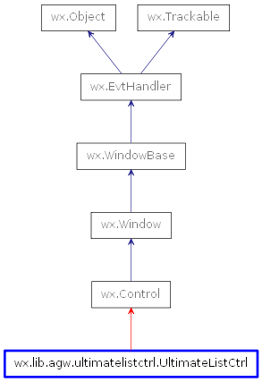
 Inheritance diagram for class UltimateListCtrl: