Navigation

- Home |
- Gallery |
- API Docs »
- wx.lib »
- wx.lib.agw »
- wx.lib.agw.ultimatelistctrl »
- wx.lib.agw.ultimatelistctrl.UltimateListMainWindow
- index
- modules |
- next |
- previous |

 wx.lib.agw.ultimatelistctrl.UltimateListMainWindow
This is the main widget implementation of UltimateListCtrl.
 Methods Summary
__init__ |
Default class constructor. |
AutoCheckChild |
Checks/unchecks all the items. |
AutoToggleChild |
Toggles all the items. |
CacheLineData |
Saves the current line attributes. |
ChangeCurrent |
Changes the current line to the specified one. |
CheckItem |
Actually checks/uncheks an item, sending (eventually) the two |
DeleteAllItems |
Deletes all items in the UltimateListCtrl. |
DeleteColumn |
Deletes the specified column. |
DeleteEverything |
Deletes all items in the UltimateListCtrl, resetting column widths to zero. |
DeleteItem |
Deletes the specified item. |
DeleteItemWindow |
Deletes the window associated to an item (if any). |
DoDeleteAllItems |
Actually performs the deletion of all the items. |
DoGetBestSize |
Gets the size which best suits the window: for a control, it would be the |
DragFinish |
A drag and drop operation has just finished. |
DrawCheckbox |
Draws the item checkbox/radiobutton image. |
DrawDnDArrow |
Draws a drag and drop visual representation of an arrow. |
DrawImage |
Draws one of the item images. |
EditLabel |
Starts editing an item label. |
EnableItem |
Enables/disables an item. |
EnableSelectionGradient |
Globally enables/disables drawing of gradient selections. |
EnableSelectionVista |
Globally enables/disables drawing of Windows Vista selections. |
EnsureVisible |
Ensures this item is visible. |
FindItem |
Find an item whose label matches this string. |
FindItemAtPos |
Find an item nearest this position. |
FindItemData |
Find an item whose data matches this data. |
GetBackgroundImage |
Returns the UltimateListCtrl background image (if any). |
GetCheckboxImageSize |
Returns the checkbox/radiobutton image size. |
GetColumn |
Returns information about this column. |
GetColumnCount |
Returns the total number of columns in the UltimateListCtrl. |
GetColumnCustomRenderer |
Returns the custom renderer used to draw the column header |
GetColumnWidth |
Returns the column width for the input column. |
GetControlBmp |
Returns a native looking checkbox or radio button bitmap. |
GetCountPerPage |
Returns the number of items that can fit vertically in the visible area |
GetDisabledTextColour |
Returns the items disabled colour. |
GetDummyLine |
Returns a dummy line. |
GetFirstGradientColour |
Returns the first gradient colour for gradient-style selections. |
GetGradientStyle |
Returns the gradient style for gradient-style selections. |
GetHeaderWidth |
Returns the header window width, in pixels. |
GetHighlightBrush |
Returns the brush to use for the item highlighting. |
GetHyperTextFont |
Returns the font used to render an hypertext item. |
GetHyperTextNewColour |
Returns the colour used to render a non-visited hypertext item. |
GetHyperTextVisitedColour |
Returns the colour used to render a visited hypertext item. |
GetImageSize |
Returns the image size for the item. |
GetItem |
Returns the information about the input item. |
GetItemCount |
Returns the number of items in the UltimateListCtrl. |
GetItemCustomRenderer |
Returns the custom renderer used to draw the input item (if any). |
GetItemKind |
Returns the item kind. |
GetItemOverFlow |
Returns if the item is in the overflow state. |
GetItemPosition |
Returns the position of the item, in icon or small icon view. |
GetItemRect |
Returns the rectangle representing the item’s size and position, in physical |
GetItemSpacing |
Returns the spacing between item texts and icons, in pixels. |
GetItemState |
Returns the item state flags for the input item. |
GetItemText |
Returns the item text. |
GetItemTextSize |
Returns the item width, in pixels, considering only the item text. |
GetItemVisited |
Returns whether an hypertext item was visited. |
GetItemWidthWithImage |
Returns the item width, in pixels, considering the item text and its images. |
GetItemWindow |
Returns the window associated to the item (if any). |
GetItemWindowEnabled |
Returns whether the window associated to the item is enabled. |
GetLine |
Returns the line data for the given index. |
GetLineCheckboxRect |
Returns the line client rectangle for the item checkbox image only. |
GetLineHeight |
Returns the line height for a specific item. |
GetLineHighlightRect |
Returns the line client rectangle when the line is highlighted. |
GetLineIconRect |
Returns the line client rectangle for the item image only. |
GetLineLabelRect |
Returns the line client rectangle for the item text only. |
GetLineRect |
Returns the line client rectangle. |
GetLineSize |
Returns the size of the total line client rectangle. |
GetLineY |
Returns the line y position. |
GetListCtrl |
Returns the parent widget, an instance of UltimateListCtrl. |
GetMainWindowOfCompositeControl |
Returns the UltimateListMainWindow parent. |
GetNextActiveItem |
Returns the next active item. Used Internally at present. |
GetNextItem |
Searches for an item with the given geometry or state, starting from item |
GetRuleColour |
Returns the colour to be used for drawing the horizontal and vertical rules. |
GetSecondGradientColour |
Returns the second gradient colour for gradient-style selections. |
GetSelectedItemCount |
Returns the number of selected items in UltimateListCtrl. |
GetSubItemRect |
Returns the rectangle representing the size and position, in physical coordinates, |
GetTextLength |
Returns the text width for the input string. |
GetTotalWidth |
Returns the total width of the columns in UltimateListCtrl. |
GetUserLineHeight |
Returns the custom value for the UltimateListMainWindow item height, if previously set with |
GetViewRect |
Returns the rectangle taken by all items in the control. In other words, |
GetVisibleLinesRange |
Returns the range of visible items on screen. |
GetWaterMark |
Returns the UltimateListCtrl watermark image (if any), displayed in the |
HandleHyperLink |
Handles the hyperlink items, sending the EVT_LIST_ITEM_HYPERLINK event. |
HasAGWFlag |
Returns True if the window has the given flag bit set. |
HasCurrent |
Returns True if the current item has been set, either programmatically |
HasFocus |
Returns True if the window has focus. |
HasFooter |
Returns True if the footer window is shown. |
HasHeader |
Returns True if the header window is shown. |
HideWindows |
Hides the windows associated to the items. Used internally. |
HighlightAll |
Highlights/unhighlights all the lines in UltimateListCtrl. |
HighlightLine |
Highlights a line in UltimateListCtrl. |
HighlightLines |
Highlights a range of lines in UltimateListCtrl. |
HitTest |
HitTest method for a UltimateListCtrl. |
HitTestLine |
HitTest method for a UltimateListCtrl line. |
Init |
Initializes the UltimateListMainWindow widget. |
InReportView |
Returns True if the window is in report mode. |
InsertColumn |
Inserts a column into UltimateListCtrl. |
InsertItem |
Inserts an item into UltimateListCtrl. |
InTileView |
Returns True if the window is in tile mode (partially implemented). |
IsColumnShown |
Returns True if the input column is shown, False if it is hidden. |
IsEmpty |
Returns True if the window has no items in it. |
IsHighlighted |
Returns True if the input line is highlighted. |
IsItemChecked |
Returns whether an item is checked or not. |
IsItemEnabled |
Returns whether an item is enabled or not. |
IsItemHyperText |
Returns whether an item is hypertext or not. |
IsSingleSel |
Returns True if we are in single selection mode, False if multi selection. |
IsVirtual |
Returns True if the window has the ULC_VIRTUAL style set. |
MoveToFocus |
Brings tyhe current item into view. |
MoveToItem |
Scrolls the input item into view. |
OnArrowChar |
Handles the keyboard arrows key events. |
OnChar |
Handles the wx.EVT_CHAR event for UltimateListMainWindow. |
OnChildFocus |
Handles the wx.EVT_CHILD_FOCUS event for UltimateListMainWindow. |
OnCompareItems |
Returns whether 2 lines have the same index. |
OnEraseBackground |
Handles the wx.EVT_ERASE_BACKGROUND event for UltimateListMainWindow. |
OnHoverTimer |
Handles the wx.EVT_TIMER event for UltimateListMainWindow. |
OnKeyDown |
Handles the wx.EVT_KEY_DOWN event for UltimateListMainWindow. |
OnKeyUp |
Handles the wx.EVT_KEY_UP event for UltimateListMainWindow. |
OnKillFocus |
Handles the wx.EVT_KILL_FOCUS event for UltimateListMainWindow. |
OnMouse |
Handles the wx.EVT_MOUSE_EVENTS event for UltimateListMainWindow. |
OnPaint |
Handles the wx.EVT_PAINT event for UltimateListMainWindow. |
OnRenameAccept |
Called by UltimateListTextCtrl, to accept the changes and to send the |
OnRenameCancelled |
Called by UltimateListTextCtrl, to cancel the changes and to send the |
OnRenameTimer |
The timer for renaming has expired. Start editing. |
OnScroll |
Handles the wx.EVT_SCROLLWIN event for UltimateListMainWindow. |
OnSetFocus |
Handles the wx.EVT_SET_FOCUS event for UltimateListMainWindow. |
PaintWaterMark |
Draws a watermark at the bottom right of UltimateListCtrl. |
RecalculatePositions |
Recalculates all the items positions, and sets the scrollbars positions |
RefreshAfter |
Redraws all the lines after the input one. |
RefreshAll |
Refreshes the entire UltimateListCtrl. |
RefreshLine |
Redraws the input line. |
RefreshLines |
Redraws a range of lines in UltimateListCtrl. |
RefreshSelected |
Redraws the selected lines. |
ResetCurrent |
Resets the current item to None. |
ResetLineDimensions |
Resets the line dimensions, so that client rectangles and positions are |
ResetTextControl |
Called by UltimateListTextCtrl when it marks itself for deletion. |
ResetVisibleLinesRange |
Forces us to recalculate the range of visible lines. |
ResizeColumns |
If ULC_AUTOSIZE_FILL was passed to UltimateListCtrl.SetColumnWidth() then |
ReverseHighlight |
Toggles the line state and refreshes it. |
ScrollList |
Scrolls the UltimateListCtrl. |
SendNotify |
Actually sends a UltimateListEvent. |
SetBackgroundImage |
Sets the UltimateListCtrl background image. |
SetColumn |
Sets information about this column. |
SetColumnCustomRenderer |
Associate a custom renderer to this column’s header |
SetColumnWidth |
Sets the column width. |
SetDisabledTextColour |
Sets the items disabled colour. |
SetFirstGradientColour |
Sets the first gradient colour for gradient-style selections. |
SetFont |
Overridden base class virtual to reset the line height when the font changes. |
SetGradientStyle |
Sets the gradient style for gradient-style selections. |
SetHyperTextFont |
Sets the font used to render hypertext items. |
SetHyperTextNewColour |
Sets the colour used to render a non-visited hypertext item. |
SetHyperTextVisitedColour |
Sets the colour used to render a visited hypertext item. |
SetImageList |
Sets the image list associated with the control. |
SetImageListCheck |
Sets the checkbox/radiobutton image list. |
SetItem |
Sets information about the item. |
SetItemCount |
This method can only be used with virtual UltimateListCtrl. It is used to |
SetItemCustomRenderer |
Associate a custom renderer to this item. |
SetItemHyperText |
Sets whether the item is hypertext or not. |
SetItemKind |
Sets the item kind. |
SetItemOverFlow |
Sets the item in the overflow/non overflow state. |
SetItemSpacing |
Sets the spacing between item texts and icons. |
SetItemState |
Sets the item state flags for the input item. |
SetItemStateAll |
Sets the item state flags for all the items. |
SetItemText |
Sets the item text. |
SetItemVisited |
Sets whether an hypertext item was visited. |
SetItemWindow |
Sets the window for the given item. |
SetItemWindowEnabled |
Enables/disables the window associated to the item. |
SetReportView |
Sets whether UltimateListCtrl is in report view or not. |
SetSecondGradientColour |
Sets the second gradient colour for gradient-style selections. |
SetUserLineHeight |
Sets a custom value for the UltimateListMainWindow item height. |
SetWaterMark |
Sets the UltimateListCtrl watermark image to be displayed in the bottom |
SortItems |
Call this function to sort the items in the UltimateListCtrl. Sorting is done |
TileBackground |
Tiles the background image to fill all the available area. |
UpdateCurrent |
Updates the current line selection. |
 Class API
UltimateListMainWindow(wx.ScrolledWindow)¶This is the main widget implementation of UltimateListCtrl.
__init__(self, parent, id, pos=wx.DefaultPosition, size=wx.DefaultSize, style=0, agwStyle=0, name="listctrlmainwindow")¶Default class constructor.
| Parameters: |
|
|---|
AutoCheckChild(self, isChecked, column)¶Checks/unchecks all the items.
| Parameters: |
|
|---|
Note
This method is meaningful only for checkbox-like and radiobutton-like items.
AutoToggleChild(self, column)¶Toggles all the items.
| Parameters: | column – the column to which the items belongs to. |
|---|
Note
This method is meaningful only for checkbox-like and radiobutton-like items.
CacheLineData(self, line)¶Saves the current line attributes.
| Parameters: | line – an instance of UltimateListLineData. |
|---|
Note
This method is used only if the UltimateListCtrl has the ULC_VIRTUAL
style set.
ChangeCurrent(self, current)¶Changes the current line to the specified one.
| Parameters: | current – an integer specifying the index of the current line. |
|---|
CheckItem(self, item, checked=True, sendEvent=True)¶Actually checks/uncheks an item, sending (eventually) the two
events EVT_LIST_ITEM_CHECKING / EVT_LIST_ITEM_CHECKED.
| Parameters: |
|
|---|
Note
This method is meaningful only for checkbox-like and radiobutton-like items.
DeleteAllItems(self)¶Deletes all items in the UltimateListCtrl.
Note
This function does not send the EVT_LIST_DELETE_ITEM event because
deleting many items from the control would be too slow then (unlike DeleteItem).
DeleteColumn(self, col)¶Deletes the specified column.
| Parameters: | col – the index of the column to delete. |
|---|
DeleteEverything(self)¶Deletes all items in the UltimateListCtrl, resetting column widths to zero.
DeleteItem(self, lindex)¶Deletes the specified item.
| Parameters: | lindex – the index of the item to delete. |
|---|
Note
This function sends the EVT_LIST_DELETE_ITEM event for the item
being deleted.
DeleteItemWindow(self, item)¶Deletes the window associated to an item (if any).
| Parameters: | item – an instance of UltimateListItem. |
|---|
DoDeleteAllItems(self)¶Actually performs the deletion of all the items.
DoGetBestSize(self)¶Gets the size which best suits the window: for a control, it would be the minimal size which doesn’t truncate the control, for a panel - the same size as it would have after a call to Fit().
DragFinish(self, event)¶A drag and drop operation has just finished.
| Parameters: | event – a MouseEvent event to be processed. |
|---|
DrawCheckbox(self, dc, x, y, kind, checked, enabled)¶Draws the item checkbox/radiobutton image.
| Parameters: |
|
|---|
DrawDnDArrow(self)¶Draws a drag and drop visual representation of an arrow.
DrawImage(self, index, dc, x, y, enabled)¶Draws one of the item images.
| Parameters: |
|
|---|
EditLabel(self, item)¶Starts editing an item label.
| Parameters: | item – an instance of UltimateListItem. |
|---|
EnableItem(self, item, enable=True)¶Enables/disables an item.
| Parameters: |
|
|---|
EnableSelectionGradient(self, enable=True)¶Globally enables/disables drawing of gradient selections.
| Parameters: | enable – True to enable gradient-style selections, False
to disable it. |
|---|
Note
Calling this method disables any Vista-style selection previously enabled.
EnableSelectionVista(self, enable=True)¶Globally enables/disables drawing of Windows Vista selections.
| Parameters: | enable – True to enable Vista-style selections, False to
disable it. |
|---|
Note
Calling this method disables any gradient-style selection previously enabled.
EnsureVisible(self, index)¶Ensures this item is visible.
| Parameters: | index – the index of the item to scroll into view. |
|---|
FindItem(self, start, string, partial=False)¶Find an item whose label matches this string.
| Parameters: |
|
|---|
Note
The string comparison is case insensitive.
FindItemAtPos(self, pt)¶Find an item nearest this position.
| Parameters: | pt – an instance of wx.Point. |
|---|
FindItemData(self, start, data)¶Find an item whose data matches this data.
| Parameters: |
|
|---|
GetBackgroundImage(self)¶Returns the UltimateListCtrl background image (if any).
Note
At present, the background image can only be used in “tile” mode.
Todo
Support background images also in stretch and centered modes.
GetCheckboxImageSize(self)¶Returns the checkbox/radiobutton image size.
GetColumn(self, col)¶Returns information about this column.
| Parameters: | col – an integer specifying the column index. |
|---|
GetColumnCount(self)¶Returns the total number of columns in the UltimateListCtrl.
GetColumnCustomRenderer(self, col)¶Returns the custom renderer used to draw the column header
| Parameters: | col – the column index. |
|---|
GetColumnWidth(self, col)¶Returns the column width for the input column.
| Parameters: | col – an integer specifying the column index. |
|---|
GetControlBmp(self, checkbox=True, checked=False, enabled=True, x=16, y=16)¶Returns a native looking checkbox or radio button bitmap.
| Parameters: |
|
|---|
GetCountPerPage(self)¶Returns the number of items that can fit vertically in the visible area
of the UltimateListCtrl (list or report view) or the total number of
items in the list control (icon or small icon view).
GetDisabledTextColour(self)¶Returns the items disabled colour.
GetDummyLine(self)¶Returns a dummy line.
Note
This method is used only if the UltimateListCtrl has the ULC_VIRTUAL
style set.
GetFirstGradientColour(self)¶Returns the first gradient colour for gradient-style selections.
GetGradientStyle(self)¶Returns the gradient style for gradient-style selections.
| Returns: | 0 for horizontal gradient-style selections, 1 for vertical gradient-style selections. |
|---|
GetHeaderWidth(self)¶Returns the header window width, in pixels.
GetHighlightBrush(self)¶Returns the brush to use for the item highlighting.
GetHyperTextFont(self)¶Returns the font used to render an hypertext item.
GetHyperTextNewColour(self)¶Returns the colour used to render a non-visited hypertext item.
GetHyperTextVisitedColour(self)¶Returns the colour used to render a visited hypertext item.
GetImageSize(self, index)¶Returns the image size for the item.
| Parameters: | index – the image index. |
|---|
GetItem(self, item, col=0)¶Returns the information about the input item.
| Parameters: |
|
|---|
GetItemCount(self)¶Returns the number of items in the UltimateListCtrl.
GetItemCustomRenderer(self, item)¶Returns the custom renderer used to draw the input item (if any).
| Parameters: | item – an instance of UltimateListItem. |
|---|
GetItemKind(self, item)¶Returns the item kind.
| Parameters: | item – an instance of UltimateListItem. |
|---|
See also
SetItemKind for a list of valid item kinds.
GetItemOverFlow(self, item)¶Returns if the item is in the overflow state.
An item/subitem may overwrite neighboring items/subitems if its text would not normally fit in the space allotted to it.
| Parameters: | item – an instance of UltimateListItem. |
|---|
GetItemPosition(self, item)¶Returns the position of the item, in icon or small icon view.
| Parameters: | item – the row in which the item lives. |
|---|
GetItemRect(self, item)¶Returns the rectangle representing the item’s size and position, in physical coordinates.
| Parameters: | item – the row in which the item lives. |
|---|
GetItemSpacing(self, isSmall=False)¶Returns the spacing between item texts and icons, in pixels.
| Parameters: | isSmall – True if using a wx.IMAGE_LIST_SMALL image list,
False if using a wx.IMAGE_LIST_NORMAL image list. |
|---|
GetItemState(self, item, stateMask)¶Returns the item state flags for the input item.
| Parameters: |
|
|---|
See also
SetItemStateAll for a list of valid state flags.
GetItemText(self, item)¶Returns the item text.
| Parameters: | item – an instance of UltimateListItem. |
|---|
GetItemTextSize(self, item)¶Returns the item width, in pixels, considering only the item text.
| Parameters: | item – an instance of UltimateListItem. |
|---|
GetItemVisited(self, item)¶Returns whether an hypertext item was visited.
| Parameters: | item – an instance of UltimateListItem. |
|---|
GetItemWidthWithImage(self, item)¶Returns the item width, in pixels, considering the item text and its images.
| Parameters: | item – an instance of UltimateListItem. |
|---|
GetItemWindow(self, item)¶Returns the window associated to the item (if any).
| Parameters: | item – an instance of UltimateListItem. |
|---|
GetItemWindowEnabled(self, item)¶Returns whether the window associated to the item is enabled.
| Parameters: | item – an instance of UltimateListItem. |
|---|
GetLine(self, n)¶Returns the line data for the given index.
| Parameters: | n – the line index. |
|---|
GetLineCheckboxRect(self, line)¶Returns the line client rectangle for the item checkbox image only.
| Parameters: | line – an instance of UltimateListLineData. |
|---|
GetLineHeight(self, item=None)¶Returns the line height for a specific item.
| Parameters: | item – if not None, an instance of UltimateListItem. |
|---|
GetLineHighlightRect(self, line)¶Returns the line client rectangle when the line is highlighted.
| Parameters: | line – an instance of UltimateListLineData. |
|---|
GetLineIconRect(self, line)¶Returns the line client rectangle for the item image only.
| Parameters: | line – an instance of UltimateListLineData. |
|---|
GetLineLabelRect(self, line, col=0)¶Returns the line client rectangle for the item text only. Note this is the full column width unless an image or checkbox exists. It is not the width of the text itself
| Parameters: | line – an instance of UltimateListLineData. |
|---|
GetLineRect(self, line)¶Returns the line client rectangle.
| Parameters: | line – an instance of UltimateListLineData. |
|---|
GetLineSize(self, line)¶Returns the size of the total line client rectangle.
| Parameters: | line – an instance of UltimateListLineData. |
|---|
GetLineY(self, line)¶Returns the line y position.
| Parameters: | line – an instance of UltimateListLineData. |
|---|
GetListCtrl(self)¶Returns the parent widget, an instance of UltimateListCtrl.
GetMainWindowOfCompositeControl(self)¶Returns the UltimateListMainWindow parent.
GetNextActiveItem(self, item, down=True)¶Returns the next active item. Used Internally at present.
| Parameters: |
|
|---|
GetNextItem(self, item, geometry=ULC_NEXT_ALL, state=ULC_STATE_DONTCARE)¶Searches for an item with the given geometry or state, starting from item but excluding the item itself.
| Parameters: |
|
|||||||||||||||||||||||||||||||||||||||||||||||||||
|---|---|---|---|---|---|---|---|---|---|---|---|---|---|---|---|---|---|---|---|---|---|---|---|---|---|---|---|---|---|---|---|---|---|---|---|---|---|---|---|---|---|---|---|---|---|---|---|---|---|---|---|---|
| Returns: | The first item with given state following item or -1 if no such item found. |
Note
This function may be used to find all selected items in the control like this:
item = -1

while 1:
    item = listctrl.GetNextItem(item, ULC_NEXT_ALL, ULC_STATE_SELECTED)

    if item == -1:
        break

    # This item is selected - do whatever is needed with it

    wx.LogMessage("Item %ld is selected."%item)
GetRuleColour(self)¶Returns the colour to be used for drawing the horizontal and vertical rules.
GetSecondGradientColour(self)¶Returns the second gradient colour for gradient-style selections.
GetSelectedItemCount(self)¶Returns the number of selected items in UltimateListCtrl.
GetSubItemRect(self, item, subItem)¶Returns the rectangle representing the size and position, in physical coordinates, of the given subitem, i.e. the part of the row item in the column subItem.
| Parameters: |
|
|---|
Note
This method is only meaningful when the UltimateListCtrl is in the
report mode.
GetTextLength(self, s)¶Returns the text width for the input string.
| Parameters: | s – the string to measure. |
|---|
GetTotalWidth(self)¶Returns the total width of the columns in UltimateListCtrl.
GetUserLineHeight(self)¶Returns the custom value for the UltimateListMainWindow item height, if previously set with
SetUserLineHeight.
Note
This method can be used only with ULC_REPORT and ULC_USER_ROW_HEIGHT styles set.
GetViewRect(self)¶Returns the rectangle taken by all items in the control. In other words, if the controls client size were equal to the size of this rectangle, no scrollbars would be needed and no free space would be left.
Note
This function only works in the icon and small icon views, not in list or report views.
GetVisibleLinesRange(self)¶Returns the range of visible items on screen.
Note
This method can be used only if UltimateListCtrl has the ULC_REPORT
style set.
GetWaterMark(self)¶Returns the UltimateListCtrl watermark image (if any), displayed in the
bottom right part of the window.
Todo
Better support for this is needed.
HandleHyperLink(self, item)¶Handles the hyperlink items, sending the EVT_LIST_ITEM_HYPERLINK event.
| Parameters: | item – an instance of UltimateListItem. |
|---|
HasAGWFlag(self, flag)¶Returns True if the window has the given flag bit set.
| Parameters: | flag – the bit to check. |
|---|
See also
UltimateListCtrl.SetSingleStyle() for a list of valid flags.
HasCurrent(self)¶Returns True if the current item has been set, either programmatically
or by user intervention.
HasFocus(self)¶Returns True if the window has focus.
Returns True if the footer window is shown.
HasHeader(self)¶Returns True if the header window is shown.
HideWindows(self)¶Hides the windows associated to the items. Used internally.
HighlightAll(self, on=True)¶Highlights/unhighlights all the lines in UltimateListCtrl.
| Parameters: | on – True to highlight all the lines, False to unhighlight them. |
|---|
HighlightLine(self, line, highlight=True)¶Highlights a line in UltimateListCtrl.
| Parameters: |
|
|---|
HighlightLines(self, lineFrom, lineTo, highlight=True)¶Highlights a range of lines in UltimateListCtrl.
| Parameters: |
|
|---|
HitTest(self, x, y)¶HitTest method for a UltimateListCtrl.
| Parameters: |
|
|---|
See also
HitTestLine for a list of return flags.
HitTestLine(self, line, x, y)¶HitTest method for a UltimateListCtrl line.
| Parameters: |
|
||||||||||||||||||||||||||||||||||||
|---|---|---|---|---|---|---|---|---|---|---|---|---|---|---|---|---|---|---|---|---|---|---|---|---|---|---|---|---|---|---|---|---|---|---|---|---|---|
| Returns: | a tuple of values, representing the item hit and a hit flag. The hit flag can be one of the following bits:
|
Init(self)¶Initializes the UltimateListMainWindow widget.
InReportView(self)¶Returns True if the window is in report mode.
InsertColumn(self, col, item)¶Inserts a column into UltimateListCtrl.
| Parameters: |
|
|---|---|
| Returns: | the index at which the column has been inserted. |
Note
This method is meaningful only if UltimateListCtrl has the ULC_REPORT
or the ULC_TILE styles set.
InsertItem(self, item)¶Inserts an item into UltimateListCtrl.
| Parameters: | item – an instance of UltimateListItem. |
|---|
InTileView(self)¶Returns True if the window is in tile mode (partially implemented).
Todo
Fully implement tile view for UltimateListCtrl.
IsColumnShown(self, column)¶Returns True if the input column is shown, False if it is hidden.
| Parameters: | column – an integer specifying the column index. |
|---|
IsEmpty(self)¶Returns True if the window has no items in it.
IsHighlighted(self, line)¶Returns True if the input line is highlighted.
| Parameters: | line – an instance of UltimateListLineData. |
|---|
IsItemChecked(self, item)¶Returns whether an item is checked or not.
| Parameters: | item – an instance of UltimateListItem. |
|---|
IsItemEnabled(self, item)¶Returns whether an item is enabled or not.
| Parameters: | item – an instance of UltimateListItem. |
|---|
IsItemHyperText(self, item)¶Returns whether an item is hypertext or not.
| Parameters: | item – an instance of UltimateListItem. |
|---|
IsSingleSel(self)¶Returns True if we are in single selection mode, False if multi selection.
IsVirtual(self)¶Returns True if the window has the ULC_VIRTUAL style set.
MoveToFocus(self)¶Brings tyhe current item into view.
MoveToItem(self, item)¶Scrolls the input item into view.
| Parameters: | item – an instance of UltimateListItem. |
|---|
OnArrowChar(self, newCurrent, event)¶Handles the keyboard arrows key events.
| Parameters: |
|
|---|
OnChar(self, event)¶Handles the wx.EVT_CHAR event for UltimateListMainWindow.
| Parameters: | event – a KeyEvent event to be processed. |
|---|
OnChildFocus(self, event)¶Handles the wx.EVT_CHILD_FOCUS event for UltimateListMainWindow.
| Parameters: | event – a ChildFocusEvent event to be processed. |
|---|
Note
This method is intentionally empty to prevent the default handler in
ScrolledWindow from needlessly scrolling the window when the edit
control is dismissed.
OnCompareItems(self, line1, line2)¶Returns whether 2 lines have the same index.
Override this function in the derived class to change the sort order of the items
in the UltimateListCtrl. The function should return a negative, zero or positive
value if the first line is less than, equal to or greater than the second one.
| Parameters: |
|
|---|
Note
The base class version compares lines by their index.
OnEraseBackground(self, event)¶Handles the wx.EVT_ERASE_BACKGROUND event for UltimateListMainWindow.
| Parameters: | event – a EraseEvent event to be processed. |
|---|
Note
This method is intentionally empty to reduce flicker.
OnHoverTimer(self, event)¶Handles the wx.EVT_TIMER event for UltimateListMainWindow.
| Parameters: | event – a TimerEvent event to be processed. |
|---|
OnKeyDown(self, event)¶Handles the wx.EVT_KEY_DOWN event for UltimateListMainWindow.
| Parameters: | event – a KeyEvent event to be processed. |
|---|
OnKeyUp(self, event)¶Handles the wx.EVT_KEY_UP event for UltimateListMainWindow.
| Parameters: | event – a KeyEvent event to be processed. |
|---|
OnKillFocus(self, event)¶Handles the wx.EVT_KILL_FOCUS event for UltimateListMainWindow.
| Parameters: | event – a FocusEvent event to be processed. |
|---|
OnMouse(self, event)¶Handles the wx.EVT_MOUSE_EVENTS event for UltimateListMainWindow.
| Parameters: | event – a MouseEvent event to be processed. |
|---|
OnPaint(self, event)¶Handles the wx.EVT_PAINT event for UltimateListMainWindow.
| Parameters: | event – a PaintEvent event to be processed. |
|---|
OnRenameAccept(self, itemEdit, value)¶Called by UltimateListTextCtrl, to accept the changes and to send the
EVT_LIST_END_LABEL_EDIT event.
| Parameters: |
|
|---|
OnRenameCancelled(self, itemEdit)¶Called by UltimateListTextCtrl, to cancel the changes and to send the
EVT_LIST_END_LABEL_EDIT event.
| Parameters: | item – an instance of UltimateListItem. |
|---|
OnRenameTimer(self)¶The timer for renaming has expired. Start editing.
OnScroll(self, event)¶Handles the wx.EVT_SCROLLWIN event for UltimateListMainWindow.
| Parameters: | event – a ScrollEvent event to be processed. |
|---|
OnSetFocus(self, event)¶Handles the wx.EVT_SET_FOCUS event for UltimateListMainWindow.
| Parameters: | event – a FocusEvent event to be processed. |
|---|
PaintWaterMark(self, dc)¶Draws a watermark at the bottom right of UltimateListCtrl.
| Parameters: | dc – an instance of wx.DC. |
|---|
Todo
Better support for this is needed.
RecalculatePositions(self, noRefresh=False)¶Recalculates all the items positions, and sets the scrollbars positions too.
| Parameters: | noRefresh – True to avoid calling Refresh, False otherwise. |
|---|
RefreshAfter(self, lineFrom)¶Redraws all the lines after the input one.
| Parameters: | lineFrom – an integer representing the first line to refresh. |
|---|
RefreshAll(self)¶Refreshes the entire UltimateListCtrl.
RefreshLine(self, line)¶Redraws the input line.
| Parameters: | line – an instance of UltimateListLineData. |
|---|
RefreshLines(self, lineFrom, lineTo)¶Redraws a range of lines in UltimateListCtrl.
| Parameters: |
|
|---|
RefreshSelected(self)¶Redraws the selected lines.
ResetCurrent(self)¶Resets the current item to None.
ResetLineDimensions(self, force=False)¶Resets the line dimensions, so that client rectangles and positions are recalculated.
| Parameters: | force – True to reset all line dimensions. |
|---|
ResetTextControl(self)¶Called by UltimateListTextCtrl when it marks itself for deletion.
ResetVisibleLinesRange(self, reset=False)¶Forces us to recalculate the range of visible lines.
| Parameters: | reset – True to reset all line dimensions, which will then be
recalculated. |
|---|
ResizeColumns(self)¶If ULC_AUTOSIZE_FILL was passed to UltimateListCtrl.SetColumnWidth() then
that column’s width will be expanded to fill the window on a resize event.
Called by UltimateListCtrl.OnSize() when the window is resized.
ReverseHighlight(self, line)¶Toggles the line state and refreshes it.
| Parameters: | line – an instance of UltimateListLineData. |
|---|
ScrollList(self, dx, dy)¶Scrolls the UltimateListCtrl.
| Parameters: |
|
|---|
SendNotify(self, line, command, point=wx.DefaultPosition)¶Actually sends a UltimateListEvent.
| Parameters: |
|
|---|
SetBackgroundImage(self, image)¶Sets the UltimateListCtrl background image.
| Parameters: | image – if not None, an instance of wx.Bitmap. |
|---|
Note
At present, the background image can only be used in “tile” mode.
Todo
Support background images also in stretch and centered modes.
SetColumn(self, col, item)¶Sets information about this column.
| Parameters: |
|
|---|
SetColumnCustomRenderer(self, col=0, renderer=None)¶Associate a custom renderer to this column’s header
| Parameters: |
|
|---|
Note
the renderer class must implement the methods DrawHeaderButton and GetForegroundColor.
SetColumnWidth(self, col, width)¶Sets the column width.
| Parameters: | width – can be a width in pixels or wx.LIST_AUTOSIZE (-1) or
wx.LIST_AUTOSIZE_USEHEADER (-2) or ULC_AUTOSIZE_FILL (-3).
wx.LIST_AUTOSIZE will resize the column to the length of its longest
item. wx.LIST_AUTOSIZE_USEHEADER will resize the column to the
length of the header (Win32) or 80 pixels (other platforms).
ULC_AUTOSIZE_FILL will resize the column fill the remaining width
of the window. |
|---|
Note
In small or normal icon view, col must be -1, and the column width is set for all columns.
SetDisabledTextColour(self, colour)¶Sets the items disabled colour.
| Parameters: | colour – an instance of wx.Colour. |
|---|
SetFirstGradientColour(self, colour=None)¶Sets the first gradient colour for gradient-style selections.
| Parameters: | colour – if not None, a valid wx.Colour instance. Otherwise,
the colour is taken from the system value wx.SYS_COLOUR_HIGHLIGHT. |
|---|
SetFont(self, font)¶Overridden base class virtual to reset the line height when the font changes.
| Parameters: | font – a valid wx.Font object. |
|---|
Note
Overridden from ScrolledWindow.
SetGradientStyle(self, vertical=0)¶Sets the gradient style for gradient-style selections.
| Parameters: | vertical – 0 for horizontal gradient-style selections, 1 for vertical gradient-style selections. |
|---|
SetHyperTextFont(self, font)¶Sets the font used to render hypertext items.
| Parameters: | font – a valid wx.Font instance. |
|---|
SetHyperTextNewColour(self, colour)¶Sets the colour used to render a non-visited hypertext item.
| Parameters: | colour – a valid wx.Colour instance. |
|---|
SetHyperTextVisitedColour(self, colour)¶Sets the colour used to render a visited hypertext item.
| Parameters: | colour – a valid wx.Colour instance. |
|---|
SetImageList(self, imageList, which)¶Sets the image list associated with the control.
| Parameters: |
|
|---|
Note
Using PyImageList enables you to have images of different size inside the
image list. In your derived class, instead of doing this:
imageList = wx.ImageList(16, 16)
imageList.Add(someBitmap)
self.SetImageList(imageList, wx.IMAGE_LIST_SMALL)
You should do this:
imageList = PyImageList(16, 16)
imageList.Add(someBitmap)
self.SetImageList(imageList, wx.IMAGE_LIST_SMALL)
SetImageListCheck(self, sizex, sizey, imglist=None)¶Sets the checkbox/radiobutton image list.
| Parameters: |
|
|---|
SetItem(self, item)¶Sets information about the item.
| Parameters: | item – an instance of UltimateListItemData. |
|---|
SetItemCount(self, count)¶This method can only be used with virtual UltimateListCtrl. It is used to
indicate to the control the number of items it contains. After calling it,
the main program should be ready to handle calls to various item callbacks
(such as UltimateListCtrl.OnGetItemText()) for all items in the range from 0 to count.
| Parameters: | count – the total number of items in UltimateListCtrl. |
|---|
SetItemCustomRenderer(self, item, renderer=None)¶Associate a custom renderer to this item.
| Parameters: |
|
|---|
Note
the renderer class must implement the methods DrawSubItem,
GetLineHeight and GetSubItemWidth.
SetItemHyperText(self, item, hyper=True)¶Sets whether the item is hypertext or not.
| Parameters: |
|
|---|
SetItemKind(self, item, kind)¶Sets the item kind.
| Parameters: |
|
|---|
SetItemOverFlow(self, item, over=True)¶Sets the item in the overflow/non overflow state.
An item/subitem may overwrite neighboring items/subitems if its text would not normally fit in the space allotted to it.
| Parameters: |
|
|---|
SetItemSpacing(self, spacing, isSmall=False)¶Sets the spacing between item texts and icons.
| Parameters: |
|
|---|
SetItemState(self, litem, state, stateMask)¶Sets the item state flags for the input item.
| Parameters: |
|
|---|
See also
SetItemStateAll for a list of valid state flags.
SetItemStateAll(self, state, stateMask)¶Sets the item state flags for all the items.
| Parameters: |
|
|---|
Note
The valid state flags are influenced by the value of the state mask.
SetItemText(self, item, value)¶Sets the item text.
| Parameters: |
|
|---|
SetItemVisited(self, item, visited=True)¶Sets whether an hypertext item was visited.
| Parameters: |
|
|---|
SetItemWindow(self, item, wnd, expand=False)¶Sets the window for the given item.
| Parameters: |
|
|---|
SetItemWindowEnabled(self, item, enable=True)¶Enables/disables the window associated to the item.
| Parameters: |
|
|---|
SetReportView(self, inReportView)¶Sets whether UltimateListCtrl is in report view or not.
| Parameters: | inReportView – True to set UltimateListCtrl in report view, False
otherwise. |
|---|
SetSecondGradientColour(self, colour=None)¶Sets the second gradient colour for gradient-style selections.
| Parameters: | colour – if not None, a valid wx.Colour instance. Otherwise,
the colour generated is a slightly darker version of the UltimateListCtrl
background colour. |
|---|
SetUserLineHeight(self, height)¶Sets a custom value for the UltimateListMainWindow item height.
| Parameters: | height – the custom height for all the items, in pixels. |
|---|
Note
This method can be used only with ULC_REPORT and ULC_USER_ROW_HEIGHT styles set.
SetWaterMark(self, watermark)¶Sets the UltimateListCtrl watermark image to be displayed in the bottom
right part of the window.
| Parameters: | watermark – if not None, an instance of wx.Bitmap. |
|---|
Todo
Better support for this is needed.
SortItems(self, func)¶Call this function to sort the items in the UltimateListCtrl. Sorting is done
using the specified function func. This function must have the
following prototype:
def OnCompareItems(self, line1, line2):

    DoSomething(line1, line2)
    # function code
It is called each time when the two items must be compared and should return 0 if the items are equal, negative value if the first item is less than the second one and positive value if the first one is greater than the second one.
| Parameters: | func – the method to use to sort the items. The default is to use the
OnCompareItems method. |
|---|
TileBackground(self, dc)¶Tiles the background image to fill all the available area.
| Parameters: | dc – an instance of wx.DC. |
|---|
Todo
Support background images also in stretch and centered modes.
UpdateCurrent(self)¶Updates the current line selection.


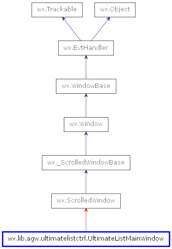
 Inheritance diagram for class UltimateListMainWindow: