Navigator
From Xojo Documentation
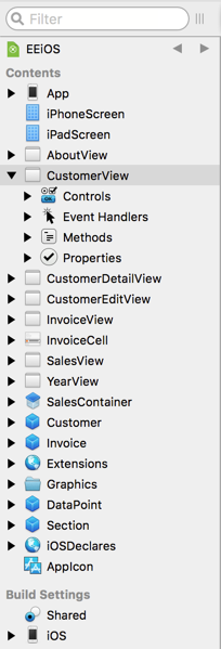
The Navigator is the area on the left sidebar that allows you to move around (and organize) the items in your project. The Navigator consists of the Filter and Jump Bar, plus the Contents, Run, Profiles and Build Settings sections.
Contents
- Filter: The Filter is used to only show specific items in the Navigator's Contents section.
- Jump Bar: The Jump Bar is used to control the level of detail you see for an item in the project.
- Contents: The Contents section contains the items in your project that were added using the Insert button or menu, such as windows, web pages, classes, menus and folders. You can click on project items in the Contents section to view them or edit them. When an item is selected, you can use the arrow keys to move the selection between items.
- The Run section is only visible in the Debugger tab when you are running your project.
- Profiles: The Profiles section only appears when you have enabled the Profiler and have run your apps in debug mode to get profiler data.
- Build Settings: The Builds Settings section contains all build-related information, including the build targets (and their settings) and active build steps used by Build Automation.
Filter
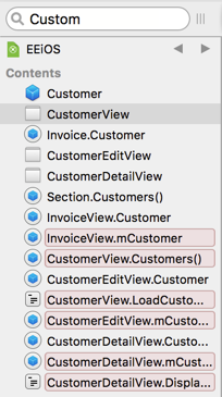
The Navigator has a Filter field at the top that can be used to filter what is displayed in the Contents section. Use the Filter to quickly show specific project items based on your criteria. For example, if you know you have a method that is called “LoadCustomer”, but you don’t recall what class or window it is on, you can just type “Custom” in the Filter field to have the Navigator display any project items that have something containing “Custom” in its name (e.g. a method, control name, constant or property). You can then click on the item to see it or edit it.
This also allows you to type the "location" of a project item and member to quick jump to it, similar to what you can do with "Go To Location". For example: "MyClass.Save" would quickly go to the Save method on MyClass.
Advanced Filtering
You can use the "%" character as a wildcard for filtering the Navigator.
You can also include a "type" operator to limit the filter to only find things of a certain type, which you can also combine with the wildcard. Here are some examples:
| Filter Spec | Result |
|---|---|
| Draw% | Displays everything that starts with "Draw". |
| CustomerName type:property | Displays only properties that contain "CustomerName". |
| ID type:property,constant | Displays only properties and constants that contain "ID". |
| Name type:%property,constant | Displays only properties, computed properties and constants that contain "Name". |
| type:%property,constant | Displays all properties, computed properties and constants. |
| % type:window | Displays all Windows. |
Jump Bar
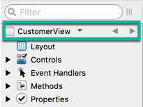
The Navigator displays items using a hierarchical list. The scope of what is displayed is controlled by the Jump Bar. By default, your entire project is in scope, so the Jump Bar displays your project name.
When you double-click on an item that is a parent, the Jump Bar changes to show the parent (this is referred to as “drilling into” the project item). Now only the items that are its children are displayed in the Navigator.
The “Double click opens item in new tab” setting in Preferences alters the above behavior. When that setting is checked, double-click opens the item in a new tab, so use Option+⌘ when double-clicking on a project item to drill into it (on Windows and Linux, use Shift-Control).
Click the name in the Jump Bar to see the entire history and to jump quickly to a specific item in the history. The Jump Bar is incredibly powerful when used with tabs because it allows you to focus the tab on just the specific item you are working with.
Contents
The Contents section shows the items in your project. You can click on project items in the Contents section to view them or edit them. When an item is selected, you can use the arrow keys to move the selection between items. You can do the usual things such as deleting, copying or pasting project items. You can also drag project items to reorganize them or to move them between project items.
For example, you can drag a method from one class to another class to move it. In addition, objects can be multi-selected. For example, you can select a Class and a Window, and drag them both into a Folder.
Run
The Run section contains your app name only appears in the Debugger tab when you run your project.
Profiles
If you run your app with Profiling enabled, the Profiles section appears with the results when the app quits normally (not if it crashes or has an exception). This section has a separate entry for time you run with the Profiler enabled. Click an entry to review the methods that were called with their elapsed times. Refer to the Code Profiler topic for more information about the Profiler.
Build Settings
The Build Settings section shows the various build OS targets available to you and is used to view and change the information needed to build and run your project.
For Desktop projects, the item “This Computer” is checked by default and contains the settings for the platform you are currently using.
For Web projects, the item "Xojo Cloud" is checked by default.
Check the check box next to other targets to create a build for it the next time you build the project. Click on a build target name to change its settings using the Inspector. For more about build settings for the various project types, refer to the App Structure section.
The Build section also is where you manage your Build Steps, which are described in the Build Automation section.
Go To Location
If you know its name, you can directly jump to a specific project item using the Go To Location feature. Select Project ↠ Go To Location to display the Go To Location window. Enter the name of the project item you want to jump to and press Return (or click Go). The Navigator will select the item for you.
Using Tabs
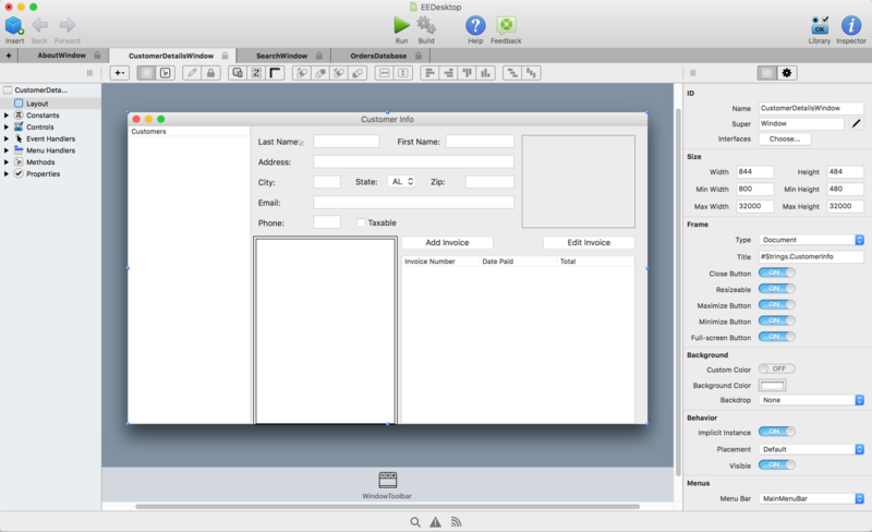
A tab is simply another view into your project. When you create a new tab, you get new Navigator and Editor areas. You can navigate anywhere you want within a tab, just as you can when there are no tabs. Everything works exactly the same; you just now have multiple views into your project, each of which can show different information. Tabs can be a great way to keep frequently used items available, particularly when used in conjunction with the Jump Bar.
To open a project item in a tab, you can use the contextual menu and select “Open in New Tab”. You can also use Option+⌘ when double-clicking on a project item to open it in a new tab (on Windows and Linux, use Shift-Control). There is also a preference to have project items open in a new tab when double-clicked.
The “Double click opens item in new tab” setting in Preferences alters the above behavior. When that setting is checked, double-click opens the item in a new tab. Using Option+⌘ when double-clicking on a project item allows you to drill into it (on Windows and Linux, use Shift-Control).
Tabs can be locked or unlocked. A locked tab will not have its contents changed when you click on Filter or Search results, nor will it be changed when you use Go To Location. In those cases, a new tab (or the next available unlocked tab) are used. Click the small “x” in the tab to close it. Hold down Option (on Mac) or Alt (on Windows or Linux) when clicking the "x" to close all tabs but the left-most one. You can also use View↠Unlock Current Tab or View↠Lock Current Tab (along with its keyboard shortcut).
If you open more tabs than can be displayed in the tab bar, an “overflow” icon appears for you to click to get a drop-down list of the remain tabs. Select a tab from the list replaces the currently selected tab. You can switch between tabs (wrapping around at the beginning or end) using ⌘+Shift+} or ⌘+Shift+{.
A new tab is added when you run your project. This tab has the App name and displays the Debugger when selected. If you navigate to another section of your project, clicking on this tab while the project is running returns to the debugger. Closing this tab is the same as clicking the "Stop" button in the Debugger.
Adding Project Items
Use the Insert button on the toolbar or the Insert menu to add new project items (which appear in the Contents area). You can also use the contextual menu when clicking on the "Contents" header in the Navigator to add project items.
You can also add new project items by dragging a control directly from the Library to the Navigator Contents area. This creates a subclass of the control. Learn about subclasses in the Object-Oriented Programming chapter.
Project items cannot be named “Xojo”.
Common Project Items
| Project Item | Description |
|---|---|
| Build Step | Build Steps are used to automate the build process. |
| Class | A class is a container for code and is the fundamental building block for object-oriented programming. |
| Class Interface | A class interface is a contract that defines methods that specific classes must implement. |
| Database | Used to add a database object to your project. |
| Folder | A folder is a collection of project items and is used for organizational purposes only. |
| Module | A module can contain members (methods, properties, etc.) that are global to your project. It can also contain project items, such as classes and even other modules, allowing you to control access and scope of your project items. |
Desktop Project Items
| Project Item | Description |
|---|---|
| Container Control | Used to combine multiple controls to create custom or reusable controls. |
| File Type Group | Manages the files that your app uses. |
| Image | Adds an Image Set where you can specify pictures with different sizes (and DPI) for use with HiDPI screens. |
| Menu Bar | By default, MainMenuBar is included with all new projects. You can add additional menu bars as well, but this is not common. |
| Report | A report can be used to display information using the built-in Report Designer. |
| Toolbar | A toolbar that can be displayed within a Window. |
| Window | Desktop apps consist of Windows, which contain the controls that define your user interface. |
Web Project Items
| Project Item | Description |
|---|---|
| Container Control | Used to combine multiple controls to create custom or reusable controls. |
| Image | Adds an Image Set where you can specify pictures with different sizes (and DPI) for use with HiDPI screens. |
| Web Page | Web apps consist of Web Pages, which contain the controls that define your user interface. |
| Web Dialog | A dialog that can be displayed on a web page. |
| Web Style | A style that can be used to alter the look and feel of your user interface. |
iOS Project Items
| Project Item | Description |
|---|---|
| Container Control | Used to combine multiple controls to create custom or reusable controls. |
| Icon | A default App Icon is included when creating a new iOS project. Adds an Icon Set where you can specify an icon in various sizes to handle the different iOS screen sizes. |
| Image | Add an Image Set where you can specify an image in various sizes to handle the different iOS screen sizes. |
| Launch Screen | A screen that appears while your app is launching. |
| View | iOS apps consist of Views, which contain the controls that define your user interface. |
| Screen | A screen defines the primary layout of the iOS screen and the views that are used. |
Adding Images and Pictures
You can add images and pictures to your projects by simply dragging the files onto the Navigator. This creates an Image Set and puts the picture at the 1x size, displaying the Image Set Editor. You can drag different pictures (with the appropriate DPI to the 2x and 3x sizes). All the pictures in an Image Set must have the same aspect ratio.
You can manually add an Image Set (Insert ↠ Image) and then drag an image or picture to each size.
When your app is run, the appropriate image for the current screen resolution will be used.
These contextual menu items are available when an image in an Image Set is selected:
- Open in External Editor: Opens the picture in the default picture viewer for the OS.
- Show on Disk: Displays the picture file using the OS file system viewer (Finder or Windows Explorer).
On Desktop and Web projects, you can also drag a picture directly into the project (without creating an Image Set) by holding down Option on MacOS (or Ctrl+Alt on WIndows and Linux). Clicking on the Picture displays a preview of it in the center area of the Workspace.
These contextual menu items are available when a Picture is selected:
- Open File: Opens the picture in the default picture viewer for the OS.
- Show on Disk: Displays the picture file using the OS file system viewer (Finder or Windows Explorer).
- Convert To Image: Converts the Picture to an Image Set with the picture placed in the 1x slot. You can multi-select pictures to convert more than one at a time. Note: The Supports HiDPI property (in Shared Build Settings) must be set to ON in order for this option to appear.
Working with Project Items
You can right-click (Control-Click on Mac) on any project item in the Navigator to display the contextual menu. From the contextual menu you have these options (not all options appear for every project item):
- Add to
- Use this command to add code items such as event handlers, methods, properties, etc. to the project item.
- Inspect
- Displays the Inspector for the project item.
- Cut/Copy
- Use to cut or copy the project item to the clipboard.
- Paste
- Pastes a project item in the clipboard into the Navigator, adding it to your project.
- Delete
- Deletes the project item. To put it in the clipboard, use Cut.
- Duplicate
- Creates a copy of the project item in the Navigator, adding a number suffix.
- Make External/Internal
- External items can be used to share project items between your projects. Learn more in the UserGuide:Sharing Code topic.
- Encrypt/Decrypt
- Refer to Encrypting Project Items for information on encrypting and decrypting project items.
- Export
- Use to export a project item to a file. This is a useful way to share a project item with someone else.
- Prints all the source code for the project item (see Printing).
- New Subclass
- Creates a new class in the Navigator that uses the project item as its superclass. Learn about classes in Object-Oriented Programming.
- Extract Interface
- Displays a dialog that allows you to create a new interface using the specified name and selected methods from the class. The class has the newly created interface added to it.
- Extract Superclass
- Displays a dialog that allows you to create a new super class using the specified name and selected members from the class. The class has the newly created class set as its Super.
- Implement Interface
- Lets you select an interface that contains methods to implement for the class. When you select the interface (or interfaces) to add, the methods from the interfaces are added to the project item. Learn about Interfaces in Object-Oriented Programming.
- Inspector Behavior
- Displays the Inspector Behavior window where you can customize the properties that display in the Inspector for your own classes and controls that you add to layouts. You can choose to display properties for your custom classes and subclasses and you can choose to hide properties that would normally be displayed. Add new properties using the “+” button on the left below the list of properties. Check or uncheck the check box next to the property name to determine if it is visible in the Inspector. You can also specify default values for any properties that are displayed. Drag properties in the list to reorder them or change their grouping in the Inspector. Use the Enumerations section to add a list of values that the user can select with a drop-down menu.
- Edit Super Class
- Displays the parent (super) class for the currently selected class. This item only appears for subclasses. Learn about classes in Object-Oriented Programming.
Printing
You can print your source code using File ↠ Print from the menu:
- When you have project items selected, only the selected items print.
- If you do not have a project item selected, the entire project prints. The easiest way to print the entire project is to select something in the Build Settings.
Refer to the Printing preferences for other settings.
Keyboard Shortcuts
In order for these to work, you must have focus in the Navigator, which means that the row selection is blue.
- Home: Move selection to first row, scrolling if necessary.
- End: Move selection to last row, scrolling if necessary.
- Right Arrow: Expand currently selected row.
- Left Arrow: Collapse currently selected row.
- Up Arrow: Move selection to previous row. If you are now selecting a code item, then focus moves to the Code Editor.
- Down Arrow: Move selection to next row. If you are now selecting a code item, then focus moves to the Code Editor.
- Page Up: Move selection up by one page, scrolling if necessary.
- Page Down: Move selection down by one page, scrolling if necessary.
- Shift + Up/Down Arrows: Select multiple rows.

