wx.RadioBox
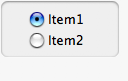
A radio box item is used to select one of number of mutually exclusive choices.
It is displayed as a vertical column or horizontal row of labelled buttons.
 Window Styles
This class supports the following styles:
wx.RA_SPECIFY_ROWS: The major dimension parameter refers to the maximum number of rows.wx.RA_SPECIFY_COLS: The major dimension parameter refers to the maximum number of columns. Events Emitted by this Class
Handlers bound for the following event types will receive a wx.CommandEvent parameter.
wxEVT_RADIOBOX event, when a radiobutton is clicked.See also
 Methods Summary
__init__ |
Default constructor. |
Create |
Creates the radiobox for two-step construction. |
EnableItem |
Enables or disables an individual button in the radiobox. |
FindString |
Finds a button matching the given string, returning the position if found, or NOT_FOUND if not found. |
GetColumnCount |
Returns the number of columns in the radiobox. |
GetCount |
Returns the number of items in the control. |
GetItemFromPoint |
Returns a radio box item under the point, a zero-based item index, or NOT_FOUND if no item is under the point. |
GetItemHelpText |
Returns the helptext associated with the specified item if any or "" . |
GetItemLabel |
GetItemLabel(self, n) . string |
GetItemToolTip |
Returns the tooltip associated with the specified item if any or None. |
GetRowCount |
Returns the number of rows in the radiobox. |
GetSelection |
Returns the index of the selected item or NOT_FOUND if no item is selected. |
GetString |
Returns the label of the item with the given index. |
IsItemEnabled |
Returns True if the item is enabled or False if it was disabled using Enable . |
IsItemShown |
Returns True if the item is currently shown or False if it was hidden using Show . |
SetItemHelpText |
Sets the helptext for an item. |
SetItemLabel |
SetItemLabel(self, n, text) |
SetItemToolTip |
Sets the tooltip text for the specified item in the radio group. |
SetSelection |
Sets the selection to the given item. |
SetString |
Sets the label for the given item. |
ShowItem |
Shows or hides individual buttons. |
 Properties Summary
ColumnCount |
See GetColumnCount |
Count |
See GetCount |
RowCount |
See GetRowCount |
Selection |
See GetSelection and SetSelection |
 Class API
wx.RadioBox(Control, ItemContainerImmutable)¶Possible constructors:
RadioBox()

RadioBox(parent, id=ID_ANY, label="", pos=DefaultPosition,
         size=DefaultSize, choices=[], majorDimension=0, style=RA_SPECIFY_COLS,
         validator=DefaultValidator, name=RadioBoxNameStr)
A radio box item is used to select one of number of mutually exclusive choices.
__init__(self, *args, **kw)¶ Overloaded Implementations:
__init__ (self)
Default constructor.
See also
__init__ (self, parent, id=ID_ANY, label=””, pos=DefaultPosition, size=DefaultSize, choices=[], majorDimension=0, style=RA_SPECIFY_COLS, validator=DefaultValidator, name=RadioBoxNameStr)
Constructor, creating and showing a radiobox.
| Parameters: |
|
|---|
Create(self, parent, id=ID_ANY, label="", pos=DefaultPosition, size=DefaultSize, choices=[], majorDimension=0, style=RA_SPECIFY_COLS, validator=DefaultValidator, name=RadioBoxNameStr)¶Creates the radiobox for two-step construction.
See wx.RadioBox for further details.
| Parameters: |
|
|---|---|
| Return type: | bool |
EnableItem(self, n, enable=True)¶Enables or disables an individual button in the radiobox.
| Parameters: |
|
|---|---|
| Return type: | bool |
See also
FindString(self, string, bCase=False)¶Finds a button matching the given string, returning the position if found, or NOT_FOUND if not found.
| Parameters: |
|
|---|---|
| Return type: | int |
GetColumnCount(self)¶Returns the number of columns in the radiobox.
| Return type: | int |
|---|
GetItemFromPoint(self, pt)¶Returns a radio box item under the point, a zero-based item index, or NOT_FOUND if no item is under the point.
| Parameters: | pt (wx.Point) – Point in client coordinates. |
|---|---|
| Return type: | int |
GetItemHelpText(self, item)¶Returns the helptext associated with the specified item if any or "" .
| Parameters: | item (int) – The zero-based item index. |
|---|---|
| Return type: | string |
See also
GetItemLabel(self, n)¶Return the text of the n’th item in the radio box.
GetItemToolTip(self, item)¶Returns the tooltip associated with the specified item if any or None.
| Parameters: | item (int) – |
|---|---|
| Return type: | wx.ToolTip |
See also
GetRowCount(self)¶Returns the number of rows in the radiobox.
| Return type: | int |
|---|
GetSelection(self)¶Returns the index of the selected item or NOT_FOUND if no item is selected.
| Return type: | int |
|---|---|
| Returns: | The position of the current selection. |
Note
This method can be used with single selection list boxes only, you should use wx.ListBox.GetSelections for the list boxes with wx.LB_MULTIPLE style.
See also
GetString(self, n)¶Returns the label of the item with the given index.
| Parameters: | n (int) – The zero-based index. |
|---|---|
| Return type: | string |
| Returns: | The label of the item or an empty string if the position was invalid. |
IsItemEnabled(self, n)¶Returns True if the item is enabled or False if it was disabled using Enable .
This function is currently only implemented in wxMSW, wxGTK and wxUniversal and always returns True in the other ports.
| Parameters: | n (int) – The zero-based button position. |
|---|---|
| Return type: | bool |
IsItemShown(self, n)¶Returns True if the item is currently shown or False if it was hidden using Show .
Note that this function returns True for an item which hadn’t been hidden even if the entire radiobox is not currently shown.
This function is currently only implemented in wxMSW, wxGTK and wxUniversal and always returns True in the other ports.
| Parameters: | n (int) – The zero-based button position. |
|---|---|
| Return type: | bool |
SetItemHelpText(self, item, helptext)¶Sets the helptext for an item.
Empty string erases any existing helptext.
| Parameters: |
|
|---|
See also
SetItemLabel(self, n, text)¶SetItemLabel(self, n, text)
Set the text of the n’th item in the radio box.
SetItemToolTip(self, item, text)¶Sets the tooltip text for the specified item in the radio group.
This function is currently only implemented in wxMSW and wxGTK2 and does nothing in the other ports.
| Parameters: |
|
|---|
See also
SetSelection(self, n)¶Sets the selection to the given item.
Notice that a radio box always has selection, so n must be valid here and passing NOT_FOUND is not allowed.
| Parameters: | n (int) – |
|---|
SetString(self, n, string)¶Sets the label for the given item.
| Parameters: |
|
|---|
ShowItem(self, item, show=True)¶Shows or hides individual buttons.
| Parameters: |
|
|---|---|
| Return type: | bool |
| Returns: |
|
See also
ColumnCount¶See GetColumnCount
RowCount¶See GetRowCount
Selection¶See GetSelection and SetSelection


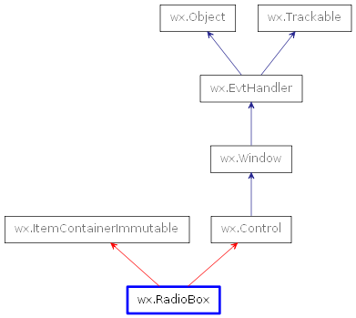
 Inheritance diagram for class RadioBox: