Animations transitions and triggers
You learned the basics of Angular animations in the introduction page.
In this guide, we go into greater depth on special transition states such as * (wildcard) and void, and show how these special states are used for elements entering and leaving a view. The chapter also explores on multiple animation triggers, animation callbacks and sequence-based animation using keyframes.
Predefined states and wildcard matching
In Angular, transition states can be defined explicitly through the state() function, or using the predefined * (wildcard) and void states.
Wildcard state
An asterisk * or wildcard matches any animation state. This is useful for defining transitions that apply regardless of the HTML element's start or end state.
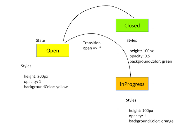
For example, a transition of open => * applies when the element's state changes from open to anything else.
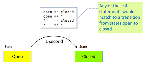
Here's another code sample using the wildcard state together with our previous example using the open and closed states. Instead of defining each state-to-state transition pair, we're now saying that any transition to closed takes 1 second, and any transition to open takes 0.5 seconds.
This allows us to add new states without having to include separate transitions for each one.
animations: [
trigger('openClose', [
// ...
state('open', style({
height: '200px',
opacity: 1,
backgroundColor: 'yellow'
})),
state('closed', style({
height: '100px',
opacity: 0.5,
backgroundColor: 'green'
})),
transition('* => closed', [
animate('1s')
]),
transition('* => open', [
animate('0.5s')
]),
]),
],
Use a double arrow syntax to specify state-to-state transitions in both directions.
transition('open <=> closed', [
animate('0.5s')
]),
Using wildcard state with multiple transition states
In our two-state button example, the wildcard isn't that useful because there are only two possible states, open and closed. Wildcard states are better when an element in one particular state has multiple potential states that it can change to. If our button can change from open to either closed or something like inProgress, using a wildcard state could reduce the amount of coding needed.
animations: [
trigger('openClose', [
// ...
state('open', style({
height: '200px',
opacity: 1,
backgroundColor: 'yellow'
})),
state('closed', style({
height: '100px',
opacity: 0.5,
backgroundColor: 'green'
})),
transition('open => closed', [
animate('1s')
]),
transition('closed => open', [
animate('0.5s')
]),
transition('* => closed', [
animate('1s')
]),
transition('* => open', [
animate('0.5s')
]),
transition('open <=> closed', [
animate('0.5s')
]),
transition ('* => open', [
animate ('1s',
style ({ opacity: '*' }),
),
]),
transition('* => *', [
animate('1s')
]),
The * => * transition applies when any change between two states takes place.
Transitions are matched in the order in which they are defined. Thus, you can apply other transitions on top of the * => * (any-to-any) transition. For example, define style changes or animations that would apply just to open => closed, or just to closed => open, and then use * => * as a fallback for state pairings that aren't otherwise called out.
To do this, list the more specific transitions before * => *.
Using wildcards with styles
Use the wildcard * with a style to tell the animation to use whatever the current style value is, and animate with that. Wildcard is a fallback value that's used if the state being animated isn't declared within the trigger.
transition ('* => open', [
animate ('1s',
style ({ opacity: '*' }),
),
]),
Void state
You can use the void state to configure transitions for an element that is entering or leaving a page. See Animating entering and leaving a view.
Combining wildcard and void states
You can combine wildcard and void states in a transition to trigger animations that enter and leave the page:
-
A transition of
* => voidapplies when the element leaves a view, regardless of what state it was in before it left. -
A transition of
void => *applies when the element enters a view, regardless of what state it assumes when entering. -
The wildcard state
*matches to any state, includingvoid.
Animating entering and leaving a view
This section shows how to animate elements entering or leaving a page.
Note: For our purposes, an element entering or leaving a view is equivalent to being inserted or removed from the DOM.
Now we'll add a new behavior:
- When you add a hero to the list of heroes, it appears to fly onto the page from the left.
- When you remove a hero from the list, it appears to fly out to the right.
animations: [
trigger('flyInOut', [
state('in', style({ transform: 'translateX(0)' })),
transition('void => *', [
style({ transform: 'translateX(-100%)' }),
animate(100)
]),
transition('* => void', [
animate(100, style({ transform: 'translateX(100%)' }))
])
])
]
In the above code, we applied the void state when the HTML element isn't attached to a view.
:enter and :leave aliases
:enter and :leave are aliases for the void => * and * => void transitions. These aliases are used by several animation functions.
transition ( ':enter', [ ... ] ); // alias for void => *
transition ( ':leave', [ ... ] ); // alias for * => void
It's harder to target an element that is entering a view because it isn't in the DOM yet.
So, use the aliases :enter and :leave to target HTML elements that are inserted or removed from a view.
Use of *ngIf and *ngFor with :enter and :leave
The :enter transition runs when any *ngIf or *ngFor views are placed on the page, and :leave runs when those views are removed from the page.
In this example, we have a special trigger for the enter and leave animation called myInsertRemoveTrigger. The HTML template contains the following code.
<div @myInsertRemoveTrigger *ngIf="isShown" class="insert-remove-container">
<p>The box is inserted</p>
</div>
In the component file, the :enter transition sets an initial opacity of 0, and then animates it to change that opacity to 1 as the element is inserted into the view.
trigger('myInsertRemoveTrigger', [
transition(':enter', [
style({ opacity: 0 }),
animate('5s', style({ opacity: 1 })),
]),
transition(':leave', [
animate('5s', style({ opacity: 0 }))
])
]),
Note that this example doesn't need to use state().
:increment and :decrement in transitions
The transition() function takes additional selector values, :increment and :decrement. Use these to kick off a transition when a numeric value has increased or decreased in value.
Note: The following example uses query() and stagger() methods, which is discussed in the complex sequences page.
trigger('filterAnimation', [
transition(':enter, * => 0, * => -1', []),
transition(':increment', [
query(':enter', [
style({ opacity: 0, width: '0px' }),
stagger(50, [
animate('300ms ease-out', style({ opacity: 1, width: '*' })),
]),
], { optional: true })
]),
transition(':decrement', [
query(':leave', [
stagger(50, [
animate('300ms ease-out', style({ opacity: 0, width: '0px' })),
]),
])
]),
]),
Boolean values in transitions
If a trigger contains a boolean value as a binding value, then this value can be matched using a transition() expression that compares true and false, or 1 and 0.
<div [@openClose]="isOpen ? true : false" class="open-close-container">
</div>
In the code snippet above, the HTML template binds a <div> element to a trigger named openClose with a status expression of isOpen, and with possible values of true and false. This is an alternative to the practice of creating two named states of open and close.
In the component code, in the @Component metadata under the animations: property, when the state evaluates to true (meaning "open" here), the associated HTML element's height is a wildcard style or default. In this case, use whatever height the element already had before the animation started. When the element is "closed," the element animates to a height of 0, which makes it invisible.
animations: [
trigger('openClose', [
state('true', style({ height: '*' })),
state('false', style({ height: '0px' })),
transition('false <=> true', animate(500))
])
],
Multiple animation triggers
You can define more than one animation trigger for a component. You can attach animation triggers to different elements, and the parent-child relationships among the elements affect how and when the animations run.
Parent-child animations
Each time an animation is triggered in Angular, the parent animation always get priority and child animations are blocked. In order for a child animation to run, the parent animation must query each of the elements containing child animations and then allow the animations to run using the animateChild() function.
Disabling an animation on an HTML element
A special animation control binding called @.disabled can be placed on an HTML element to disable animations on that element, as well as any nested elements. When true, the @.disabled binding prevents all animations from rendering.
The code sample below shows how to use this feature.
<div [@.disabled]="isDisabled">
<div [@childAnimation]="isOpen ? 'open' : 'closed'"
class="open-close-container">
<p>The box is now {{ isOpen ? 'Open' : 'Closed' }}!</p>
</div>
</div>
When the @.disabled binding is true, the @childAnimation trigger doesn't kick off.
When an element within an HTML template has animations disabled using the @.disabled host binding, animations are disabled on all inner elements as well. You can't selectively disable multiple animations on a single element.
However, selective child animations can still be run on a disabled parent in one of the following ways:
-
A parent animation can use the
query()function to collect inner elements located in disabled areas of the HTML template. Those elements can still animate. -
A subanimation can be queried by a parent and then later animated with the
animateChild()function.
Disabling all animations
To disable all animations for an Angular app, place the @.disabled host binding on the topmost Angular component.
@Component({
selector: 'app-root',
templateUrl: 'app.component.html',
styleUrls: ['app.component.css'],
animations: [
slideInAnimation
// animation triggers go here
]
})
export class AppComponent {
@HostBinding('@.disabled')
public animationsDisabled = false;
}
Note: Disabling animations application-wide is useful during end-to-end (E2E) testing.
Animation callbacks
The animation trigger() function emits callbacks when it starts and when it finishes. In the example below we have a component that contains an openClose trigger.
@Component({
selector: 'app-open-close',
animations: [
trigger('openClose', [
// ...
]),
],
templateUrl: 'open-close.component.html',
styleUrls: ['open-close.component.css']
})
export class OpenCloseComponent {
onAnimationEvent ( event: AnimationEvent ) {
}
}
In the HTML template, the animation event is passed back via $event, as @trigger.start and @trigger.done, where trigger is the name of the trigger being used. In our example, the trigger openClose appears as follows.
<div [@openClose]="isOpen ? 'open' : 'closed'"
(@openClose.start)="onAnimationEvent($event)"
(@openClose.done)="onAnimationEvent($event)"
class="open-close-container">
</div>
A potential use for animation callbacks could be to cover for a slow API call, such as a database lookup. For example, you could set up the InProgress button to have its own looping animation where it pulsates or does some other visual motion while the backend system operation finishes.
Then, another animation can be called when the current animation finishes. For example, the button goes from the inProgress state to the closed state when the API call is completed.
An animation can influence an end user to perceive the operation as faster, even when it isn't. Thus, a simple animation can be a cost-effective way to keep users happy, rather than seeking to improve the speed of a server call and having to compensate for circumstances beyond your control, such as an unreliable network connection.
Callbacks can serve as a debugging tool, for example in conjunction with console.warn() to view the application's progress in a browser's Developer JavaScript Console. The following code snippet creates console log output for our original example, a button with the two states of open and closed.
export class OpenCloseComponent {
onAnimationEvent ( event: AnimationEvent ) {
// openClose is trigger name in this example
console.warn(`Animation Trigger: ${event.triggerName}`);
// phaseName is start or done
console.warn(`Phase: ${event.phaseName}`);
// in our example, totalTime is 1000 or 1 second
console.warn(`Total time: ${event.totalTime}`);
// in our example, fromState is either open or closed
console.warn(`From: ${event.fromState}`);
// in our example, toState either open or closed
console.warn(`To: ${event.toState}`);
// the HTML element itself, the button in this case
console.warn(`Element: ${event.element}`);
}
}
Keyframes
In the previous section, we saw a simple two-state transition. Now we'll create an animation with multiple steps run in sequence using keyframes.
Angular's keyframe() function is similar to keyframes in CSS. Keyframes allow several style changes within a single timing segment. For example, our button, instead of fading, could change color several times over a single 2-second timespan.
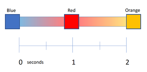
The code for this color change might look like this.
transition('* => active', [
animate('2s', keyframes([
style({ backgroundColor: 'blue' }),
style({ backgroundColor: 'red' }),
style({ backgroundColor: 'orange' })
]))
Offset
Keyframes include an offset that defines the point in the animation where each style change occurs. Offsets are relative measures from zero to one, marking the beginning and end of the animation, respectively.
Defining offsets for keyframes is optional. If you omit them, evenly spaced offsets are automatically assigned. For example, three keyframes without predefined offsets receive offsets of 0, 0.5, and 1. Specifying an offset of 0.8 for the middle transition in the above example might look like this.
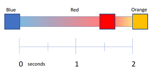
The code with offsets specified would be as follows.
- transition('* => active', [
- animate('2s', keyframes([
- style({ backgroundColor: 'blue', offset: 0}),
- style({ backgroundColor: 'red', offset: 0.8}),
- style({ backgroundColor: 'orange', offset: 1.0})
- ])),
- ]),
- transition('* => inactive', [
- animate('2s', keyframes([
- style({ backgroundColor: 'orange', offset: 0}),
- style({ backgroundColor: 'red', offset: 0.2}),
- style({ backgroundColor: 'blue', offset: 1.0})
- ]))
- ]),
You can combine keyframes with duration, delay, and easing within a single animation.
Keyframes with a pulsation
Use keyframes to create a pulse effect in your animations by defining styles at specific offset throughout the animation.
Here's an example of using keyframes to create a pulse effect:
-
The original
openandclosedstates, with the original changes in height, color, and opacity, occurring over a timeframe of 1 second -
A keyframes sequence inserted in the middle that causes the button to appear to pulsate irregularly over the course of that same 1-second timeframe
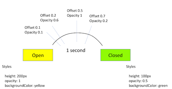
The code snippet for this animation might look like this.
trigger('openClose', [
state('open', style({
height: '200px',
opacity: 1,
backgroundColor: 'yellow'
})),
state('close', style({
height: '100px',
opacity: 0.5,
backgroundColor: 'green'
})),
// ...
transition('* => *', [
animate('1s', keyframes ( [
style({ opacity: 0.1, offset: 0.1 }),
style({ opacity: 0.6, offset: 0.2 }),
style({ opacity: 1, offset: 0.5 }),
style({ opacity: 0.2, offset: 0.7 })
]))
])
])
Animatable properties and units
Angular's animation support builds on top of web animations, so you can animate any property that the browser considers animatable. This includes positions, sizes, transforms, colors, borders, and more. The W3C maintains a list of animatable properties on its CSS Transitions page.
For positional properties with a numeric value, define a unit by providing the value as a string, in quotes, with the appropriate suffix:
- 50 pixels:
'50px' - Relative font size:
'3em' - Percentage:
'100%'
If you don't provide a unit when specifying dimension, Angular assumes a default unit of pixels, or px. Expressing 50 pixels as 50 is the same as saying '50px'.
Automatic property calculation with wildcards
Sometimes you don't know the value of a dimensional style property until runtime. For example, elements often have widths and heights that depend on their content and the screen size. These properties are often challenging to animate using CSS.
In these cases, you can use a special wildcard * property value under style(), so that the value of that particular style property is computed at runtime and then plugged into the animation.
In this example, we have a trigger called shrinkOut, used when an HTML element leaves the page. The animation takes whatever height the element has before it leaves, and animates from that height to zero.
animations: [
trigger('shrinkOut', [
state('in', style({ height: '*' })),
transition('* => void', [
style({ height: '*' }),
animate(250, style({ height: 0 }))
])
])
]
Keyframes summary
The keyframes() function in Angular allows you to specify multiple interim styles within a single transition, with an optional offset to define the point in the animation where each style change occurs.
More on Angular animations
You may also be interested in the following: