Multiple resolutions
The problem of multiple resolutions
Developers often have trouble understanding how to best support multiple resolutions in their games. For desktop and console games, this is more or less straightforward, as most screen aspect ratios are 16:9 and resolutions are standard (720p, 1080p, 1440p, 4K, …).
For mobile games, at first, it was easy. For many years, the iPhone and iPad used the same resolution. When Retina was implemented, they just doubled the pixel density; most developers had to supply assets in default and double resolutions.
Nowadays, this is no longer the case, as there are plenty of different screen sizes, densities, and aspect ratios. Non-conventional sizes are also becoming increasingly popular, such as ultrawide displays.
For 3D games, there is not much of a need to support multiple resolutions (from the aesthetic point of view). The 3D geometry will just fill the screen based on the field of view, disregarding the aspect ratio. The main reason one may want to support this, in this case, is for performance reasons (running in lower resolution to increase frames per second).
For 2D and game UIs, this is a different matter, as art needs to be created using specific pixel sizes in software such as Photoshop, GIMP or Krita.
Since layouts, aspect ratios, resolutions, and pixel densities can change so much, it is no longer possible to design UIs for every specific screen. Another method must be used.
One size fits all
The most common approach is to use a single base resolution and then fit it to everything else. This resolution is how most players are expected to play the game (given their hardware). For mobile, Google has useful stats online, and for desktop, Steam also does.
As an example, Steam shows that the most common primary display resolution is 1920×1080, so a sensible approach is to develop a game for this resolution, then handle scaling for different sizes and aspect ratios.
Godot provides a several useful tools to do this easily.
Base size
A base size for the window can be specified in the Project Settings under Display → Window.

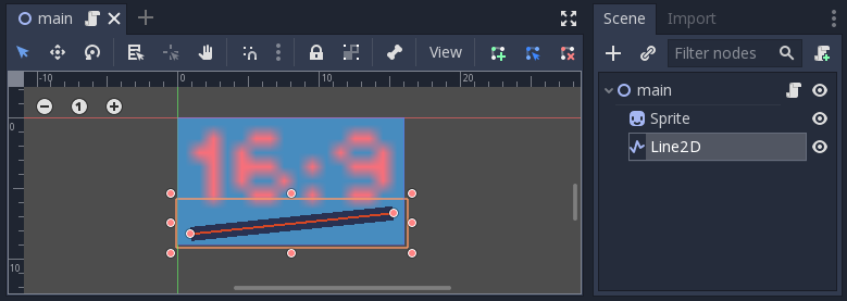
However, what it does is not completely obvious; the engine will not attempt to switch the monitor to this resolution. Rather, think of this setting as the “design size”, i.e. the size of the area that you work with in the editor. This setting corresponds directly to the size of the blue rectangle in the 2D editor.
There is often a need to support devices with screen and window sizes that are different from this base size. Godot offers many ways to control how the viewport will be resized and stretched to different screen sizes.
Resizing
There are several types of devices, with several types of screens, which
in turn have different pixel density and resolutions. Handling all of
them can be a lot of work, so Godot tries to make the developer’s life a
little easier. The Viewport
node has several functions to handle resizing, and the root node of the
scene tree is always a viewport (scenes loaded are instanced as a child
of it, and it can always be accessed by calling
get_tree().get_root() or get_node("/root")).
In any case, while changing the root Viewport params is probably the most flexible way to deal with the problem, it can be a lot of work, code and guessing, so Godot provides a simple set of parameters in the project settings to handle multiple resolutions.
Stretch settings
Stretch settings are located in the project settings, it’s just a bunch of configuration variables that provide several options:

Stretch Mode
The Stretch Mode setting defines how the base size is stretched to fit the resolution of the window or screen.

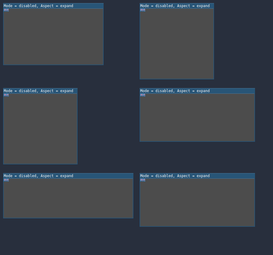
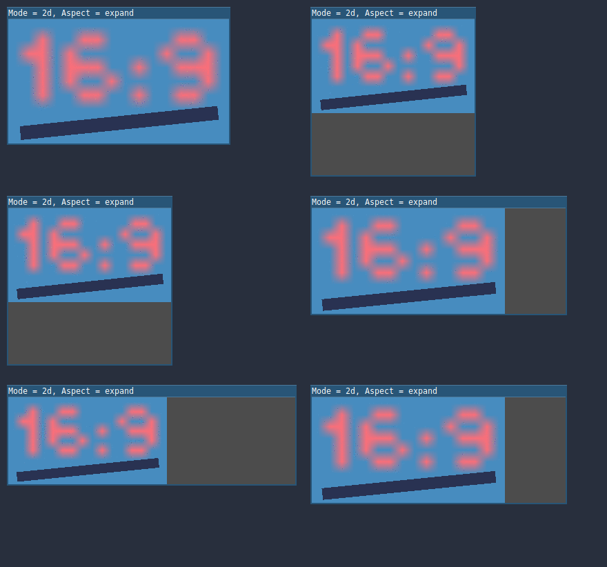
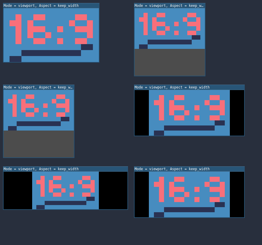
The animations below use a “base size” of just 16×9 pixels to demonstrate the effect of different stretch modes. A single sprite, also 16×9 pixels in size, covers the entire viewport, and a diagonal Line2D is added on top of it:

Stretch Mode = Disabled (default): No stretching happens. One unit in the scene corresponds to one pixel on the screen. In this mode, the Stretch Aspect setting has no effect.
This is a good option if you want full control over every screen pixel, and is probably the best option for 3D games.

Stretch Mode = 2D: In this mode, the size specified in display/width and display/height in the project settings is stretched to cover the whole screen (taking the Stretch Aspect setting into account). This means that everything is rendered directly at the target resolution. 3D is largely unaffected, while in 2D, there is no longer a 1:1 correspondence between sprite pixels and screen pixels, which may result in scaling artifacts.
This is a good option if your 2D artwork has a sufficiently high resolution and does not require pixel-perfect rendering. Consider enabling texture filtering and mipmapping on your 2D textures and fonts.

Stretch Mode = Viewport: Viewport scaling means that the size of the root Viewport is set precisely to the base size specified in the Project Settings’ Display section. The scene is rendered to this viewport first. Finally, this viewport is scaled to fit the screen (taking the Stretch Aspect setting into account).
This mode is useful when working with pixel-precise games, or for the sake of rendering to a lower resolution to improve performance.

Stretch Aspect
The second setting is the stretch aspect. Note that this only takes effect if Stretch Mode is set to something other than Disabled.
In the animations below, you will notice gray and black areas. The black areas are added by the engine and cannot be drawn into. The gray areas are part of your scene, and can be drawn to. The gray areas correspond to the region outside the blue frame you see in the 2D editor.
Stretch Aspect = Ignore: Ignore the aspect ratio when stretching the screen. This means that the original resolution will be stretched to exactly fill the screen, even if it’s wider or narrower. This may result in nonuniform stretching: things looking wider or taller than designed.

Stretch Aspect = Keep: Keep aspect ratio when stretching the screen. This means that the viewport retains its original size regardless of the screen resolution, and black bars will be added to the top/bottom of the screen (“letterboxing”) or the sides (“pillarboxing”).
This is a good option if you know the aspect ratio of your target devices in advance, or if you don’t want to handle different aspect ratios.

Stretch Aspect = Keep Width: Keep aspect ratio when stretching the screen. If the screen is wider than the base size, black bars are added at the left and right (pillarboxing). But if the screen is taller than the base resolution, the viewport will be grown in the vertical direction (and more content will be visible to the bottom). You can also think of this as “Expand Vertically”.
This is usually the best option for creating GUIs or HUDs that scale, so some controls can be anchored to the bottom (Size and anchors).

Stretch Aspect = Keep Height: Keep aspect ratio when stretching the screen. If the screen is taller than the base size, black bars are added at the top and bottom (letterboxing). But if the screen is wider than the base resolution, the viewport will be grown in the horizontal direction (and more content will be visible to the right). You can also think of this as “Expand Horizontally”.
This is usually the best option for 2D games that scroll horizontally (like runners or platformers).

Stretch Aspect = Expand: Keep aspect ratio when stretching the screen, but keep neither the base width nor height. Depending on the screen aspect ratio, the viewport will either be larger in the horizontal direction (if the screen is wider than the base size) or in the vertical direction (if the screen is taller than the original size).

Stretch Shrink
The Shrink setting allows you to add an extra scaling factor on top of what the Stretch options above already provide. The default value of 1 means that no scaling occurs.
If, for example, you set Shrink to 4 and leave Stretch Mode on Disabled, each unit in your scene will correspond to 4×4 pixels on the screen.
If Stretch Mode is set to something other than Disabled, the size of the root viewport is scaled down by the Shrink factor, and pixels in the output are scaled up by the same amount. This is rarely useful for 2D games, but can be used to increase performance in 3D games by rendering them at a lower resolution.
From scripts
To configure stretching at runtime from a script, use the
get_tree().set_screen_stretch() function (see
SceneTree.set_screen_stretch()).
Reducing aliasing on downsampling
If the game has a very high base resolution (e.g. 3840×2160), aliasing might appear when downsampling to something considerably lower like 1280×720. Aliasing can be made less visible by shrinking all images by a factor of 2 upon loading. This can be done by calling the method below before the game data is loaded:
VisualServer.texture_set_shrink_all_x2_on_set_data(true)
Handling aspect ratios
Once scaling for different resolutions is accounted for, make sure that your user interface also scales for different aspect ratios. This can be done using anchors and/or containers.
Field of view scaling
The 3D Camera node’s Keep Aspect property defaults to the Keep Height scaling mode (also called Hor+). This is usually the best value for desktop games and mobile games in landscape mode, as widescreen displays will automatically use a wider field of view.
However, if your 3D game is intended to be played in portrait mode, it may make more sense to use Keep Width instead (also called Vert-). This way, smartphones with an aspect ratio taller than 16:9 (e.g. 19:9) will use a taller field of view, which is more logical here.